Every morning, we compile the links of the day and dump them here… highlighting the big story line. Because there’s nothing quite as satisfying as a good morning dump.
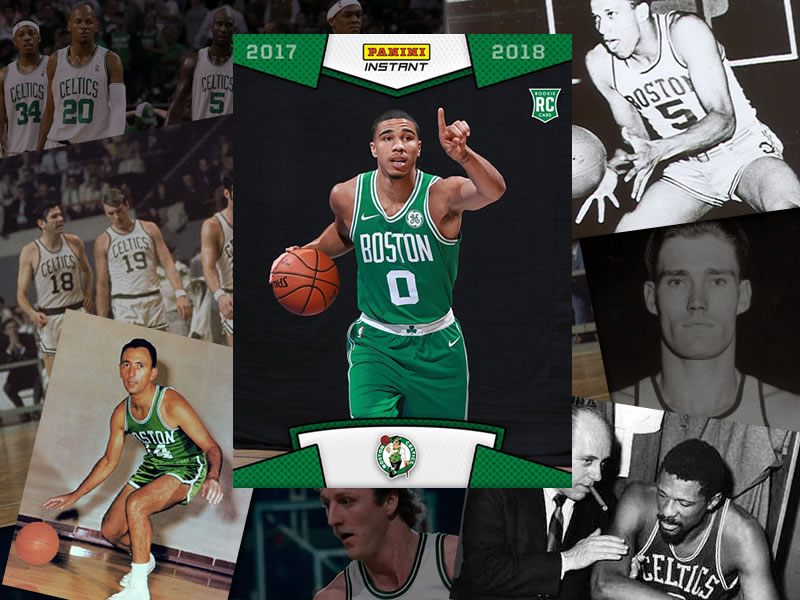
Finally in the @celtics green! Cant wait to get the season started. Go check out my 1st trading card #Celtics https://t.co/pHLahkkxyJ pic.twitter.com/mEqqVim4zb
— Jayson Tatum (@jaytatum0) August 11, 2017
As expected, the new uniforms look a lot like the old uniforms.
So, since there is absolutely nothing else to report today, let’s take a look at the history of the Celtics uniforms.
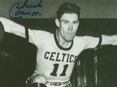
That’s Chuck “The Rifleman” Connors, wearing the Celtics’ original 1946 home uniform complete with sleeves and vertically oriented serif ‘CELTICS’ logotype.
Chuck Person, who irritated the heck out of me as a young Celtics fan, was named after Chuck Connors.
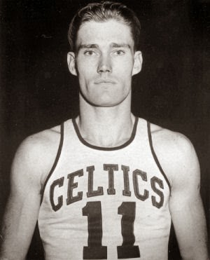
And here’s Chuck wearing a tank top version of the uniform that looks about two sizes too small.
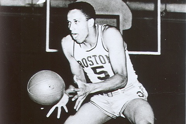
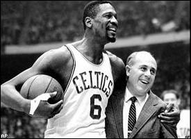
Here’s another Chuck–Cooper this time–with a couple oddities to observe: First, the home jerseys have “BOSTON” on them, which didn’t happen before or after this brief period in the early 50s. Second, for some reason, Coop’s wearing number 5. For most of his career with Boston he wore number 11.
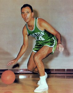
Here’s Cooz in the late ’50s/early ’60s home and road uniforms. The basketball shorts are no longer held up with a belt, and both “BOSTON” and “CELTICS” are serif fonts, like before, but now, they curve around the numbers instead of being aligned straight up and down. Also, this was the era of shiny shorts. For some reason.
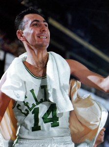
In the mid-60s the uniforms got another tweak. “BOSTON” was dropped from the road uniforms (and would not reappear on the team’s standard road unis until 2016). Also the font was tightened up a bit. It looks closer to what the Celtics wear today, but it’s still a serif font, and the letters still curve around the numbers.
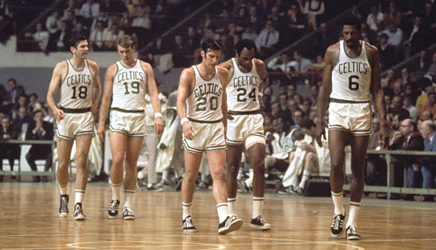
This pic is great for a number of reasons. Not the least of which is the fact that Larry Siegfried’s jersey (20) doesn’t match the rest of the team’s. Siegfried’s wearing the old style, the rest of the guys are wearing the style that the Celtics are more or less still wearing today. “CELTICS” is now in a sans-serif font, and instead of curving around the numbers, all of the letters are straight up and down
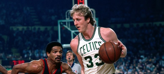
To say that the Celtics uniforms have barely changed is understating it. The vertically aligned sans-serif “CELTICS” has been in use for fifty years with little to no change apart from the relative size and spacing of the letters.
The contrasting green and white stripes on the jerseys have been part of the uniform for sixty years, and the contrasting green and white stripes on the shorts have been there even longer than that. They go back almost 70 years.
Add The Sports Daily to your Google News Feed!