
The Vancouver Canucks have a long history of, really nothing. They don’t have any championships, and they can’t really be said to have much of an identity either. Not only do they change their logos every 10-15 years, but more than once, they have completely changed the color scheme. Let’s give these various jersey logos (there are too many primary logos to consider) a rating, out of 10.

[8/10]
The orginal Canucks logo was beautiful in its simplicity. The hockey stick slices into the rink making a C, and the green and blue is a classic color combination. There or only a couple of demerits because in retrospect, it maybe looks a little like a whale, which led to the monstrosity we see now, and given the color scheme seems a little disrespectful to Hartford.
[4/10]
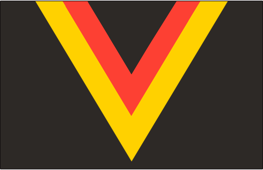
For all the subtlety and hockey-ness of the “C” logo, it was exactly the opposite in the early 80s. Instead of the C for Canucks, they went for a V for Vancouver, and instead of a classic color combination, they went with an eye searing Red Yellow and Black combo. West Germany was really popular at the time.
There is an even worse version in which the yellow is the primary background color, swapped with the black. Yikes.
[3/10]
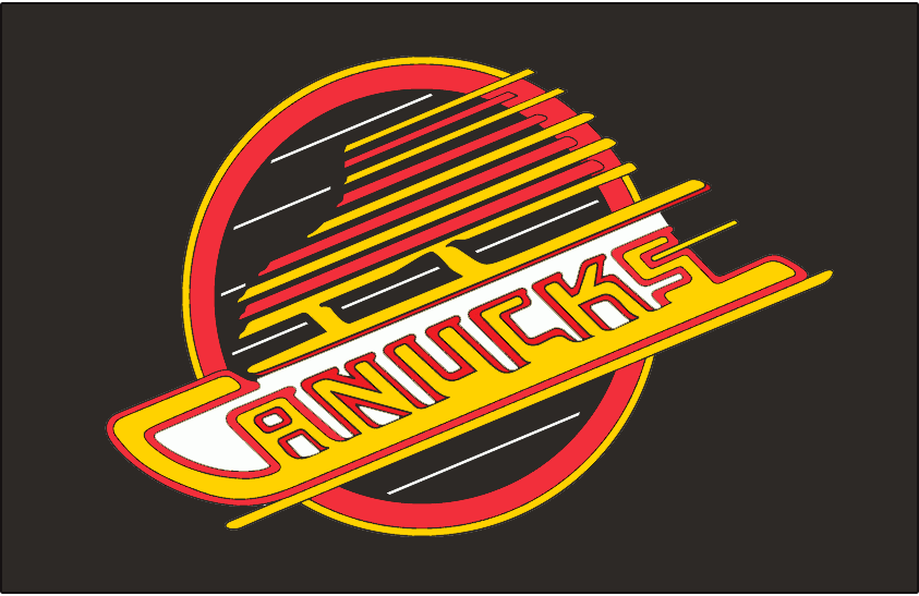
How do we make that color scheme worse? Let’s try to make it LOOK like a hockey thing! It is supposed to be a skate, but looks like the logo of a 24/7 diner with color blind owners.

[2/10]
Here, the Canucks have swapped the emphasis from the team name to the location, and to go with it changed their color scheme from “nightmare” to blue and different blue. It all seems washed out, and changes the logo to this weird looking whale. Is it emerging from glass? Does it have it’s tail in some sort of sock? Even if it was, shouldn’t we still be able to see it somewhere? And what’s up with the lips? Is this an orca, or is it a tail-less whale from a minstrel show.
The Canucks went from a cool, minimalist logo to a racist-ass whale. Terrible marketing.
Add The Sports Daily to your Google News Feed!