If you’ve been a fan of Days of Y’Orr for awhile, you know that I’m a jersey nut. In the beginning of my lifetime it was football jerseys but as I got older I realized that hockey jerseys were the way to go. Now, I don’t have a sizable jersey collection but I do have a few. When The Bruins won the Stanley Cup, the DOY got together and wondered what to do during the summer when not much hockey news happens. My answer: An NHL jersey project.
So I was watching the Winter Classic and figured I should do something to incorporate all the Winter Classic jerseys and I decided I would rank them. Now, I would like to say that this is only for the Winter Classic and does include the Heritage Classic.
10. Philadelphia Flyers – 2010 Winter Classic

When the Flyers debuted their Winter Classic jerseys for the 2010 Winter Classic against Boston, it was a huge “meh” in my book. Usually a road team isn’t going to reveal anything flashy given that the base of their jersey is white, but the jersey above isn’t anything special. It’s something seen before and is pretty generic looking. That’s why it ranks 10th on my list.
9. Washington Capitals – 2011 Winter Classic

Ugh, Jesus Christ. I didn’t like the Flyers 2010 Winter Classic jerseys for being unique enough, but I hate these things because of the fucking stars. Stars on the chest. Stars on the sleeves. Stars. Stars. Stars. Mother fucking stars. I also hate the color scheme, but I get it since it’s located in Washington DC and it’s America’s capitol. However, it’s a color scheme that’s overused in sports (shit, even the Washington Wizards are now red, white and blue) and I think Washington was better served with their blue and copper scheme. Also, fuck Ovechkin.
8. Pittsburgh Penguins – 2011 Winter Classic

Circular logos. I fucking hate circular logos. Now, don’t that get mistaken with a logo like the Bruins, which has virtually been the same thing sicne their inception. The circular logo I’m talking about is the one that you’re looking what right now. A smaller version of the team’s logo with a circle around it and a word font of the city. Every fucking team does this now. Pittsburgh, Florida, Minnesota, Columbus, Chicago and St. Louis are the teams I can name off the top of my head. I’m sure I’m missing some others. I also hate tons of striping on a jersey and the bottom of this jersey is just filled with them. I also don’t like the dark jersey base and the light blue stripes. I’d rather have it the other way around.
7. New York Rangers – 2012 Winter Classic
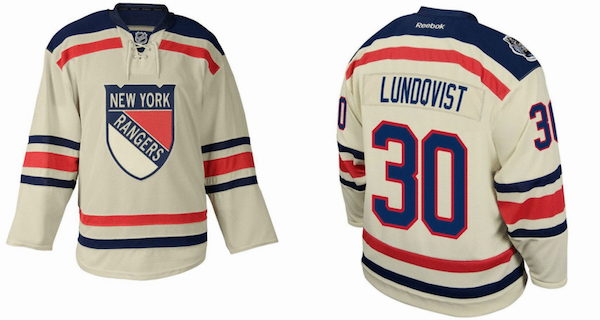
The Rangers uniforms is nice, but it’s nothing special. The offwhite looks much better than a vibrant white jersey, but I’m a little disappointed that the Rangers didn’t use their well known diagonal RANGERS spelling. The traditional feel to the jersey is nice.
6. Buffalo Sabres – 2008 Winter Classic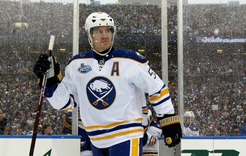
Usually I’m not a fan of white uniforms like I mentioned with the Philadelphia jersey but in 2008 the Sabres were in Buffaslug mania. For some reason the franchise felt it needed to break away from the traditional Buffalo and crossed sabres logo (pictured in the jersey) and go modern. The modernization of logos basically killed some classics and Buffalo was no different. Enter January 2008. The Sabres showed up in Buffalo rocking old school sweaters with that beautiful traditional logo. That’s the reason why this jersey is 6th on my list. Buffalo went back to tradition and it was a beautiful transfer.
After the jump…my top 5 Winter Classic jerseys…
5. Pittsburgh Penguins – 2008 Winter Classic I know that it’s from one of those fake jersey sites, but you know what I mean. So I hate the fucking logo. Lets get it out of the way. When I put Chicago on this list, I’ll hate that logo too. The rest of the jersey though is sexy. The light blue base pops at you and the rest of the jersey is simple. Simple and generic are two totally different things. I love the way this jersey looks. Although Pittsburgh should’ve been wearing white because they were away, they hit a homerun here.
4. Detroit Red Wings – 2009 Winter Classic
What a beautiful jersey. Is there any other type of jersey that the Detroit Red Wings can wear? The answer is no. This is beauty. What else can I say?
3. Philadelphia Flyers – 2012 Winter Classic
The first time I saw this jersey, I fell in love with it. I loved it even more when my cousin’s husband (who is originally from Philadelphia and is a Flyers fan) wore it to my mother’s on Christmas. Comparing the 2008 Winter Classic jersey and the 2012 Winter Classic Jersey is like comparing apples to abortions. This is a beautiful jersey and was very close to being ranked #1 on my list.
2. Boston Bruins – 2010 Winter Classic
When the Bruins announced this jersey, I was a little disappointed. I was hoping the Bruins would wear something out of the Eddie Shore era, with the numbers on the front and back and the logo on the shoulder. Anyway, Once the Bruins debuted these bad boys on the ice, I loved them and I now own one.
However, I must say this to the people out there. If your Boston Bruins winter classic jersey is:
1. Black on the numbers/shoulders
2. Not felt
3. A non yellow B
It’s a fake. I’ve seen so many fake Bruins Winter Classic jerseys out there, it’s sickening. In fact, I’m sure the picture I’m using is a fake one also.
1. Chicago Blackhawks – 2009 Winter Classic
Chicago has had the best Winter Classic jerseys in the 5 year history of the event. The logo sucks, there I said it. Everything else? Masterful. The black base, the cream and red stripes, it all works.
So there you go, all 10 Winter Classic jerseys ranked from 10 to 1.
Add The Sports Daily to your Google News Feed!