 Welcome to the “Re-Imagining The NHL” project created by Cole Jones. Cole has been great enough to allow Days of Y’Orr to post his idea on different teams with his spin on them. You can follow Cole on Twitter. Please feel free to comment on the team below. Feel free to read the official announcement of the project here. We will also do our best to include someone who knows the team better than any of us. Editor’s Note: The Atlanta Thrashers concept was created before the team was picked up and moved to Winnipeg.
Today we have the Atlanta Thrashers and to help talk about the uniforms is Laura Astorian, former Atlanta Thrashers ticket holder and writer of Thrashing The Blues. Let’s start with the man who created it, Mr. Cole Jones.
Cole’s description: The Atlanta Thrashers; a team that struggles to even have an identity, with a color scheme that could best be described as the rainbow (minus green).
I’ll be honest… the home and road jersey designs started out as a Philadelphia Flyers third jersey concept I was working on… but it really reminded me of Atlanta more than anything, so I decided to use it. It reminded me of the T-bird logo, so I originally planned for the T-bird to be the primary crest (since i think it’s their best mark)… however, it just didn’t mesh as well as I’d hoped with that logo as the crest, so I kept the primary bird logo on the home and road, and put the T-bird on the third.
I’d feel like a hypocrite if I fought to preserve what “tradition” Tampa Bay has, but threw it all away with an Atlanta redesign, so I decided to make them a primarily blue team, since they seem to be really wrapped up in the whole “Blueland” concept. I kept it navy, however, as I just don’t feel Columbia blue suits them very well. I also ditched the maroon and gave them copper and athletic-gold accents. To me, it just feels like a unique color scheme that feels like Georgia to me. I also preserved the controversial “asymmetrical” sleeves that have adorned the previous home/alternate sweater, since it’s unmistakably an “Atlanta Thrashers” trait that I don’t hate in concept… only in execution.
That said, here goes nothing: (click the images for higher resolution)
After the jump, it’s ATL jersey time…
Home: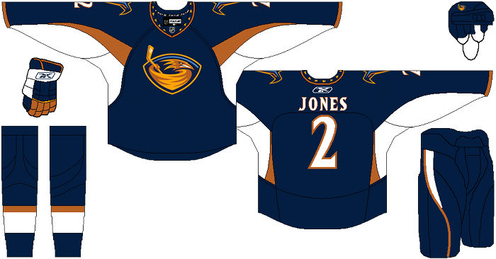
Away: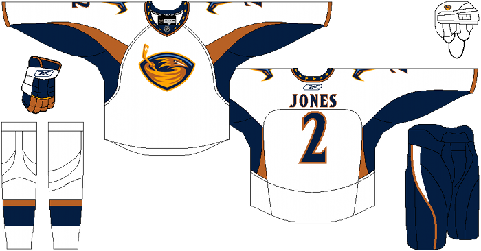
Alternate: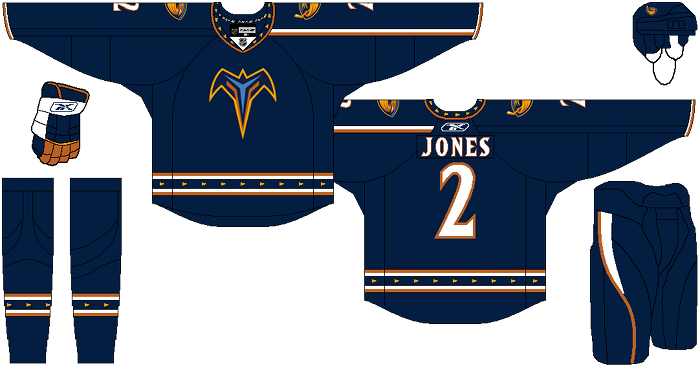
Days of Y’Orr’s comments: Atlanta’s concept has always confused me because they could never get it right. Their red alternate may be the worst jersey ever created, which includes the Islanders Gorton’s Fisherman jersey and the Bruins Pooh Bear jersey. The style, the oversized shoulder patches and the color just don’t fit. Also, there’s no real symmetry with the Thrashers uniforms. This brings me to Cole’s vision of Atlanta (well before they moved). I like what he’s done here because there’s consistency with the uniforms. The most current uniforms were baby blue with the bird logo (home), white with navy blue sleeves and the bird logo (away), and maroon with a thrashers wordmark (third). With Cole’s design, there’s some consistency which is nice. I’m not to hot on the choice of logo for the alternate, but it’s better than what they have (had).
Laura Astorian’s comments: Hey, they’re all better than the home jerseys we had. Honestly, the only ATL jersey that I ever cared for was the initial home, which wound up being the road. I like the cleanness of the white and the fact that they’re not amazingly busy. The other jerseys, though… the color schemes were always off, the newer homes looked like they were made in NHL ’11, and the third jerseys were the abomination that can only happen when RBK has a jersey template no one wants to use and a team has owners who were probably all drunk and went “AWESOME! Use those!” at the same time.
I was never a huge fan of the “Bat Bird” logo as the primary one – I did like it as the secondary, though. But on the navy background with some elements of the original home/away jerseys retained in the striping at the bottom, I like it. They’re clean and recognizable as a Thrashers jersey without looking like a BMX jersey and an Atlanta Hawks jersey hooked up and had a bastard child.
The roads and homes are a bit too Edmonton-y for my taste. Instead of the bronze, maybe the lighter orange from the bird could work, or the maroon. I like the maroon color, but not as the dominant color in the scheme. The road jerseys have a bit too much white – maybe adding the maroon in on the shoulders somewhere. As it stands, all that white makes it look like they’re getting ready to stage a white-out.
Oh. Never mind.
Well you heard from Cole, you heard from us and you heard from Laura. The real question is what do you think?
Add The Sports Daily to your Google News Feed!