![]() Welcome to the “Re-Imagining The NHL” project created by Cole Jones. Cole has been great enough to allow Days of Y’Orr to post his idea on different teams with his spin on them. You can follow Cole on Twitter. Please feel free to comment on the team below. Feel free to read the official announcement of the project here. Since neither Cole or Days of Y’Orr consider this team our “home team”, we will do our best to bring in a fan of the team described to get their thoughts. Today we have the boys from Blackhawks Down Low, Kelly and Andrew.
Welcome to the “Re-Imagining The NHL” project created by Cole Jones. Cole has been great enough to allow Days of Y’Orr to post his idea on different teams with his spin on them. You can follow Cole on Twitter. Please feel free to comment on the team below. Feel free to read the official announcement of the project here. Since neither Cole or Days of Y’Orr consider this team our “home team”, we will do our best to bring in a fan of the team described to get their thoughts. Today we have the boys from Blackhawks Down Low, Kelly and Andrew.
If you haven’t checked out our other teams, visit the Re-Imagining the NHL team page. The team page will be updated daily with every team we update. So before we take a look at the uniforms, lets take a look at Cole’s comments on the Blackhawks.
Cole’s comments: Here is one of the teams that barely needs any tweaks at all. I absolutely adore everything about the Blackhawks uniforms and always have. The logo, the striping, the colors. It’s a classic that doesn’t need to be changed.
That said, where is the fun in making a concept that doesn’t change anything? I did the unthinkable and actually ditched my favorite hockey jersey of all time (the blackhawks white sweater) and tried to come up with some something classic, understated, and more in-line with the home sweater. I hope you don’t hate me for it. (I actually have 3 different blackhawks road sweaters on my laptop, and i didn’t know which one i was going to use for sure until about an hour ago, and i’m still not entirely convinced i made the right choice.)
The homes are mostly unchanged, with only a slight alteration of the logos, and a return to the classic tie-up sweaters that I think accompanied Chicago’s best look (Hull-era)…. I also brought back the triple stripe on the sleeves, rather than the white/black/white that they’ve had for my entire life. The roads try to mimic the look of the home, with a few artistic liberties thrown in just for my own taste’s sake.
The thirds are something I’m pretty proud of, but will probably be polarizing. Using the same template as the home and road, I made a solid black and white sweater that nods to the original chicago black hawks uniforms of the 1920’s and 30’s, but can’t be considered a throwback, since the design is entirely different. i kept a few red accents just to give it a bit of a “sin city” aesthetic and add a little modern flavor to it.
After the jump, the Blackhawks!…
Home: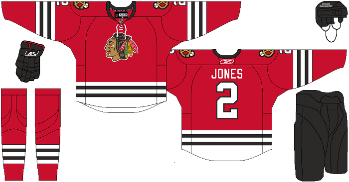
Away: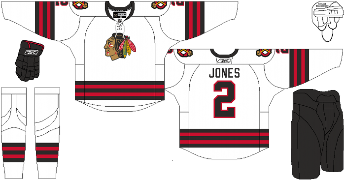
Alternate: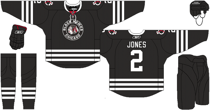
Kelly from BHDL: For the homes, I dig the tie-ups, but that’s across the board for me, I wish all NHL sweaters had that. Not sure if I like the triple stripe on the sleeves, maybe it just looks odd since it’s been otherwise for so long. Probably would grow on me. I do really like the simplified “tomahawk” shoulder patches. Nice choice there.
I actually really like the new away sweaters. Changing those would probably result in fire and brimstone raining down, but I like the addition of the red in there. I also dig the red in the shoulder patches here too.
The alts were really close to being perfect. Had you left out any red and kept it just black & white, it would have been perfect. I’ve hoped that they brought this style sweater back for some time now, and I know it’ll never happen, but I would want it totally black & white.
Andrew from BHDL: I love the look of the home jersey. The tie up and the extra stripe on the sleeve look really good in my mind. Its hard to improve such a classic sweater, and I’m sure they’ll never change it, but I would not be opposed to the Hawks switching to these.
I think I might like the road jersey better without the black in the striping. I like the addition of red and would like to see some red in the aways, but the black and red stripes just don’t sit well with me.
I’ve heard the Hawks are ditching the Winter Classic alternates. The black and white ones here give it the classic look from the logo and mixes it with a more modern black and white color scheme. I’d probably like it a lot more if the red wasn’t included. If it was just straight black and white, this is a jersey I’d buy.
Days of Y’Orr’s comments: Wow. I’m going to agree with Kelly and Andrew about the home jerseys. The tie-up collar is a fucking homerun. Laser show. Whatever baseball term you want to use to describe a piece of hockey paraphanilia. I think both the home and away are perfect.
Now onto what may be my favorite jersey displayed so far, Chicago’s alternate. Holy shit. I know both Andrew and Kelly don’t like the red, but I think the red is an important color in Chicago’s history. When you think of the Blackhawks, you don’t think of black, but those red home sweaters. With that said, having the red accents throughout the logo and shoulder patches work. I think it does just enough to not make the jersey look plain.
Cole was spot on with this franchise in my eyes, but what about yours? Love the extra stripes? How about the collars?
Add The Sports Daily to your Google News Feed!