![]() Welcome to the “Re-Imagining The NHL” project created by Cole Jones. Cole has been great enough to allow Days of Y’Orr to post his idea on different teams with his spin on them. You can follow Cole on Twitter. Please feel free to comment on the team below. Feel free to read the official announcement of the project here.
Welcome to the “Re-Imagining The NHL” project created by Cole Jones. Cole has been great enough to allow Days of Y’Orr to post his idea on different teams with his spin on them. You can follow Cole on Twitter. Please feel free to comment on the team below. Feel free to read the official announcement of the project here.
So we’ve looked at a few teams now so if you haven’t checked them out, go do so. The Atlanta Thrashers, Florida Panthers, Phoenix Coyotes, New York Islanders, Minnesota Wild and Buffalo Sabres have all been displayed to the world. Let’s head out to the Pepsi Center and showcase the Colorado Avalanche, a team who has had a pretty good grasp on their identity since moving from Quebec. As usual, let’s start with Cole’s thought process through it all.
Cole’s description: Well, last time I posted a team, they relocated to Winnipeg. So lets see if this makes the Avs go back to Quebec…
My main goal here was to ditch the nondescript Reebok template that they currently wear, giving them something that could be considering proprietary and their own. Another thing I hoped to do was remove black from their color scheme. While it’s always been there, and isn’t really all that offensive, I found it to be completely unnecessary in their identity. Maroon is their color that I feel they own in pro hockey, so I wanted them to keep that as the focus and find a way to keep only one of blue and black. I felt the blue added more to the look than the black, but since the blue was so light, it looked awful without the black gloves/pants/helmet to anchor the look, while showcasing the maroon. The simple solution was to kill the black and make the blue darker. I really like how it turned out.
After the jump, the Colorado Avalanche…
Home: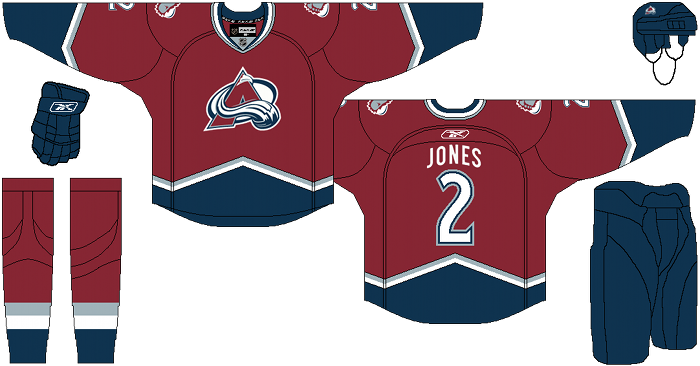
Away: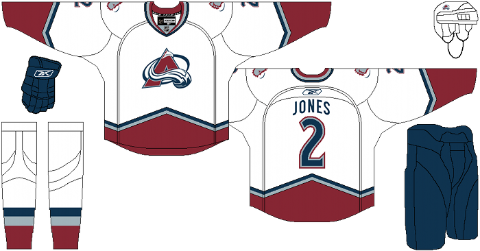
Alternate: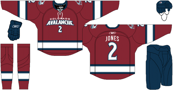
Days of Y’Orr’s comments: Colorado’s current home and away uniforms aren’t bad but these uniforms bring it back to the old school when Joe Sakic and Peter Forsberg were winning Stanley Cups. I do like the addition of the darker blue and the lack of shoulder yokes. The home and away are simple yet effective and really bring out who the Avalance are.
The current alternate is an abomination. Where do I begin? The light blue as a main color is an awful idea. Black under the armpits is an awful idea and the Colorado wordmark is uninspired and bland. Cole’s alternate uniform is a much better fit with the Avs than the current one. The maroon works and the blue and white striping seem to fit. Also, the Colorado wordmark is a lot better than the diagonal wordmark they’re currently using. Overall, I’m a fan though the white striping is a little off-puting. I may switch the larger white stripe for the navy blue one.
Overall I like it a lot more than what they’re wearing now.
Jibblescribbets comments: Love the sweater concepts. It should be known that Avs fans, almost universally save for the one’s with really bad taste, hate the Reebok Edge sweaters we are currently wearing. We call them uniprons because well the current sweaters are the bastard love children of a uniform and an apron. So your bar for being better than what we currently have was pretty low.
That said, you went back to a classic look, which is giving Avs fans what they want. We all loved the zig-zag bottom border, as it signified Mountains. The rest of the sweaters are crisp and clean for the most part and I like them. I love how simple the sweater is, and in this case: less is more. No shoulder stripes, no trying to hard. We’ll get to the main problem with the pants in a second, but I always wondered how the avs would look with some sort of piping.
That said: What’s the fascination with taking the black out of the color scheme. I don’t like it, and I doubt many Avs fans will either. As someone who has spent many hours on the NHL series trying to take black out of the Avs color schemes: It just doesn’t work. With blue pants and a blue helmet you’ve made the Avs kinda look like cheap Montréal Canadiens knockoffs. Coming from a Bruins fan the summer after winning the Stanley Cup, it makes me wonder if you may have the hockey equivalent of daddy issues (I kid, I kid).
The Alternative Sweater pretty solid. I’m not sure I like the entire team name on the front, but I don’t hate it. I wouldn’t like the Alternate foot logo there (love that logo as a secondary, but as a primary it screams minor league). I liked the Avs current blues at first, but the more I see them the more I dislike them. The Avs just feel right in burgundy.
Overall, a net positive, but it would be a lot better with Black re-incorporated in the helmets, numbers and pants.
Add The Sports Daily to your Google News Feed!