 Welcome to the “Re-Imagining The NHL” project created by Cole Jones. Cole has been great enough to allow Days of Y’Orr to post his idea on different teams with his spin on them. You can follow Cole on Twitter. Please feel free to comment on the team below. Feel free to read the official announcement of the project here.
If you haven’t had the chance to look at the first two teams posted head over to the Atlanta Thrashers and the Phoenix Coyotes. Introducing the Florida Panthers.
Cole’s description: Here’s my take on the Florida Panthers… since this series is meant to put NHL teams in the uniforms that I think they should be wearing, not everything is going to stand out for its uniqueness. some teams either currently have it right, or had it right before the screwed it all up. the florida panthers fall in the latter category.
i think the florida panthers (similar to the houston texans) hit it out of the park with their inaugural season’s uniform set. the florida panthers used to wear uniforms that i’d classify as “modern classics,” before resorting to connect-the-dots Reebok templating and then falling into the 2-tone blue trend that everyone seems to be jumping on.
with that in mind, one of the most stunning hockey jerseys i’ve ever seen in person was the florida panthers white jersey from the mid 90’s. photos and graphical representations don’t do it justice. what stands out about the uniform is the metallic gold used in the panther’s fur on the crest. it didn’t even remotely clash with the sunflower yellow that’s used on the rest of the uniform like you’d expect… that said, the stunning part was how the gold complemented the navy and red. i took that idea and ran with it, while drawing inspiration from the original striping pattern that guys like brian skrudland, scott mellanby, and stu barnes wore.
i returned to red at home, white on the road, and navy as an alternate, and i killed the “breaking-stick” logo, becaue i find it ruins one of the most underrated logos in sports. i went with new shades of red, blue, and metallic gold that the panthers do not currently use. (click the images for higher resolution)
After the jump, the Florida Panthers…
Home: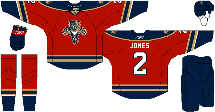
Away: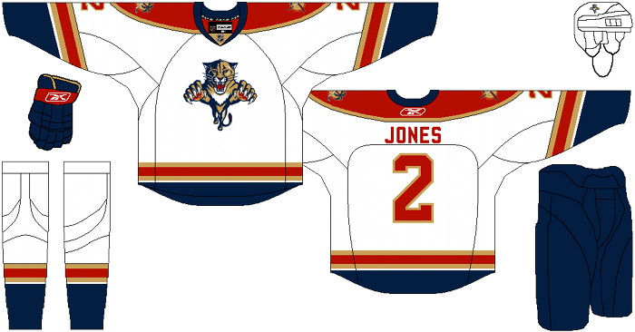
Alternate: 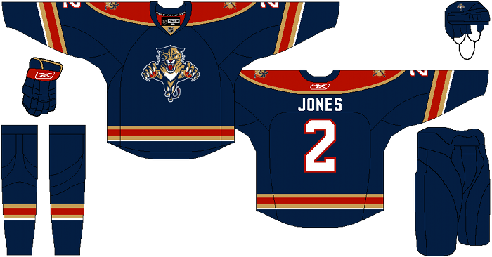
Days of Y’Orr comment: It’s funny that Florida released their new home jersey after Cole designed these one. There’s a lot of similarities between the jersey released by the team and the one Cole designed. With that said, I like Cole’s a little bit better. The biggest reason I don’t like Florida’s released home jersey? The piping down the arm reminds me to much of the Bruins pre-Edge jerseys. I’m also a big fan of the gold on the jerseys and not the yellow that Florida has used. Overall with the home and away uniforms, it’s a nice little upgrade but nothing huge. The third jersey is really where it’s at. Florida’s current alternate is a blue abortion that should have never made it out of the art room. Baby blue (or Carolina blue) should have never been included in a Florida Panthers mock-up, especially given the influx of blue alternates (hello, Columbus) that’s starting to be released. Cole’s mock-up is perfect. It fits with the flow of the other designs and the navy blue really stands out well. Even the current alternate’s logo is an eye sore. I’m getting really sick of seeing circular logos with the logo in the middle and then a word mark going around it being used. Columbus uses it, Pittsburgh uses it, Chicago uses it, and it’s a god damn eyesore. Stop with being so un-fucking-original. Whoa, sorry about that tangent.
Overall, I’m a big fan. I think this would be small upgrade over Florida’s primary set and a major upgrade over it’s alternate.
So what do you think? Yay? Nay? What would you change if you could?
Add The Sports Daily to your Google News Feed!