 Welcome to the “Re-Imagining The NHL” project created by Cole Jones. Cole has been great enough to allow Days of Y’Orr to post his idea on different teams with his spin on them. You can follow Cole on Twitter. Please feel free to comment on the team below. Feel free to read the official announcement of the project here. Since neither Cole or Days of Y’Orr consider this team our “home team”, we will do our best to bring in a fan of the team described to get their thoughts. Today we were lucky enough to get input from Jenna Volden, creater of the Coyotes blog Hip Checks
Welcome back. Our first official entry of the project was the now defunct Atlanta Thrashers so if you haven’t had a chance to look at them, do that. Comment on the work there, we’d love to hear from you. After Atlanta, I figured it was only proper to post the other team discussed with moving to Winnipeg, the Phoenix Coyotes.
Cole’s description: I present the Phoenix Coyotes:
I wanted to accomplish a few things with this team. First of all, I wanted a return to an aesthetic that was very desert-like and Arizonan. Take the current Phoenix Coyotes identity and plop them down in any city in the world, and they’d fit right in (which might come in handy next season). That used to not be the case. The original Coyotes sweaters had their flaws (waaaaay too many colors just to name one), but they were unmistakably a southwestern hockey franchise. I wanted to return to that.
With that in mind, I updated their original logo to fit with my concept. I kept the modern colors (slightly darker sand) and tried to fit in some Navajo style artwork to complement the old logo without over-designing the jersey to pieces. I drew inspiration from the Coyotes current alternate jersey for the brick helmet/black jersey/brick pants look, because it’s pretty slick, unconventional, and would make them a team that wouldn’t ever get confused for any of the other black or red teams.
Without further ado, here’s what I came up with. The template for the alternate is based on the soon-to-be-defunct Thrasher alternate. It looks awful on Atlanta, but it’s a very interesting cut that allowed me to do a few things I liked. (Click the uniforms for higher resolution pics)
After the jump, a look at Phoenix’s uniforms…
Home: 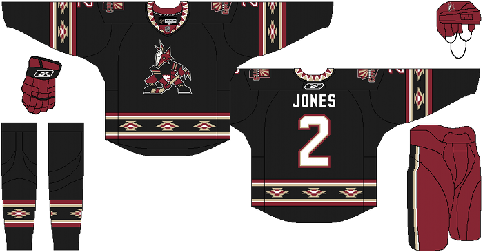
Away: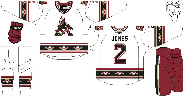
Alternate: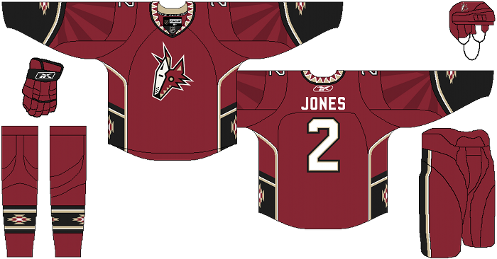
Jenna Volden’s comments: When I first read Cole’s description, I was skeptical. I was never a fan of the old jerseys and didn’t think using them as inspiration was a good idea. The current alternate does happen to be my favorite (I hated it at first) and when I opened the home link, I was quite impressed. I actually think the old logo looks very sharp on the black jersey. I also really like the trim on the jersey. I don’t really like the trim on the socks but I bet if I saw it all together on a player, it would click.
I know the road jersey is the same as the home, just in white but I don’t think it works as well. I think the trim is too stark of contrast on the white jersey.
I do enjoy the third. I like the red with the coyotes head and the black details. The trim is incorporated but doesn’t overwhelm the jersey. I also like the tone-on-tone sunburst on the red part of the sleeves. It’s unique but again, not overwhelming. This might be my favorite of the three. It’s hard to pick between the black home and the red alternative.
Days of Y’Orr comment: Uh, wow. I hope someone in the Coyotes organization stumbles across our little blog because these uniforms are amazing. Cole did a great job giving these uniforms a “desert” feel to them and they’re unique enough that I believe they would sell well. The current uniforms that Phoenix wears are plain and uninspired. You could slap any red logo on that and no one would know the difference. Their current alternate jersey does a better job of differientiating the Arizona feel, but not as much as Cole’s designs do. I think if the Coyotes were to ever go with this concept, they’d have a great set to use for decades. From the Navajo style used along the striping to the choice of logos, this is a great set.
Well, what do you think? Is this something you’d like to see the Coyotes use?
Add The Sports Daily to your Google News Feed!