 Welcome to the “Re-Imagining The NHL” project created by Cole Jones. Cole has been great enough to allow Days of Y’Orr to post his idea on different teams with his spin on them. You can follow Cole on Twitter. Please feel free to comment on the team below. Feel free to read the official announcement of the project here. Since neither Cole or Days of Y’Orr consider this team our “home team”, we will do our best to bring in a fan of the team described to get their thoughts. Today we were lucky enough to get input from Sarah Connors from Something’s Bruin (and is also a big Blues fan)
If you haven’t checked out our other teams, visit the Re-Imagining the NHL team page. The team page will be updated daily with every team we update. So before we take a look at the uniforms, lets take a look at Cole’s comments on the Blues.
Cole’s comments: I’ve used the term “modern classic” a few times so far, and I really feel like the pre-edge Blues fit that description perfectly. Before the switch to the Edge system, I ranked the Blues as the second best dressed team in hockey, behind the Blackhawks. There’s just something about the sleek and sharp shoulder stripes that works for the Blues, giving them a modern edge that pays plenty homage to their original sweaters. My original plan was to drop the navy blue and go with 1 shade of blue and yellow, but that just didn’t work for the template I was going for. Then I tried to re-incorporate red into the color scheme, since I loved the Early-Hull-era look. (They went overboard in the Gretzky/Pronger era.) The more I worked, the more I realized that the Blues already designed the perfect Blues sweaters. They just weren’t using them anymore.
I simplified the outlines on the logo and added a bit more royal blue to the white jersey than the original had… but overall, all I really did was convert the pre-edge sweaters into the new cut. As far the third jersey goes, I think the Blues current third is one of the best in the league. It just reeks of classic simplicity. That said, I felt like I could improve on it, while keeping the same general aesthetic. I feel like I did that.
After the jump, the St. Louis Blues in action…
Home: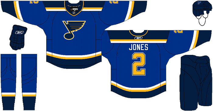
Away: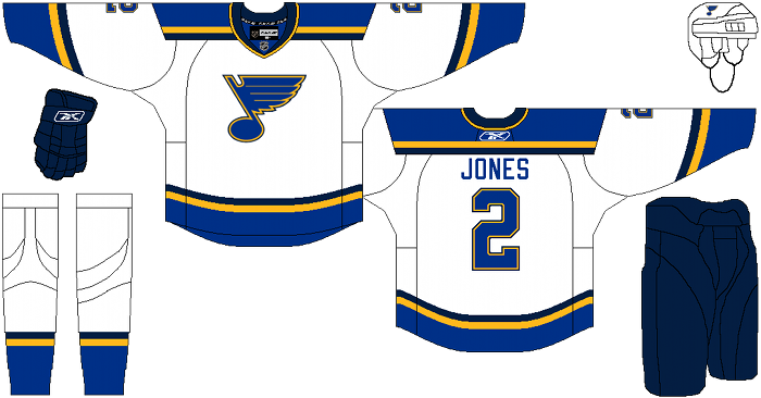
Alternate: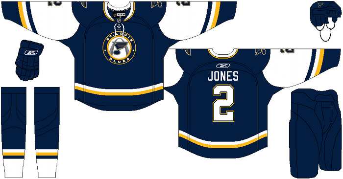
Sarah Connors’ comments: I like what you’ve done with the primary home and away jerseys; the third jersey tweaks, though, I’m really iffy on. The simplicity of the home/away uniform designs is nice; I like the re-introduction of the stripes to the bottom of the jersey and the lack of that weird gold piping (I actually just bought a home jersey last week, and it’s my first non-Bruins jersey, and the piping kinda weirds me out.)
It looks like you’ve removed the white from the logo entirely which works for me aesthetically. The road uniform looks quite sharp – again, good job on the simplicity. It works because I think the strength of those primary stripes is enough that the uniforms don’t need to be any more busy; the fact that the stripes along the yoke and along the hem are the same weight also helps with this. As a fan I’m also happy that you stuck with the same color palette. That bright, pure-primary blue looks great on the ice; no other team uses quite that color of true-blue. Even the Rangers’ blue is more of a lighter shade, and accented with the navy blue, gold, and white, the Blues’ unis just look crisp.
The third jersey is really the only misfire in the set, in my opinion. The white on the sleeves is overwhelming and gives the navy blue a “sleeveless” jersey look, which is a little tacky. Again, I think part of this is that there’s really no need to re-imagine the current third, since (not that I’m biased) but they’re one of the classiest-looking third jerseys in the league – the sleek, solid-navy look with white cuffs, downplayed striping and the drawstringed collar just looks amazing. The gold as piping works here as just an accent to the white stripes and the outline in the logo; in the reimagined version, the gold is a little too similar to how it’s used in the primary jerseys, which isn’t really the point of an alternate jersey.
Days of Y’Orr’s comments: I love the home and road sweaters. This is what St. Louis should be wearing and if they stray from this at all, it’s a shame. I even like that Cole chose not to use a tie-collar and I think tie-collars are the shit. Honestly, there’s nothing wrong with the home and away sweaters. They’re as close to perfect as you can get.
Now the alternate. First off, it’s better than the scrapped third the Blues were planning on using during the 1996 season. Horns? A mascot named Cool Cat? Yikes. Their current alternates? Beautiful. Even if it does have a shitty circular logo. Cole’s alternate isn’t up to snuff when compared to the one being used right now. For me, the white is distracting. It seems a little out of place on the jersey and a solid design would benefit it more.
Other than that, this set gets good marks from me. Stylish, clean and crisp. Can’t go wrong. What do you think?
Add The Sports Daily to your Google News Feed!