 Welcome to the “Re-Imagining The NHL” project created by Cole Jones. Cole has been great enough to allow Days of Y’Orr to post his idea on different teams with his spin on them. You can follow Cole on Twitter. Please feel free to comment on the team below. Feel free to read the official announcement of the project here. Since neither Cole or Days of Y’Orr consider this team our “home team”, we will do our best to bring in a fan of the team described to get their thoughts. Today we were lucky enough to get Dani Toth from Lightning Hockey Blog.
If you haven’t checked out our other teams, visit the Re-Imagining the NHL team page. The team page will be updated daily with every team we update. So before we take a look at the uniforms, lets take a look at Cole’s comments on the Tampa Bay Lightning.
Cole’s comments: With this concept, I hoped to retain the heritage and history of the Tampa Bay Lightning, while still giving them a more striking and exciting look. I like that the new Lightning uniforms focus on blue as the primary color, but that’s just about the only thing they get right with the new set. Before anyone gets on me for trying to preserve the “heritage and history” of the Lightning, or says that a 1990’s southern expansion team HAS no history, let me point out that the Bolts are almost 20 years old now… with a Stanley Cup. That’s almost as long as the North Stars spent in Minnesota (26 years), the Nordiques spent in Quebec (23 years), or the Jets spent in Winnipeg (24 years)… with more hardware to show for it… and everyone seems to want to honor and celebrate their history and heritage. Say what you will about Tampa hockey, it’s future viability, or if you think they should have ever had a team to begin with, but that’s beside the point. They’ve been doing things a certain way for 20 years, and I don’t think they have to throw the baby out with the bathwater if they want to re-design with a focus on blue. That means I retained the victory stripes, kept the bolt on the pants, and made an alternate jersey that is a nod to their past without being a straight Cup-Era throwback. I brought back the electric blue from their inaugural season as well, to help spice up their palette.
Normally, what drives me insane and keeps me from finishing my concepts is my A.D.D. about striping consistency… that’s part of why I love this concept so much. Factoring in the pants and skates as black design elements, the striping pattern on each of these jerseys stays the same throughout the design, without cluttering together 4 colored stripes around the waist.
After the jump, it’s the Toronto Maple Bolts…err, Tampa Bay Lightning…
Home: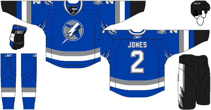
Away: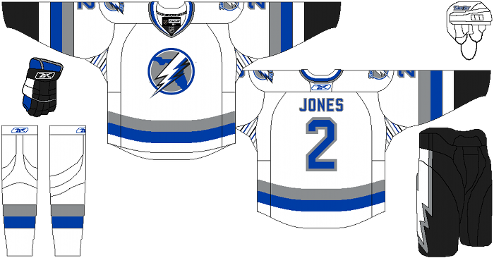
Alternate: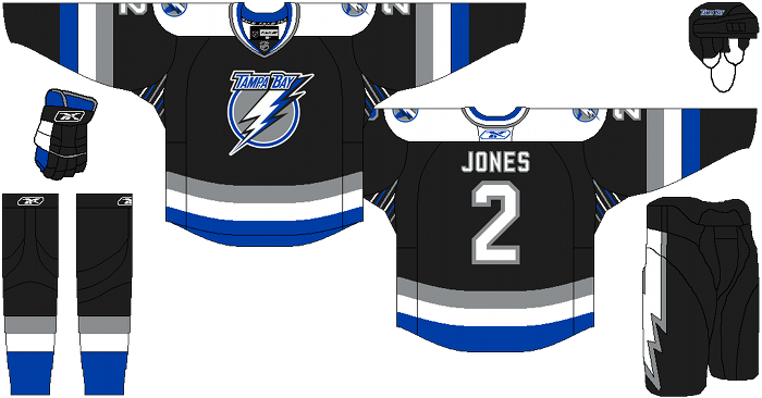
Dani’s comments: In comparison to what the new Lightning logo looks for September, I liked how Cole kept the black pants and how he played with what the Lightning had this year in comparison to re-designing a whole new logo. Maybe the new logo of the Lightning will just take some time in getting used to, but I know that not everyone loved it when it was unveiled.
Cole’s concept of the home and away logo looks like it needs some tinkering, something with the way the state of Florida image looks and the size of the lightning bolt just seems a little off. And I don’t really know what is going on the underarm portion, but as a whole the home/away jersey works for me.
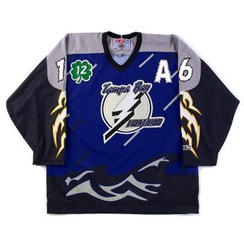
The third jersey is similar to the jersey that I own from a few years ago but with some serious improvements. I love the way the ‘Tampa Bay’ lettering is made more sleek, the addition of the electric blue and the detailing in the collar and striping pattern. Again I’m not loving what is going on with the underarms, but I do love this third jersey.
Days of Y’Orr’s comments: Before I comment on these, I would like to state that I fucking hate the Lightning’s new uniforms for the 2011-2012 season. For a team that has been “unique” with their uniforms, these new ones are about as bland as a plate of lettuce. Not only is the logo boring as fuck but the color scheme and the design is horrible. What a miss by Tampa. A huge fucking miss.
With that said, is it shocking that I love these? The BOLTS alternate jersey is one of my favorites in the league. Quick note: In NHL 11, I use the Lightning in Be A GM and make it my primary home. In saying that, the love the idea of using electric blue has the home jersey. It works with this franchise, unlike the blue they’re currently using for their new home sweaters.
Having Florida behind the lightning bolt works as well. In reading Cole’s description, I thought the state would take away or distract the eye but it doesn’t. It looks like it belongs in the logo, which is a plus. The use Florida in the logo for the home and away and the use of the logo without the state in it for the alternate is a good move as well.
I like the black being used as an alternate. It works with the color scheme and the nod to winning the Cup in 2004 is a nice touch.
So what do I hate about these uniforms? Victory stripes. Why do teams feel like it is okay to have something different under the pits of their jerseys? Buffalo has that weird gray patch in their thirds that make it look like their players forgot to put on deodorant. I just don’t get it. I hate them in real life and I hate them here. It’s really the only negative thing I have to say about these bad larrys.
Thoughts out there?
Add The Sports Daily to your Google News Feed!