![]() Welcome to the “Re-Imagining The NHL” project created by Cole Jones. Cole has been great enough to allow Days of Y’Orr to post his idea on different teams with his spin on them. You can follow Cole on Twitter. Please feel free to comment on the team below. Feel free to read the official announcement of the project here. Since neither Cole or Days of Y’Orr consider this team our “home team”, we will do our best to bring in a fan of the team described to get their thoughts. Today we were lucky enough to get input from Dani Toth, founder of Benched Whale.
Welcome to the “Re-Imagining The NHL” project created by Cole Jones. Cole has been great enough to allow Days of Y’Orr to post his idea on different teams with his spin on them. You can follow Cole on Twitter. Please feel free to comment on the team below. Feel free to read the official announcement of the project here. Since neither Cole or Days of Y’Orr consider this team our “home team”, we will do our best to bring in a fan of the team described to get their thoughts. Today we were lucky enough to get input from Dani Toth, founder of Benched Whale.
If you haven’t checked out our other teams, visit the Re-Imagining the NHL team page. The team page will be updated daily with every team we update. So before we take a look at the uniforms, lets take a look at Cole’s comments on the best team to not win the Stanley Cup in 2010-2011. (Burn).
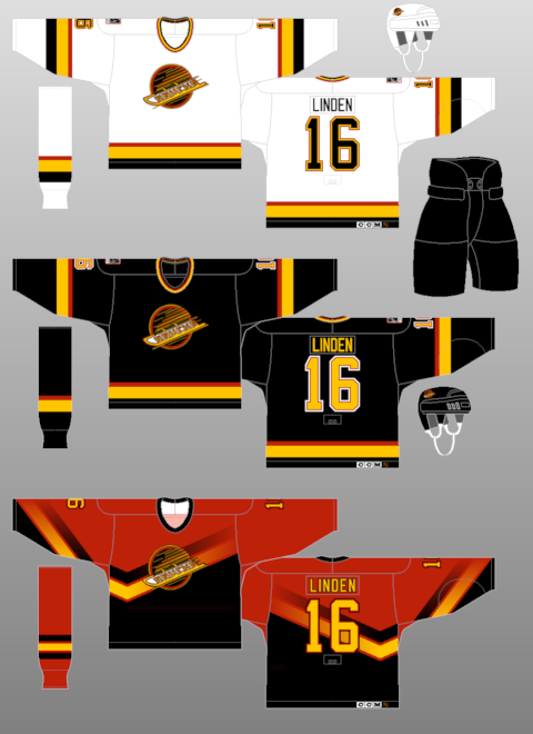
Cole’s comments: Here’s one that only required minor tweaking…the Vancouver Canucks.
Things I like about the real Canucks uniforms:
The colors are very unique and distinctive.
The striping is bold and traditional, but still varies slightly from what i used on calgary, thanks to the bottom blue stripes engulfing the waist/sleeves.
The hardly-used johnny canuck logo is simply fantastic.
Things I HATE about the real Canucks uniforms:
None of their logos have anything to do with the team name. an orca isn’t a canuck, and the arched wordmark on top of the orca makes an ugly logo into an ugly CRAMPED logo.
They hardly use the johnny canuck, and when they do, they cut his head off?!
The striping on the home and road doesn’t match nearly as much as it could (and does in my concept).
Their alternate and throwback uniforms are both 20x better than their home and roads.
I tried to address each of these concerns. nothing earth shattering.
Random fact: the striping on the alternate was ALMOST plaid, but it just looked waaaay too celtic and not northwesterny at all, as I’d hoped.
After the jump, the Vancouver Canucks…
Home: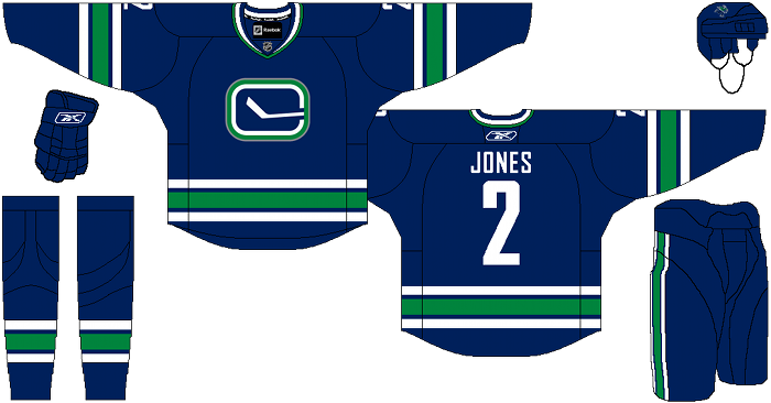
Away: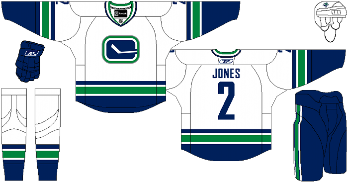
Alternate: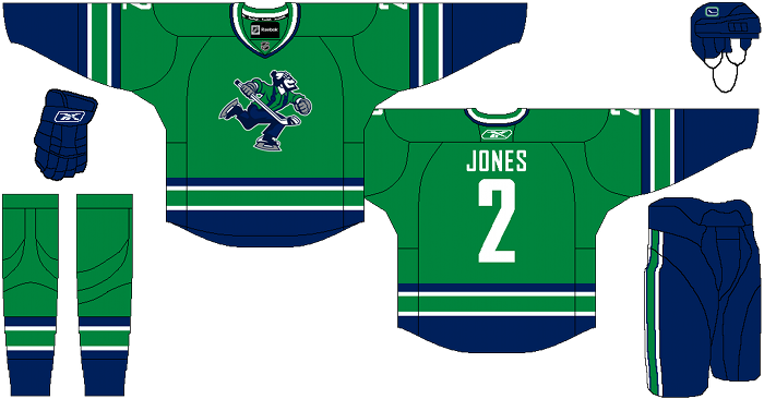
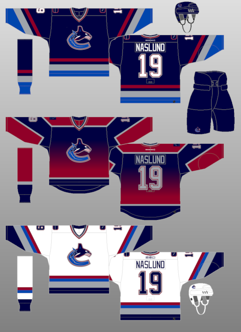
Dani’s comments: There is not much I would change about the current Canucks’ jersey right now. We have gone through so many different logo’s and colour schemes over our 40 year existence that right now, no change in jerseys would be the best thing for the brand.
As for the re-design, I liked what Cole’s idea to have the stick in the rink as the home and away jersey’s, though it is pretty much the same as the Canucks’ current 3rd jersey minus the shoulder patches. I would have personally kept the Johnny Canuck shoulder patches on there. I know a lot of fans have wanted the team to switch the the stick in the rink logo for the home/away jerseys permanently, but they do truthfully use it often enough already (with their throwback jersey this year) that I don’t really care if they make this the home/away jersey or just keep it as a third.
As for the Orca conundrum…the background story is that the previous owners were called Orca Bay and thus we have the orca logo used to form the C and the VANCOUVER across the top was a new addition to the jersey when they last re-designed the jersey the season before the Olympics. The management and current owners, the Aquilini’s, opted to keep using the orca C logo and it has become a part of the Canucks’ identity and looks to have ties with aboriginal orca motifs.
As for the VANCOUVER written on the jerseys, well there was outcry when it was first done. I myself, love it. But from a marketing standpoint, I theorize that it was a move to capitalize on the marketing of Vancouver and hockey during the 2010 Olympics year. Whether its there or not doesn’t really make a difference to the jersey, but like I said, I like it there.
As you said earlier, an orca isn’t a Canuck, but then what is a Canuck? A Canuck is a Canadian but a Canuck doesn’t necessarily equal Johnny Canuck.
Thus, the Johnny Canuck third isn’t working for me. Aesthetically, it doesn’t jump out at me and say, ‘hey! I want that jersey’. Not the logo, or the green fill colour. And neither do I identify Canuck with the political cartoon of Johnny Canuck. I don’t identify with a logger and don’t imagine most of the fans identify with a logger either. It works for me on the patches of the sweater, but to make this the third? May have to rethink this 3rd jersey concept.
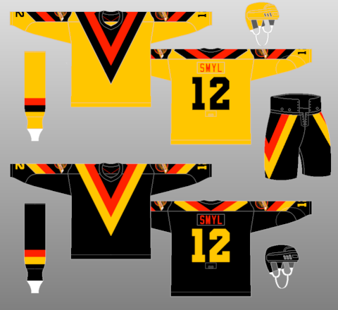
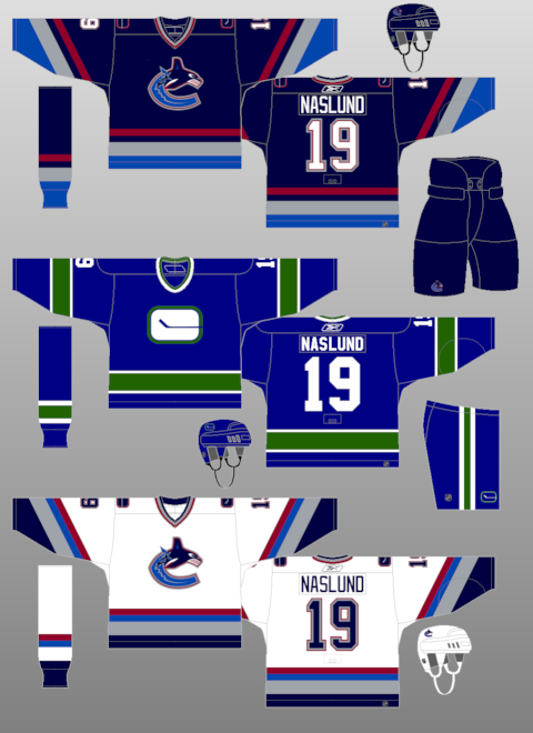
Days of Y’Orr’s comments: I’ll try not to make any biting jokes so here we go. I love the idea of keeping the color scheme the same. Anyone who has seriously watched hockey for a long amount of time (looking at you dirty, wave-doing Pink Stink Bruins’ fans) know that the Canucks have changed jerseys like I change my underwear (wait didn’t I make this joke already in this project), which may or may not be a long time. For a team that has been around since 1970, having six uniform sets and most of them being different colors is a problem. In 1970 the uniforms looked more like Cole’s design. Then the Canucks dabbled with the dreaded V jerseys. In 1985 they scrapped the V idea but kept the black and yellow (while adding a disgusting red alternate). After the black and yellow abortion, Vancouver went to the Orca logo and a blue home primary with a fucked up rainbow third. God, I hate that jersey so much. In fact, Vancouver fucked up so much that they used TWO different colored jerseys in one season. WHAT? It would be like New Jersey wearing a red home and then a purple alternate. It makes no fucking sense.
Anyway, I apologize for that mini rant on the fuckness of Vancouver. Cole’s home and away jerseys are pretty mint. Vancouver gets rid of the hideous Orca whale and brings back the classic stick logo. I love the stick logo and I’m not really sure as to why. It’s simple and although it doesn’t really say “Vancouver Canucks”, you know what team it’s representing.
The lack of shoulder logos on all three Canucks jerseys is also a plus in my book. Sometimes jerseys on need shoulder logos, plain and simple. If you’re going for a simplistic feel, the lack of shoulder logos is definitely a helper.
And now to the alternate…I’m indifferent, really. I don’t like the Johnny Canuck logo, but if it were the Johnny Canuck head in the V, I think it may work better. I don’t hold a grudge against Johnny Canuck like it seems Dani may (because lets be honest, it is stereotypical) but it just doesn’t do it for me. Also, plaid striping would be fucking mint.
Overall I love the home and away but the alternate could be better.
What say you folks?
Add The Sports Daily to your Google News Feed!