![]() Welcome to the “Re-Imagining The NHL” project created by Cole Jones. Cole has been great enough to allow Days of Y’Orr to post his idea on different teams with his spin on them. You can follow Cole on Twitter. Please feel free to comment on the team below. Feel free to read the official announcement of the project here.
Welcome to the “Re-Imagining The NHL” project created by Cole Jones. Cole has been great enough to allow Days of Y’Orr to post his idea on different teams with his spin on them. You can follow Cole on Twitter. Please feel free to comment on the team below. Feel free to read the official announcement of the project here.
Finally, the team you’ve all been asking for. Ever since the project started, I got a lot of requests for the Bruins. Well, here they are! If you haven’t checked out our other teams, visit the Re-Imagining the NHL team page. The team page will be updated daily with every team we update. So before we take a look at the uniforms, lets take a look at Cole’s comments on the Jets.
Cole’s comments: What I didn’t like about the real ones, I tried to fix with my version. I’m one of the few that thinks the new Jets logo is simple yet good. It’s not amazing, but I like it, so I kept it. What I don’t like about the Jets jerseys, however, is the lack of red. The Winnipeg Jets of my childhood wore blue, red, and white. The Jets and the Capitals will always be linked in my mind as the 2 red, white, and blue teams at the end of the alphabet when choosing my team on Sega Genesis. Just like the Capitals, who wore a very nice color scheme of blue, copper, and black for a few years, but look best in red white and blue, the Jets chose a very nice 2-tone blue… but they’d look better in blue, red, and white. Just my take on it…
I also kept the red pants, since I think the Jets in anything else just wouldn’t look right (plus, my making the Blue Jackets into the 2-tone blue team freed up red pants for another non-rangers RWB team  ).
).
As far the secondary logo goes, I cut most of it out and just went with the wings and a maple leaf, which I think is simple and dignified enough to stand on it’s own.
The alternate is a design of my own that was inspired by the original WHA Jets uniforms, with a few liberties taken. I love the new Jets wordmark for some reason, so I wanted to feature it on the alternate. Rather than going with the standard 3-stripes from the originals, I decided two bolder stripes would give it more unique and striking pattern they could call their own.
After the jump, the Winnipeg Jets…
Home: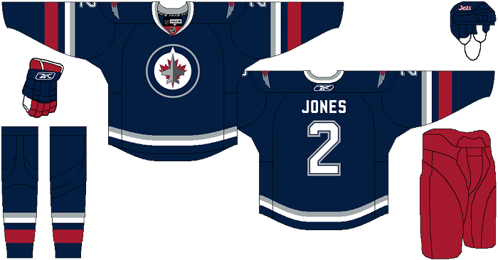
Away: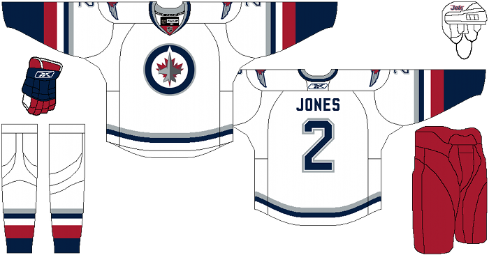
Alternate: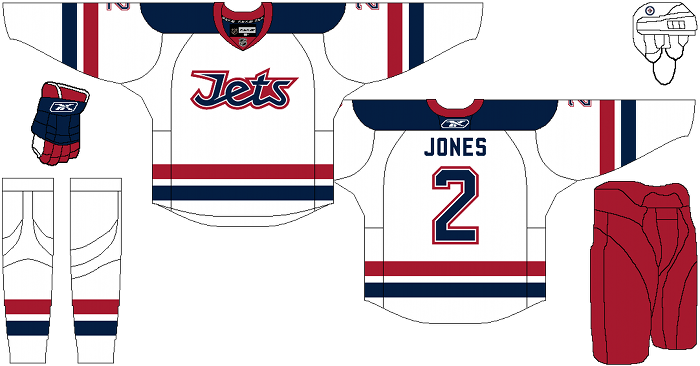
Days of Y’Orr’s comments: Yesterday the Winnipeg Jets unveiled the most generic, bland and uninspired jerseys I’ve ever seen a hockey team unveil.
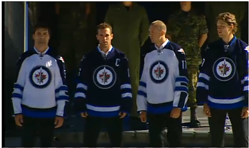
What the fuck. Lets start with the home jersey. Outside of the baby blue stripe at the bottom of the jersey, it doesn’t look to bad. In fact, it’s just…normal. Just a typical hockey jersey. Nothing outstanding, but nothing really wrong with it. The away jersey is where the shit really hits the fan. First, what’s up with the blue stripe going from arm to collar? It makes no fucking sense. Why is that there? Also, is the stripe is there then why have the two blue stripes going around the elbow/forearm? WHAT’S THE POINT? PICK ONE AND BE WITH IT!
A better idea would be eliminate the blue stripe going down the white jersey and keep the blue stripes around the elbow. That would make sense. THAT WOULD MESH WITH THE HOME JERSEY, BUT WHY WOULD WINNIPEG DO SOMETHING SO FUCKING SIMPLE WHEN THEY’RE TO BUSY WALKING OUT OF JETS TO SHITTY, GENERIC ROCK MUSIC?!?!
Cole’s designs are much better than what Winnipeg could produce. I’m starting to see a trend here with the project. Maybe these NHL teams need to pay this man to design their uniforms. The home and road are simple, which is much different than being generic. I like the use of the red stripe because it’s in their color scheme (and apparently missing in the actual jerseys) and the red pants are an awesome touch. The use of the grey works well too without being to prominent.
The third jersey is okay. The wordmark doesn’t do anything for me. I like that it was given a blue shoulder yolk (and stops at the shoulder, not the entire fucking arm), The alternate was how I thought the home and away would look, instead of the mess Winnipeg showed yesterday.
Love it? Hate it?
Add The Sports Daily to your Google News Feed!