They skated into the world — or, more specifically, the World Hockey Association — as the Alberta Oilers.
The province is annually responsible for roughly 75 percent of Canada’s oil production — and Canada is the No. 1 supplier of crude to the U.S. — so the name fit. However, it didn’t fit the original plan.
 The WHA figured the hockey team would be the Edmonton Oilers, but when some shuffling before the inaugural 1972-73 season moved Alberta’s other would-be team, the Calgary Broncos, to Ohio as the Cleveland Crusaders, the Oilers took on the mantle of their province, rather than their home city. It wasn’t until the next season that the Edmonton Oilers officially suited up.
Now, 45 years after the WHA debuted, the Oilers stand as the only franchise among four WHA teams absorbed by the National Hockey League in 1979 to remain in its original city. Add their five Stanley Cups in seven seasons (1984-90), plus the fact that they had the greatest player ever, Wayne Gretzky, for his greatest seasons, and there is a certain regal history to the club.
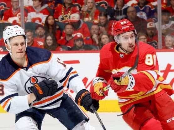
A regal history captured perfectly by the team’s new orange jerseys.
Adopting an Alternative Look
OK, so they aren’t exactly new. Now that adidas is the official supplier of NHL jerseys, the company executed a soft opening in June, debuting team sweaters across the league that were, in the main, tweaked versions of previous iterations. In the Oilers’ case, adidas upgraded what had been Edmonton’s alternate jersey, which — speaking of regal history — debuted at the 2015 NHL draft on then prospect and current 20-year-old, $100 million signing league MVP Connor McDavid.
The praise hasn’t been universal, but hockey writer Matt Duscharme ranked the Oilers’ look third among the 31 new adidas jerseys. It’s at least that good.
Let’s face it, it’s hard to do orange jerseys well. Other than the Philadelphia Flyers, name one. Early Tampa Bay Bucs? Hardly. The Houston Astros? A parfait nightmare. The new Oilers sweater nails it with a simplicity that has been the club’s hallmark since its inception.
Oilers Jerseys Through the Years
Out of the Association …
 The Oilers have had the same logo since their WHA days. The orange drop of oil above a puddling royal blue script “Oilers” on a field of white set the color palette from 1979 to 1995. There were minor tweaks to the number font along the way, but this look is essentially the Yankees pinstripes of the pro sports expansion franchise set. The contrasting shoulder yoke, matching the upper and lower stripes on the sleeves and waist, is, if you’ll pardon the expression, badass.
Calling in the Navy…
 From 1996 through 2007, Edmonton went through a dark era. Literally. The royal blue jerseys were replaced by a deep navy — some call it “midnight” — shoulder yokes disappeared, orange stripes became copper edged with red. Call it a mildly dispirited break from the club’s glory days. A far more spirited break would follow.
Spawn of an Era …
 In 2001, the Oilers launched their first alternate jersey. It was designed by Todd McFarlane, who rose to prominence as an illustrator of Spider-Man before launching his own line of comics and the character Spawn. A minority owner of the Oilers, McFarlane, you’d guess after a night at Skywalker Ranch, designed a blue, white and silver sweater with a logo that looked like it might have been a failed prototype for a fidget spinner. But it was a thoughtful misfire, McFarlane’s website explaining the industrial-oil-drip-in-space logo by saying, “The new design’s key element — the oil drop — is taken from the original Oilers logo. The five rivets encircling the oil drop represent the five Stanley Cups the team has won since its 1979 National Hockey League debut. The 10 gear teeth (five each on both the inner and outer rings) represent each of the Oilers’ 10 team captains… “
Reebok Takes a Shot …
 CCM was replaced by Reebok as the NHL’s jersey supplier in 2007. While the dark blue, copper and red remained, the sleeve and waist stripes — with the logo, the last vestiges of Edmonton’s original look — disappeared. The sleeve stripes only half disappeared, traversing an incomplete portion of the circumference of the sleeve at the elbow. Piping from the collar to waist didn’t help a weak silhouette.
A Welcome Return …
 In 2008, the Oilers brought back their original orange-yoked, royal blue sweater as an alternate jersey. It proved wildly popular with fans across all generations. In 2011, the blue-yoked white road sweater came back as well.
And Now …
 There are minor differences between the adidas and Reebok orange jerseys. The blue yoke on the adidas shoulders is a bit darker, and the numbers have moved from within the yoke to the sleeves just below. The Reebok jersey’s wide blue sleeve and waist stripes have been halved, more orange finding its way between the blue and flanking white stripes. The collar is trimmed in white instead of orange. They nailed it. Somebody’s going to be selling a lot of these at a hockey store.
Author bio: AJ Lee is Marketing Specialist at Pro Stock Hockey, an online resource for pro stock hockey equipment. He was born and raised in the southwest suburbs of Chicago and has been a huge Blackhawks fan his entire life. Lee picked up his first hockey stick at age 3 and hasn’t put it down yet.
Add The Sports Daily to your Google News Feed!


