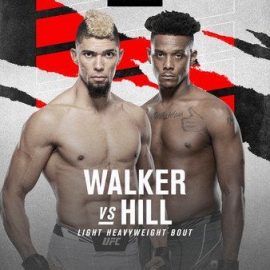
This week, Reebok and the UFC revealed their third take at jerseys. As a follow up to the more color heavy versions that they released as their first modification, Reebok this time added splashes of off colors (mostly white) to go on top of their primary colors. The new jerseys will make their debut this weekend on the UFC 215 card headlined by Demetrius Johnson’s potentially record breaking title defense.
THE PROBLEM
It’s no secret that the UFC and Reebok have taken a lot of flack for their jerseys. There’s a myriad of issues at play that make fighters, fans and analysts upset with the apparel line. The issue at the forefront of the critique is fighter pay. Many fighters have claimed to be making far less money off of the Reebok deal than they were with individual sponsors that they previously had. Those making their UFC debut make a scant $2,500 from Reebok. Although the number is much higher, champions like Daniel Cormier are making $40,000 – that still is not as high as they might be making under their own negotiations.
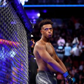
Another problem people have had with the jerseys is the lack of individuality. The original unveiling included only black and white shorts with some lettering of color depending on country. The walkout shirts also include a name in the color. Although the naming is awkwardly sideways down the jersey, which causes you to have to turn to read who the jersey is even for. On my plane ride a couple weeks ago, I had to do exactly this in order to identify the first Reebok jersey I had ever seen in public (surprise, it was a Conor jersey). Also, there is a small country insignia, but the jerseys include nothing about their hometowns, gyms or personality. As a result, many people were upset that we lost the trademark shorts; the Chuck Liddell icicles or the Tito Ortiz flames. Overall, they have been very bland. The second unveil included more color, but did little to remedy the personalization issue.
SOLUTION?
Luckily for the public, the UFC and Reebok seem to have heard that we are complaining. They knew it was time to crank out another version; something the public would like more, a chance to make things exciting. Of course, they may be doing this more to reverse the abysmal rate at which these are selling rather than because we are unhappy, but regardless, at least they knew they needed change. Reebok even admitted that they knew showing fighters’ personalities is a must and is something that they are striving for… and here’s what we got:

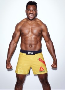
At first you might look at these and ask yourself “wait, how are these any different?” There are no new colors. There are no new logos or place for advertisements? The place for the name didn’t change?
You’re right. Apart from this small splash of color near the crotch or shoulder, there isn’t much that’s changed. The jerseys are still dull and they still don’t allow for any customization past using the country colors. So even though they supposedly recognized that they needed to make changes to show off personalities, there is seemingly no difference between two Polish fighters or two Americans. Therefore, on the first test, Reebok clearly failed. We still don’t have anything that gets fans connected to their fighters. So, after failing to appease the fans, clearly they must have made some other change that makes this big unveiling more exciting to fighters. Wrong again. There is no increased pay for the fighters or place for another ad.
MISSED CHANCES
While analysts keep poking jabs at the stuff that Reebok rolls out, some people have come to the defense. The typical response is that they are uniforms and they need to be similar. How could these be fixed? There are literally hundreds of answers that would sell more of these. Below are a couple that people have pitched to me over the course of this latest unveil.
Fight Camps – If Reebok allowed them to have a logo for their fight camp, they would be more personal. Plus, people from that gym would want to have one with their gym’s logo on it.
Color Scheme – There are a ton of ways to make this more personal, or at least more exciting to buy. You could let the fighters pick whatever color they want instead of the country. Chuck would have been able to have his baby blue even if he couldn’t have his icicles. You could also get them to wear the color of whatever stadium they are in. Fighting in the Staples Center? Have one corner wear purple and one wear gold. Then the locals would eat up their local gear.
Names – The names should be more prominently featured than the Reebok logo. Nobody wants to crane their neck or twist their leg to see who the jersey is for. Plus, if we let fighters have nicknames on there (similar to MLB’s player’s weekend) then you would have personalities on there.
Which idea do you like best. VOTE BELOW:
[polldaddy poll=9825399]Add The Sports Daily to your Google News Feed!