The Sabres are back and with a new hockey season comes new hope, new expectations and, most importantly, new goalie equipment.
Every goalie in the Sabres system has a new-ish look for the season and while this lineup certainly isn’t the most impressive collection of masks and gear the team has ever seen, there are still a few solid set ups throughout the pipeline.
None is better than Robin Lehner’s phenomenal Brian’s OPT1K set. Known for unparalleled customization, Brian’s and Lehner cooked up a terrific blend of stock and custom team-logo graphics. I’m not always a fan of the fully custom team logo sets Brian’s creates, but the Sabre on each piece of Lehner’s set is understated enough that you have to look hard to find it.
Chad Johnson is really the only other worthwhile set up to speak of. He is sporting a clean Ventus set that is a little less colorful than the Ventus gear Lehner wore last season. The Ventus graphics are attractive and work nicely with the Sabres colors.
Other than the two goalies with the big club, Buffalo’s other netminders all sport very basic blue and white sets which won’t clash with the Amerks uniforms but don’t stand out much either. Where there is plenty of variety is in the mask department.
Robin Lehner’s newest Daveart mask leaves a bit to be desired. He’s stuck with the In Flames icons but the mask lacks the proper blue to tie into the rest of his uniform – which his pads do flawlessly. Simply filling in some of the white areas on his old sketch pen Daveart mask would’ve made for an awesome mask, but this one misses the mark.
UPDATE: Lehner made a pair of changes to his set up after only a few games of the 2017-18 season. He switched back to the Vaughn Ventus pads he wore throughout last season after only a couple of games and eventually switched back to the white sketch pen mask, also done by Daveart, he originally debuted in 2015-16.

The switch back to Vaughn pads is a let down in the visual department – although the Ventus graphic works beautifully with Buffalo’s colorway – but seems to have helped Lehner play a better game overall.
I’m not a big fan of the all-white mask, I think it could stand to have gotten a few hits of color worked in to make the impressive hand-drawn art pop a bit more. But I do think it’s an improvement over the chrome mask he started the season with.
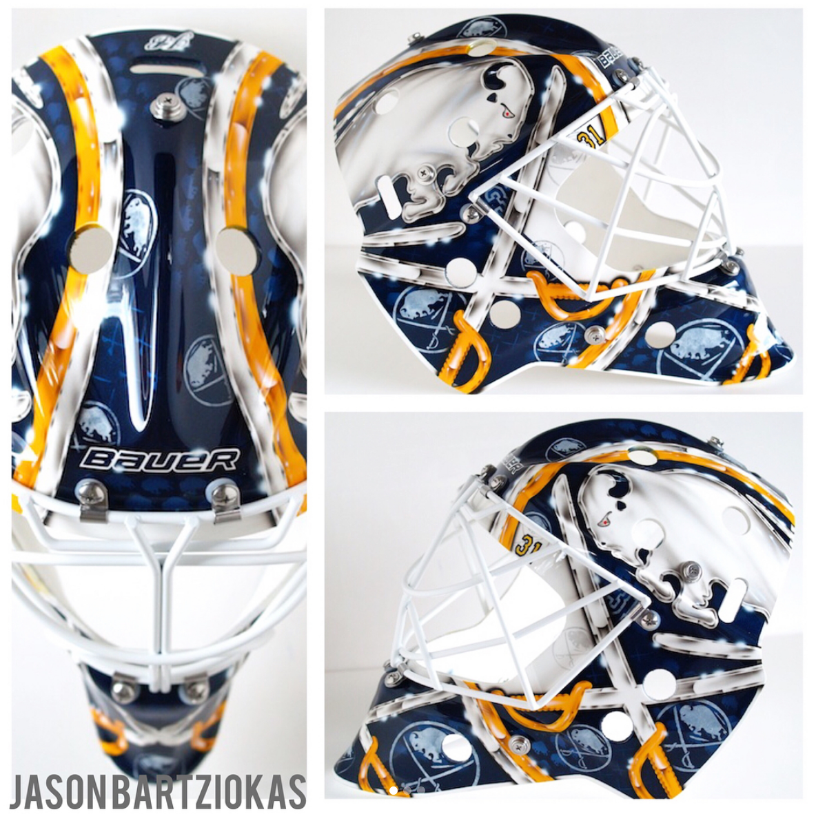
Ochocinco’s new Sabres mask is pretty similar to his old Sabres mask. Painted by Jason Bartziokas, it’s a simple design with some really great finishes. The chrome-look added to bits of the logo makes the mask pop and the classic white frame around the opening is an awesome touch. Of the group of masks for this season, this is the best of the bunch.
For now it appears that Linus Ullmark is sticking with a pair of masks he had commissioned last season. For call ups to the big club he opts for an understated mask that features a very classy tribute to Pelle Lindbergh and Stefan Liv. The mask has some similarities to Ben Bishop’s tron mask as the stars and charging buffalo are painted in a neon blue. It’s a very cool constellation-look that Dave Gunnarsson gave to the mask and it looks really good when worn with the Sabres uniforms.
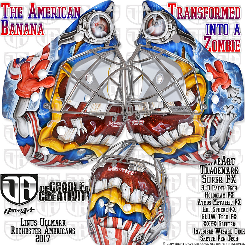
Ullmark switches things up when he’s down in Rochester. Most recently he’s been sporting a take on the Captain America Minion mask he had a couple of years back. The new version is crazier than the last one, with Gunnarsson giving it a zombie look compared to the last one. I’m a bigger fan of the original mask from 2016 as compared to last year’s. I’m interested to see if he winds up with a new look for the coming season.
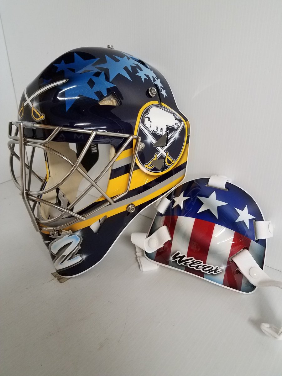
Ullmark’s partner in Rochester, Adam Wilcox, has gone in a different direction than he has with previous masks. Going back to his time with the University of Minnesota, Wilcox had a cool Iron Man theme to each of his masks. This season, his Miska Designs mask is a far more simple design but with some really cool features, including the American flag backplate and the subtle stars along the top of the mask. Wilcox also has added a touch of gold on his pads which clashes when compared to the white and navy set he started training camp with.
Jason Kasdorf looks to be keeping the same look he debuted last season, a cool Yeti mask that works really well with the Amerks and ought to look pretty good with Cincinatti’s as well.
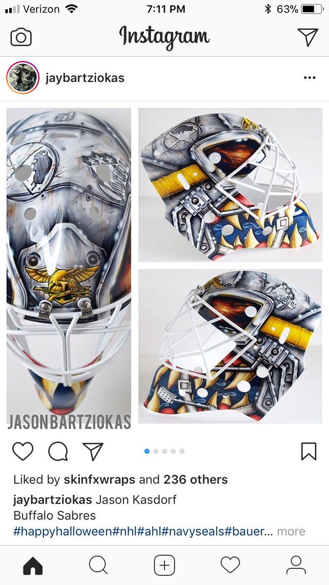
UPDATE #2: After starting the year with his Yeti mask from last year, Kasdorf switched painters (to the same artist who does Johnson’s masks) and updated his look. The new design includes most of the key design cues from his first Sabres/Amerks mask but includes a little more gold and a little less snowy blue.
 Jonas Johansson’s new Amerks mask has also been officially released. It’s an incredible take on the Amerks color scheme with a cool sketch pen treatment on the word mark with a bold white stripe and stars on the forehead. The stars don’t look terrific but the lower 75% of the mask is phenomenal. Ochocinco’s mask might be the best on the big club, but Johnasson’s mask takes the cake for best in the entire organization.
Add The Sports Daily to your Google News Feed!