It’s time for some summer fun. We are firmly in the dog days of summer and news has crawled to a near halt. Sure, there was major news in Vancouver on Wednesday night with Trevor Linden departing the organization, but it is very quiet other than that. So, late in July, it’s time to have a little fun and look at some different things.
Today, I’m going to do something I’ve always wanted to, I’m going to look at what the ideal NHL would look like. Not in terms of rules, pace of play, schedule, alignment or anything like that. No, we are talking jerseys. As the new third jerseys slowly get released, I’ve noticed a trend. Everyone seems to be going to black, which I don’t think is ideal. The jerseys are too bland and, in Carolina’s case, very ugly. I was left disappointed by the Ducks’ choice for a third jersey, changing the eggplant base to black.
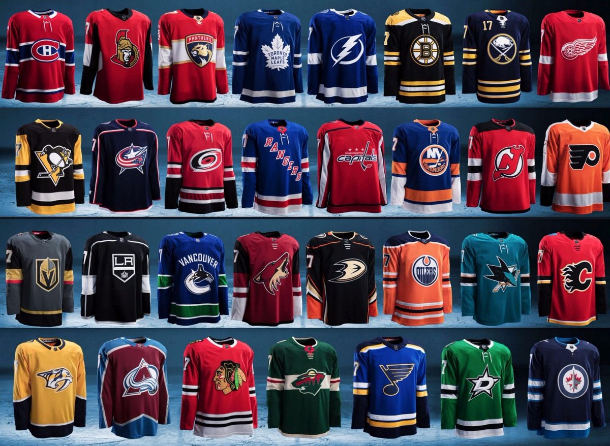
So, here’s what my ideal NHL would look like by division:
The Atlantic:
Boston Bruins:
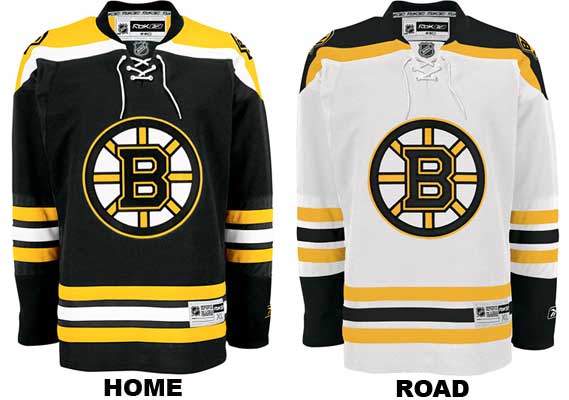
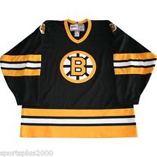
Don’t mess with a good thing. Boston’s home and away jerseys are terrific, and have a clean and classic look. The new third jersey is the “Happy Gilmore” jersey, worn in the late 1980’s-90’s when the Bruins made the Cup twice, falling both times to the Oilers.
Buffalo Sabres:
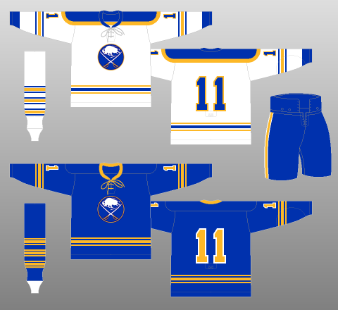
No third jersey for Buffalo, because they don’t need one. These retro jerseys are beautiful, and give the Sabres their best look in a long time. I think those white uniforms are among the best in the NHL.
Tampa Bay Lightning:
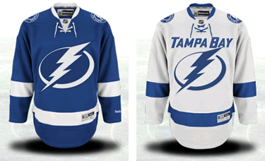
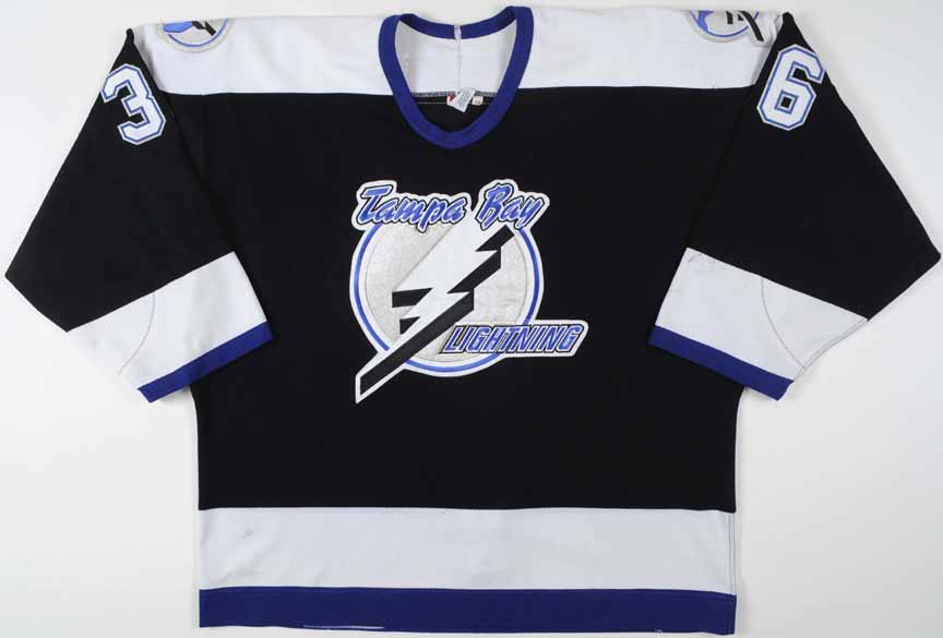
The Bolts keep their current home and away uniforms, which I think are better than people give them credit for. They go ‘retro’ with a third and stick with the fad of black uniforms, tipping their cap to the 2004 Cup Champions.
Florida Panthers:
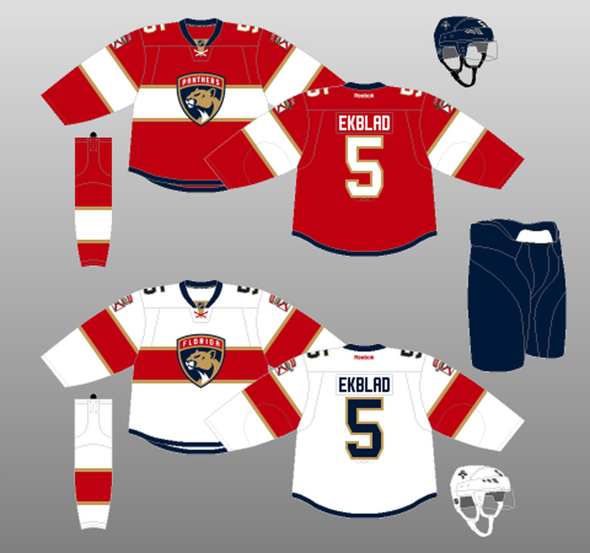
No changes needed for Florida. They have a terrific jersey set.
Montreal Canadiens:
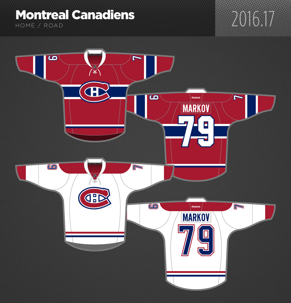
One of the most classic, clean looks in NHL history. Don’t touch it.
Toronto Maple Leafs:
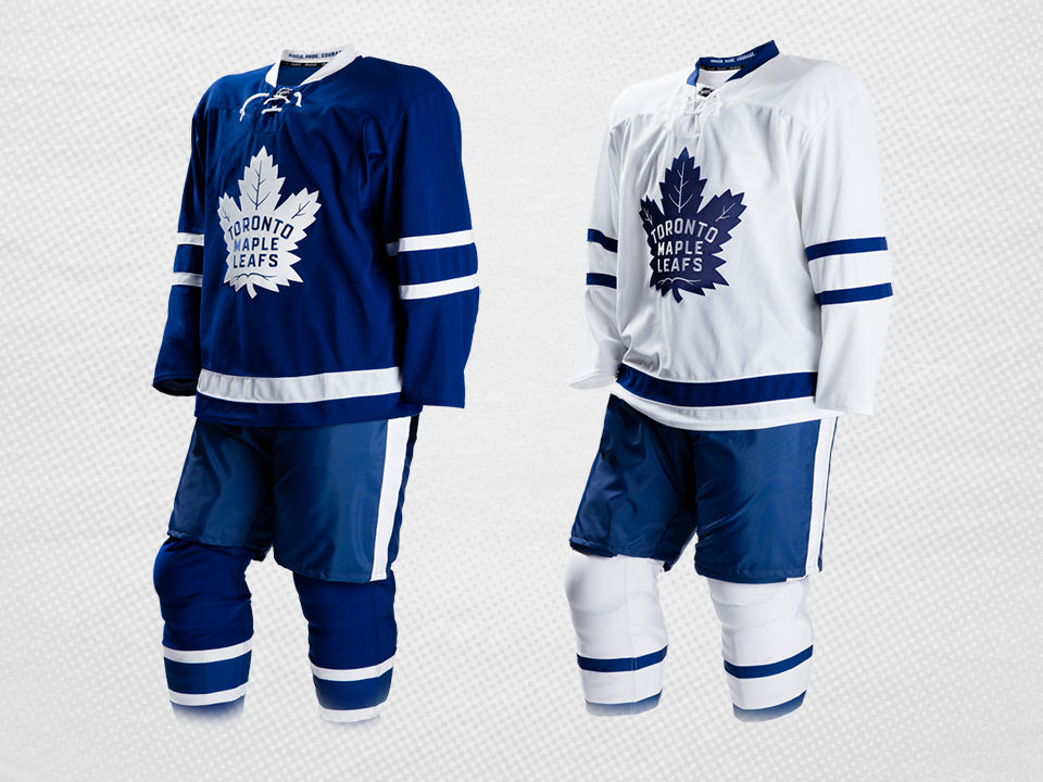
Like Montreal and Florida, no need to make a change here. This is a classic look.
Ottawa Senators:
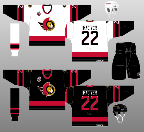
The Sens go back to their best look, by far, with a 90’s styled jersey. This should also help Ottawa’s PR nightmare and make some fans happy.
Detroit Red Wings:
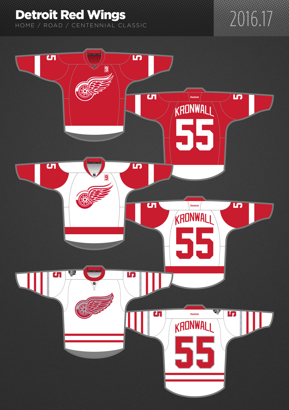
The Wings keep their original look, while making the Centennial Classic jerseys their alternate. They begin a trend of white home thirds.
The Metropolitan:
Washington Capitals:
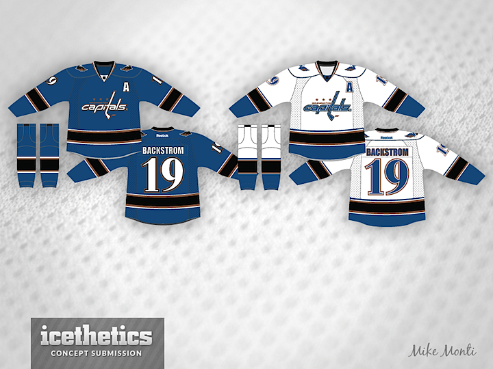
Our first concept jersey goes to Washington, as we combine the retro 80’s look with the 90’s look. I think these jerseys are really sharp and would be a hit. Tip of the cap to icethetics for this concept and many of the images used here.
Carolina Hurricanes:
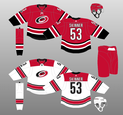
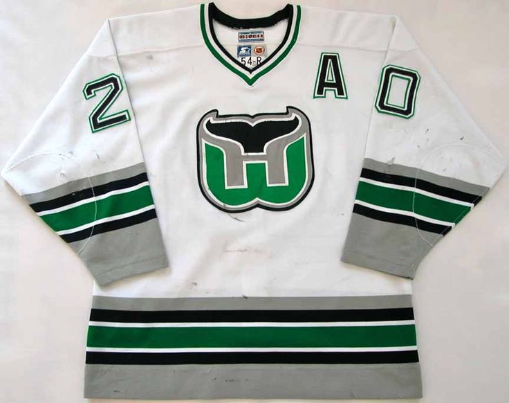
Carolina’s current jersey set for home and away are very nice and should stick around. Their third? A throwback Whalers jersey, but white. It’s a clean and classic look and should be a cash cow for the organization.
Philadelphia Flyers:
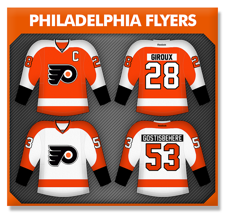
Flyers have a great jersey set, don’t touch it. Philly stays the same and doesn’t get a third.
Pittsburgh Penguins:
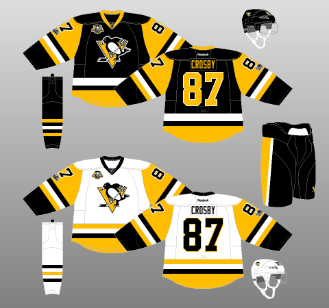
Penguins, like the Flyers, stick with their current look. No third for the Penguins, although I thought about the 90’s jersey. I decided in the end to just keep the classic set.
New York Rangers:
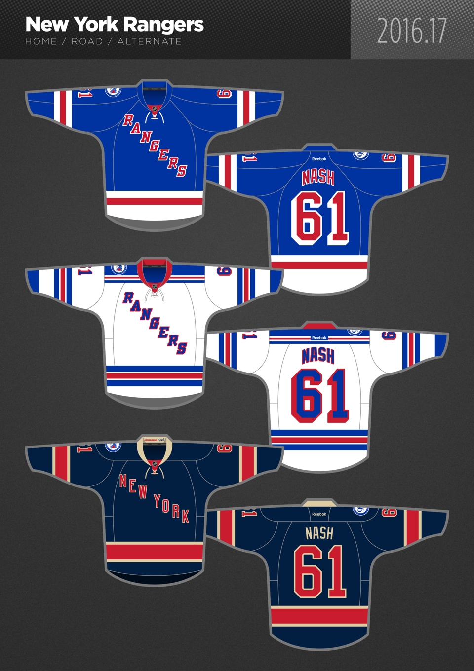
Rangers keep their classic and historic home and away while bringing back one of my favorite third jerseys.
New York Islanders:
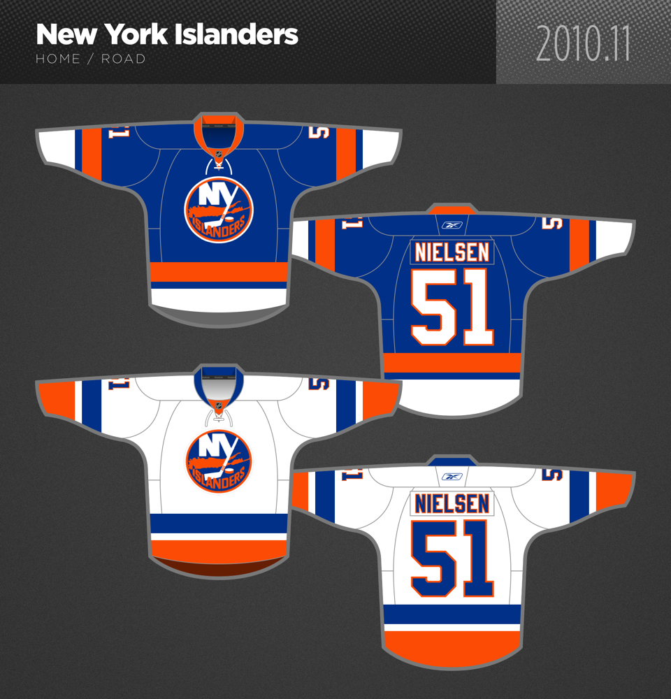
Islanders keep their best look as well, with the 70’s/80’s style uniform. No third jersey for the Isles, which is probably better considering their history with the alternate.
New Jersey Devils:
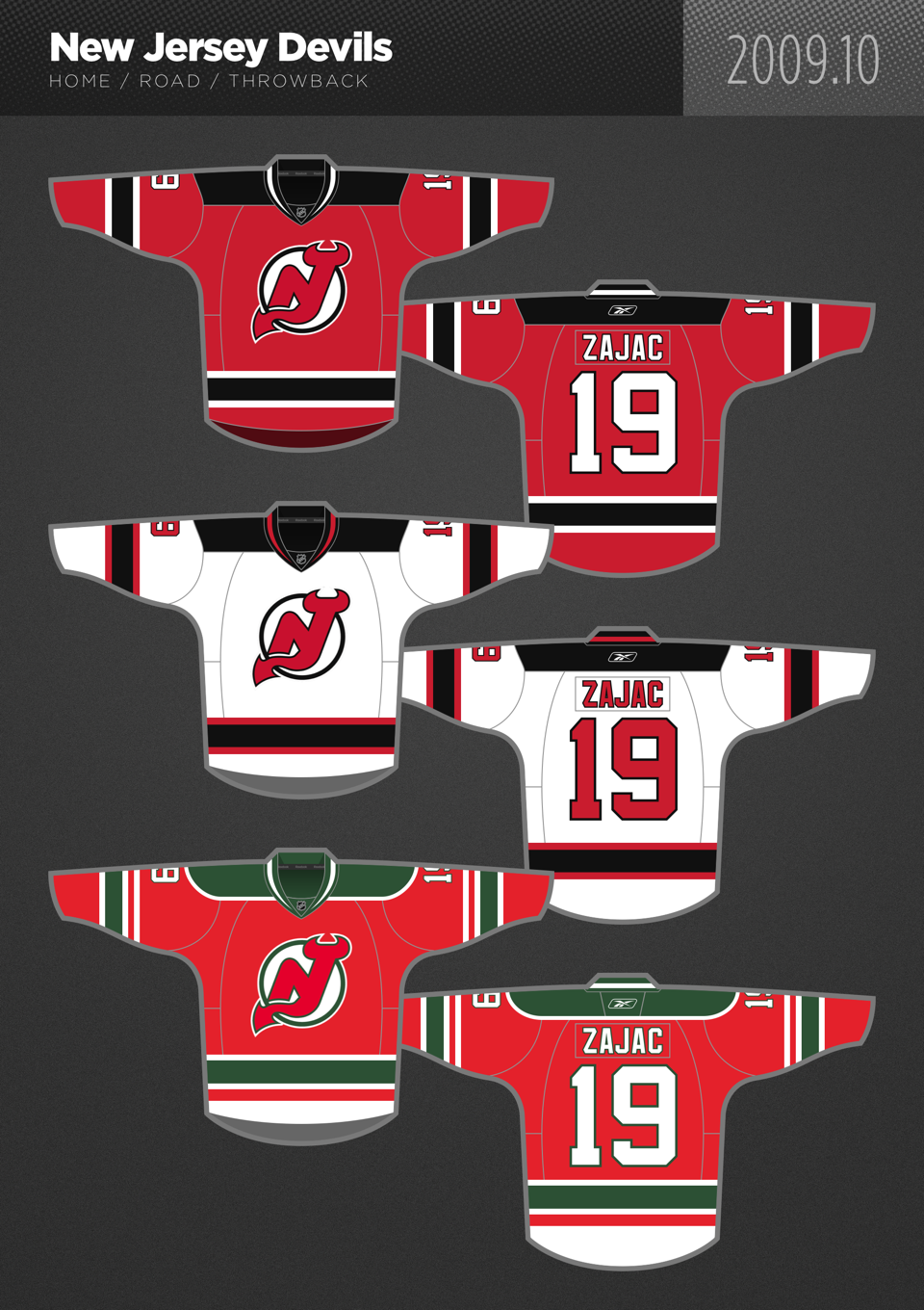
The Devils return to their jerseys from 2016-17, while bringing the 80’s third jersey back into the fold. Another classic uniform back in circulation in the NHL.
Columbus Blue Jackets:
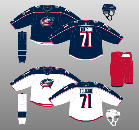
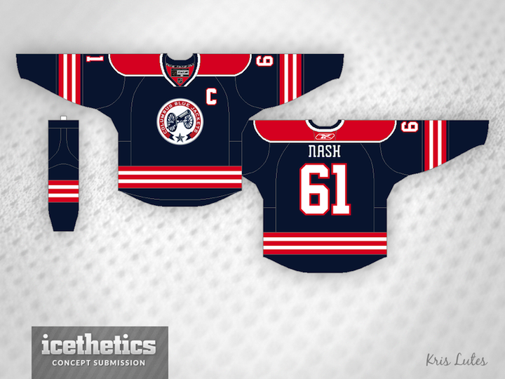
The Jackets keep their home and away jerseys, which is a nice and clean look, while bringing back the cannon logo. The third jersey, however, is a concept that incorporates more red and keeps the dark blue base.
The Central:
Nashville Predators:
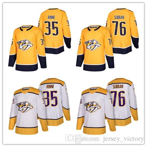
I hated the Predators jerseys when they came out last summer. They’ve grown on me since then, and I think they are Nashville’s best jersey kit yet. They keep them in our ideal NHL.
Winnipeg Jets:
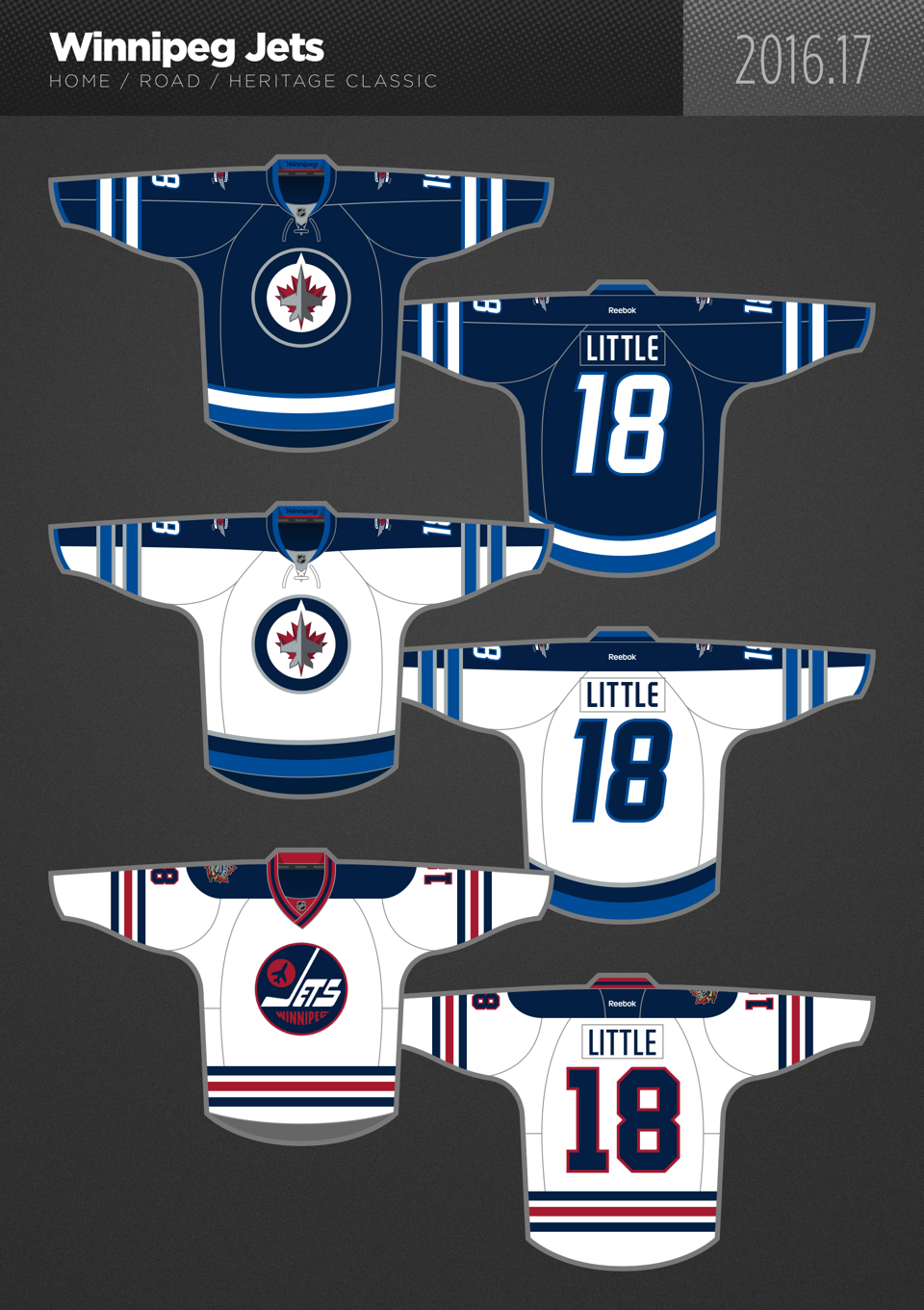
Winnipeg keeps the only home and away jerseys they have ever had, while adding the retro uniform as a permanent alternate. The alternate, which is beautiful, also tips the cap to Winnipeg’s hockey history.
Minnesota Wild:
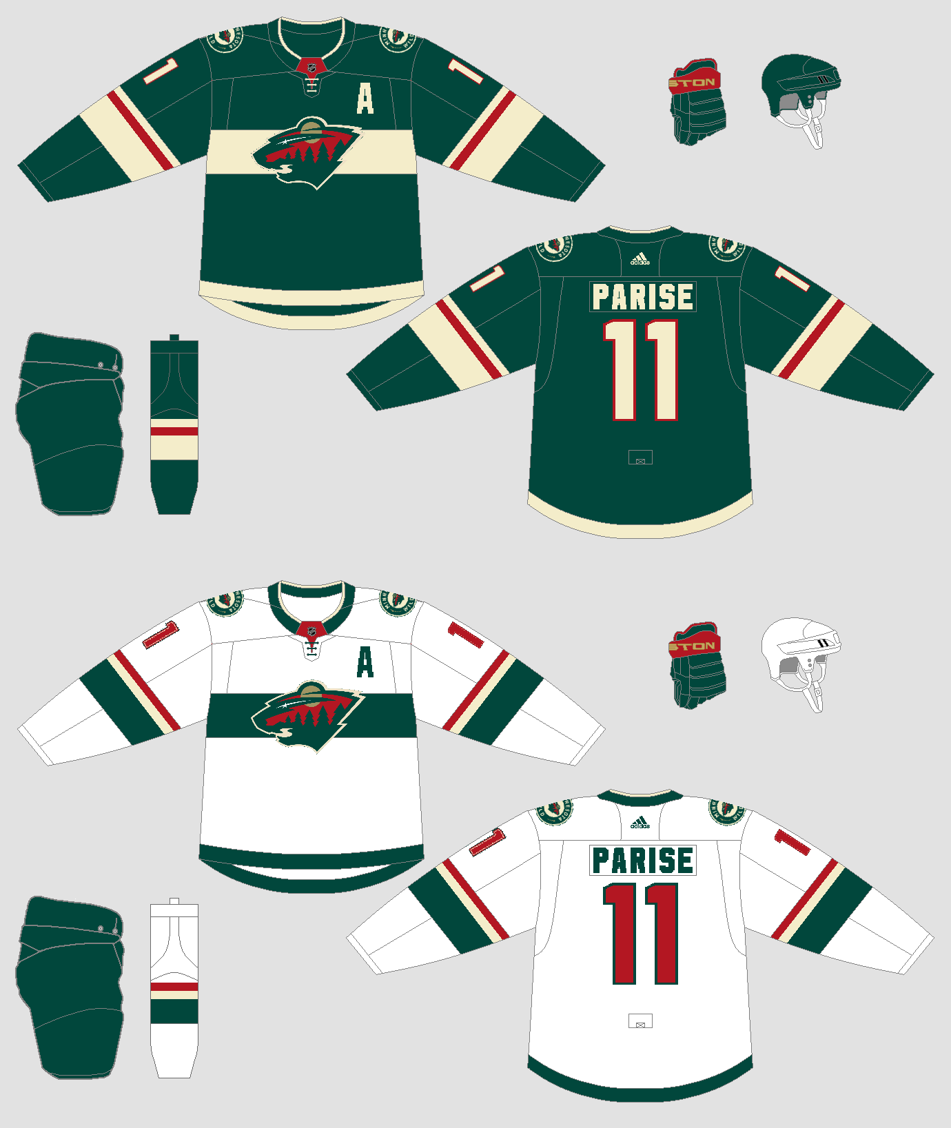
Minnesota will keep their current uniforms, with some minor changes (tip of the hat to B-mer on Sportslogos.com for the image). No third jersey for Minnesota, mainly because there was nothing from their past worth bringing back.
Colorado Avalanche:
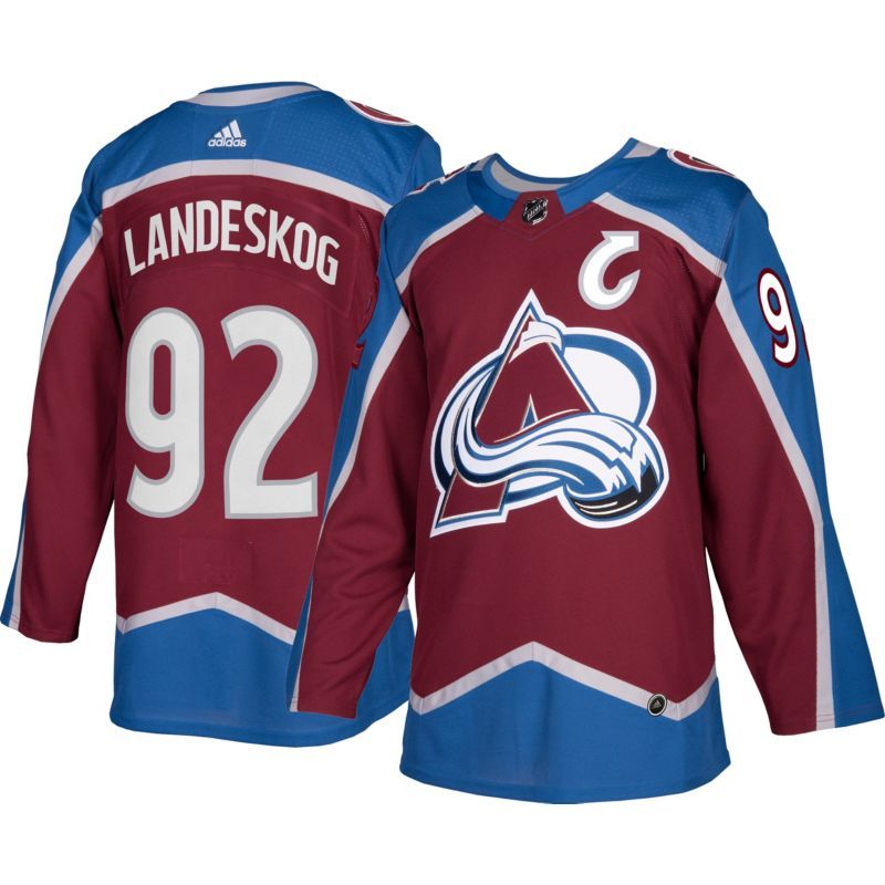
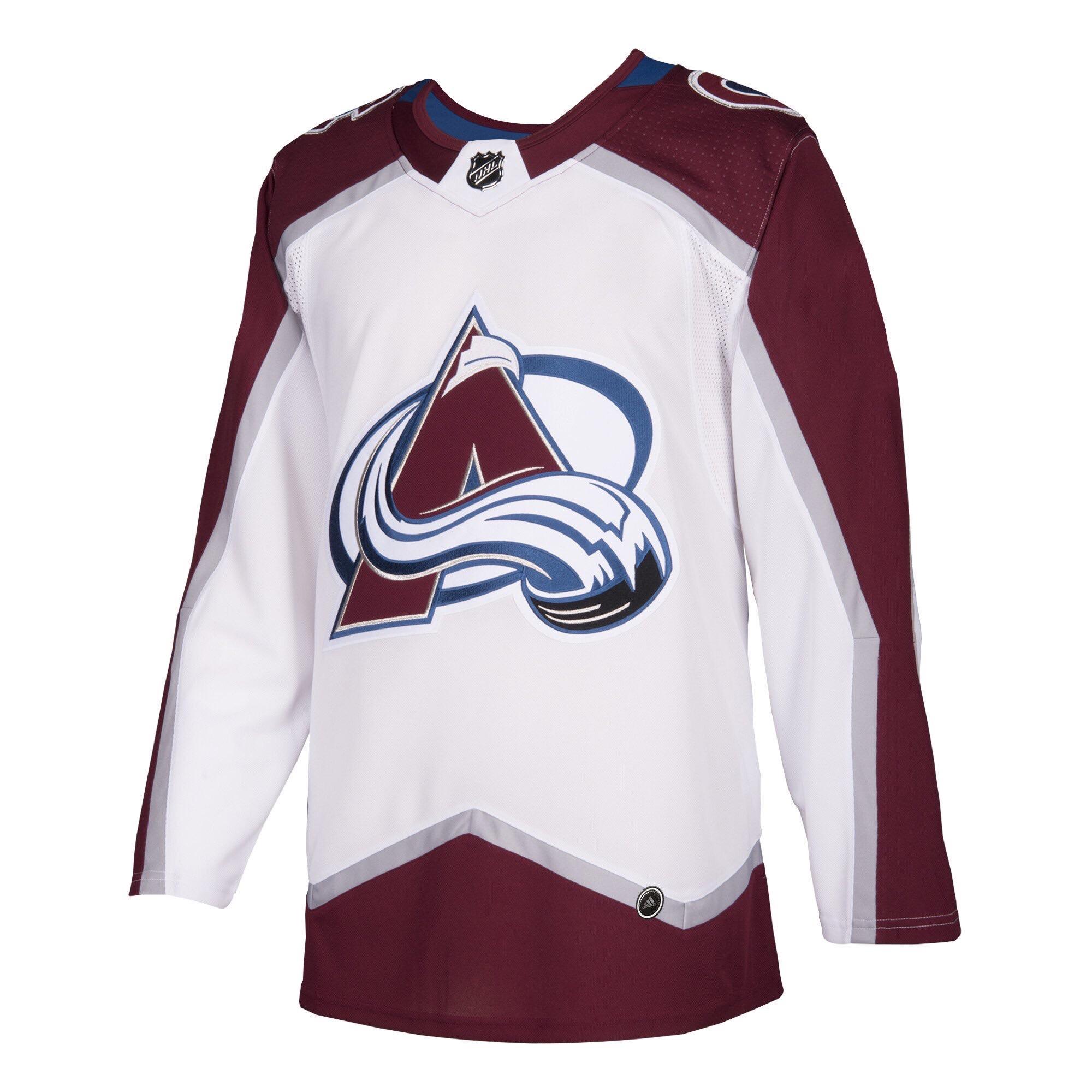
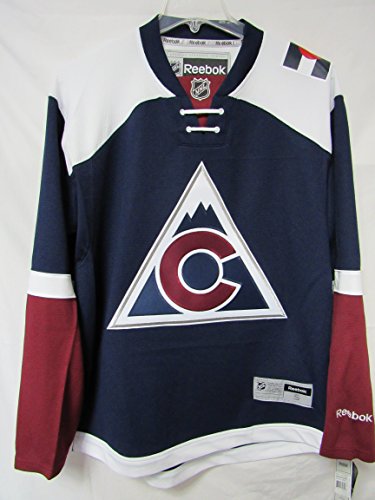
Colorado sticks with their current home and away, while reintroducing the the Rockies’ style third jersey. This is a really sharp set and one of my favorites in the entire NHL.
St. Louis Blues:
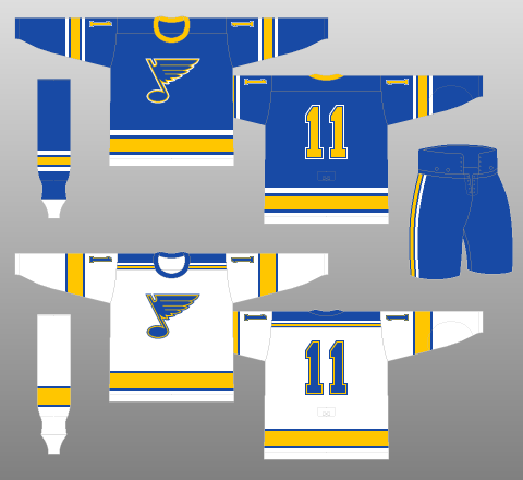
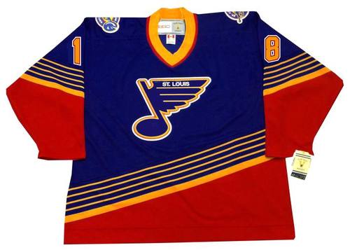
The Blues return to their original uniforms, which looked terrific at the 2017 Winter Classic. As a third jersey, the Blues return to the 1990’s, arguably the best era for the club, with a classic alternate.
Dallas Stars:
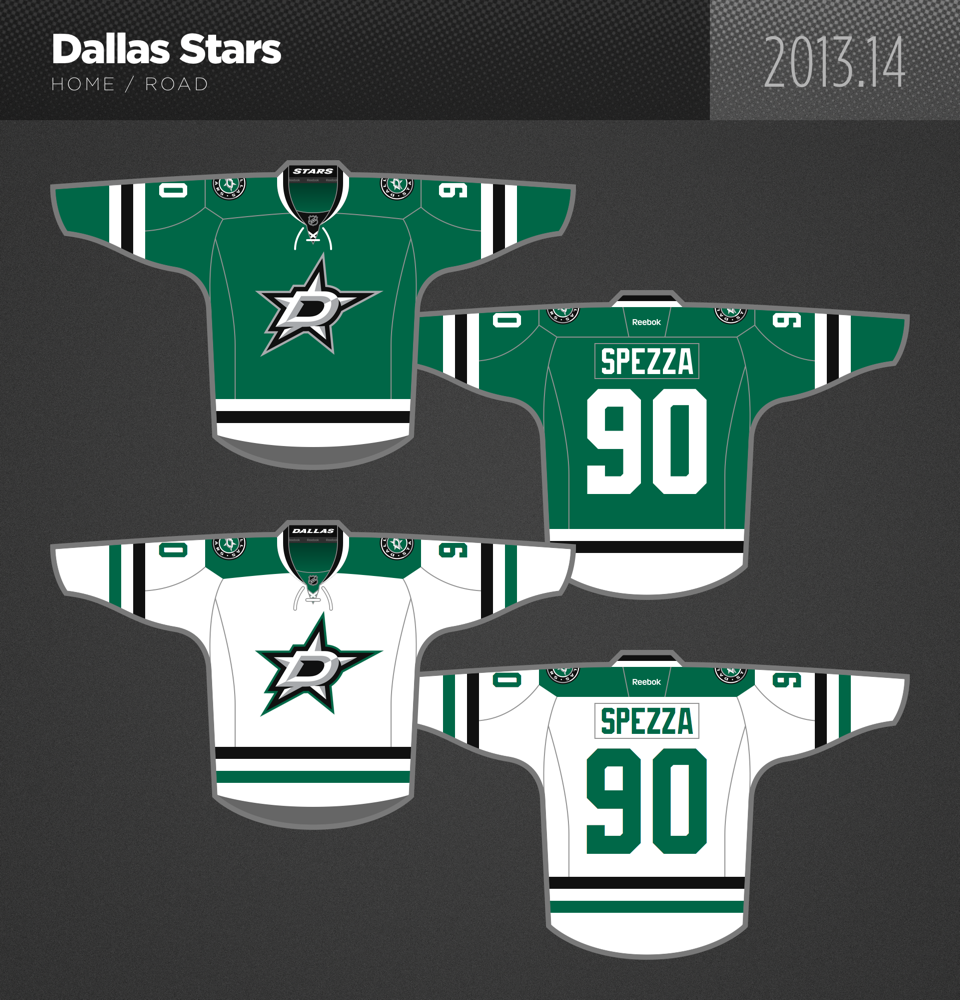
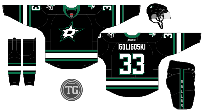
Dallas keeps their current home and away sets, while adding a third jersey that is a concept (Reddit). The black third is a tip of the cap to Dallas’ first uniforms, with a modern twist logo wise. There is also an added shoulder patch on the teams new third.
Chicago Blackhawks:
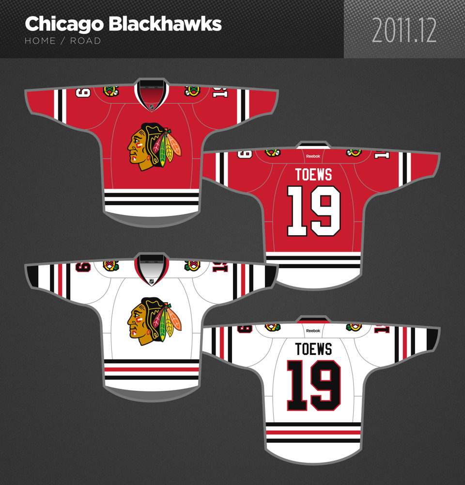
Arguably the best jersey in the NHL, unsurprisingly, remains.
The Pacific:
Vegas Golden Knights:
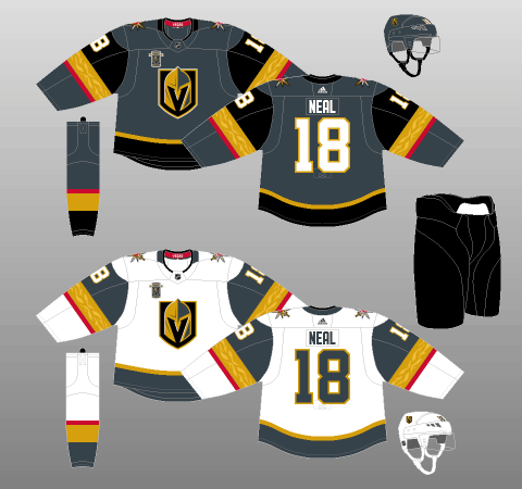
No changes for the NHL’s newest team.
Anaheim Ducks:
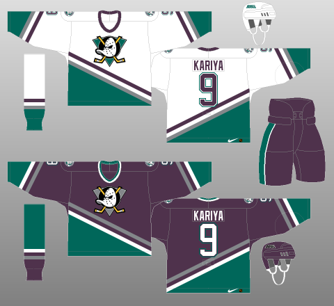
Anaheim goes back to the best set, the 1990’s throwback uniform. There will be no third jersey in Anaheim, but they hit a homerun here. Let’s face it, almost everyone would prefer them in these uniforms.
San Jose Sharks:
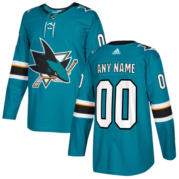
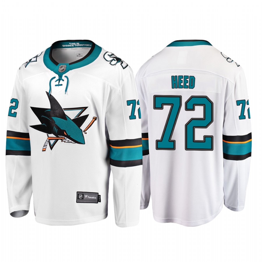
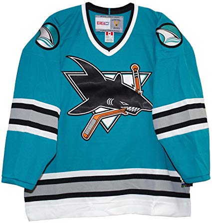
San Jose keeps their current home and away jerseys, while adding the very popular 1990’s jersey as a permanent alternate uniform.
Los Angeles Kings:
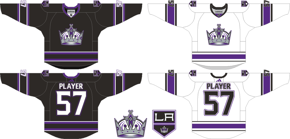
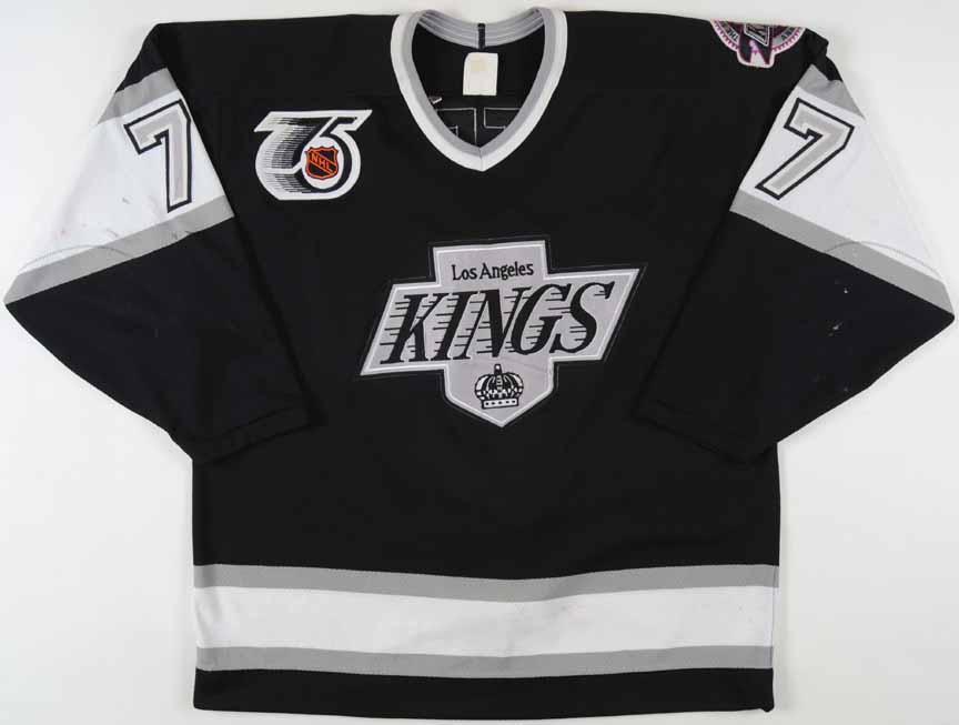
LA returns to the crown logo for their home and away uniforms, bringing back the purple as well. LA keeps their current logo as a shoulder patch on this concept jersey as well. The iconic Gretzky-era jerseys make their return as the club’s alternate.
Calgary Flames:
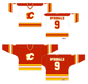
The Flames return to their best era, the 1980’s, with the best uniforms in franchise history. This throwback set is one of the best in the entire NHL.
Edmonton Oilers:
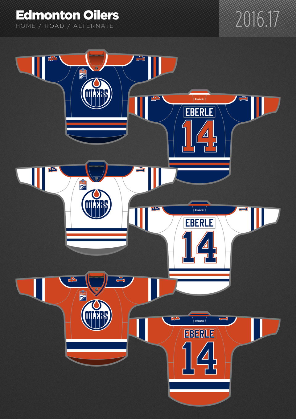
The Oilers return to one of the best home and away sets in the league, while returning the orange jersey to its rightful state as the alternate. Edmonton never should have made a change after 2016-17.
Vancouver Canucks:
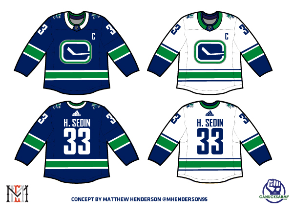
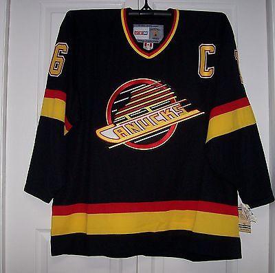
Canucks make the ‘stick in the rink’ uniform their home and away, while bringing the 1994 look back as the full-time alternate uniform.
Arizona Coyotes:
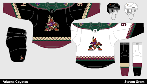
Arizona returns to the classic look of the 1990’s. Their current third jersey becomes the home, while a white version is brought in as the road jersey. This should be a hit with fans everywhere. Arizona ditches the current logo and re-brands.
Add The Sports Daily to your Google News Feed!