
The Islanders attempted rebranding in the late 1990s remains one of the most bizarre chapters in the team’s history. The ill-fated move by the team’s ownership group at the time was rejected by the fans and remains a sore point in the up and down history of the franchise.
Still, it has remained one of the most under-covered points in the Islanders existence.
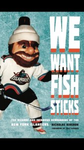
Enter Nicholas Hirshon, a long-time Islanders fan and former reporter with the New York Daily News, whose own curiosity about the subject led to him penning the upcoming book “We Want Fish Sticks.” Coincidentally, the book is scheduled to be released on December 1, the same day the Islanders play their first game back at Nassau Coliseum.
“I know everyone just kind of dismissed it like this stupid thing,” Hirshon said about the failed plan.
The idea to write about the fisherman logo stemmed from Hirshon”s dissertation he did while completing his Ph.D. in mass communications at Ohio University. From there, it turned into his current book that will hit bookstores on Saturday.
“We Want Fishsticks” is the second Islanders related book that Hirshon has worked on. Hirshon published “Images of America: Nassau Veterans Memorial Coliseum” in 2010.
 Hirshon, an assistant professor of communications at William Paterson University, did over 50 interviews with people associated with the Islanders fisherman era. That included former players, team executives and members of the firm that was hired to design the logo.
“The people who worked at that design firm that’s where I was a little bit nervous about…when you call up saying I’m going to write about your greatest failure,” Hirshon said. “I tried to make clear to them, which was genuine, that I really want to understand because people so quickly dismiss things. As a former journalist, you care about trying to get every side of every story. I tried to make that case of I’m really genuinely interested in knowing why you went in this direction and what were some of those factors.
“You could tell those sorts of people were a little bit skeptical at first, but as I kind of explained my motives they opened up to it a little more.”
Along with exploring the reasoning behind the design of the logo and why ownership felt the need to rebrand, Hirshon also found an answer to one of the greatest mysteries surrounding that era.
The whereabouts of the team’s long forgotten former mascot, Nyisles. The exploits of Rob Di Fiore, who was one of two people who played the mascot, were examined in the book and it was Di Fiore who held onto the mascot costume after a falling out with the team.
[youtube=https://www.youtube.com/watch?v=hyspS2O05Oc&w=560&h=315]One of the stories in the book about Di Fiore’s time as Nyisles was when the fanny pack that held the battery for the light on top of the costume caught on fire.
“There are still portions of the original Nyisles costume that still exist,” Hirshon said.
While the premise of the book is about the failed rebranding of the Islander in the 1990s, it explores more than just that. The book, according to Hirshon, is comprised of stories that explain what was going on around the team at the time as well.
That includes tales about one of the most hated characters in the team’s history, Mike Milbury.
“Obviously the fisherman was the face of that rebrand, but I try to make the argument that there was a lot of other stuff that affected that branding,” Hirshon said. “They hired Milbury at that time. They hired him as a coach, but Don Maloney is out after a few more months and he becomes the coach and GM. So he’s a key part of the rebrand. John Spano becomes a key part of the rebrand… It’s really looking at pretty much from 94ish when they’re starting to look at the rebrand to when all is ending when the logo goes out in 1997.”
Now nearly two decades removed the fisherman logo isn’t viewed as negatively by Islander fans. In fact, it has taken on cult-like following and the team has embraced it as a part of its history.
In 2015, the Islanders brought it back on merchandise and the Islanders skated in warmups one game with fisherman logos on their jerseys.
“It shows from a design standpoint it’s not that the logo itself was such an awful logo,” Hirshon said, “because a lot of people now like it for a variety of reasons.”
Add The Sports Daily to your Google News Feed!