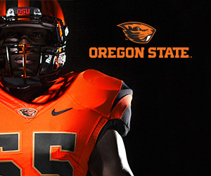
What’s the latest news from the fashion world? The Oregon State Beavers are on the runway. With a new logo, a bronze accent color, and fresh looks for every season, the orange and black are back on everyone’s radar.
For fans and critics the question is easily “why?” Their uniforms weren’t tragic before. Sure, it’s been quite some time since they were last updated but that’s the case for several teams around the nation. So why now? Was it necessary? For the Beavers, the answer is without a doubt yes.
Since the moment these uniforms hit the runway, they’ve been put under the microscope. The Nike makeover has drawn lovers and haters – something similar to the lightening yellow Oregon once unveiled several years ago. While I’m not going to critique the fashion choices of these uniforms, I can’t refrain from one piece of advice – never wear orange on orange unless you’re cleaning up the side of a freeway. But that’s not the point of this article and it isn’t the point of OSU’s unveiling. The reason they needed new uniforms and a runway and a makeover wasn’t just to be rebranded but to be remembered.
Sure not everyone likes the uniforms but at least people are talking about them. It’s marketing at its best. Oregon State could have come out in trash bags but it wouldn’t have mattered because people would be talking and watching and writing about the orange and black that has seemed to fall into the shadows of their Southern Eugene brethren.
In fact, in many ways, it seems that OSU has perhaps taken a page from the Ducks’ book. After all, before Oregon made their three BCS appearances, they were known as the team with flashy, crazy, even obnoxious uniforms. It’s hard to imagine Duck fans criticizing OSU uniforms when they’ve been seen donning lightening yellow, lime green, metallic wings, and a variety of other combinations that have shocked even their truest supporters. But back in the day when Oregon was boasting some 300 uniform combinations they weren’t just innovating and experimenting with color and style but succeeding at an attention grabbing marketing strategy.
And now it’s OSU’s turn. Think what you want of their new uniforms. They certainly don’t top the shock value of some of Oregon’s previous fashions. But for the purpose of a little attention, the unveiling has done its job. If there’s any team in Oregon and arguably any team in the Pac-12 that could benefit from some name drops and extra eyeballs its OSU. After being Oregon’s equal for several years, OSU has recently lost pace with the Ducks on the athletic stage. While new uniforms won’t bring wins, they certainly capture the attention of fans, sports media, and maybe even recruits. It’s not crazy; in theory part of it worked for the Ducks right?
In any case it doesn’t matter what the uniforms look like. It’s simply about any press being good press. While I’m sure the initial goal was to birth their jerseys into the 21st century, the “ReBeaved” unveiling also put the Beavers back on the map. I’m glad to see OSU out with the old and in with the new and perhaps the school will see the revival of their brand which has been long overdue.
Samantha Saldivar is on Twitter. Follow her at @SammySaldivar
Add The Sports Daily to your Google News Feed!
