This week’s Tuesday Top 5 actually takes us into the world of sports. Apparently the NBA Finals are happening. I haven’t really watched or cared much about the NBA since 1999, so in the spirit of that, my Tuesday Top 5 will take a look back at some of the best and worst jerseys of the 1990s. I’m going to break with tradition here and actually do the Top 10 Best and Worst because I wasn’t able to narrow the list down to just 5.
Jersey pictures from SportsLogos.net one of the best sites on Al Gore’s internet.
10. Indiana Pacers 3rd 1997/98
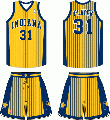
Pinstripes on a uniform aren’t always bad, but in this case there’s simply too many of them. This uniform looks like someone tried to draw it sideways on a piece of looseleaf paper while their teacher wasn’t looking and the team was like “Oh, hey, those stripes look cool, even through they cut right through the name and number, which happen to be the same color.”
9. Miami Heat Home 1998/99

The concept here wasn’t bad, and actually looked decent on their black road jerseys where the “3D” effect worked with the red background behind the white numbers. However, on the home threads, the red background behind the red numbers looks muddled and confusing. Outlining the players name on the back with an extra black layer makes it just look too busy.
8. Orlando Magic Home 1998/99

In the era of Penny Hardaway and Shaquille O’Neal, most people remember the black pinstripes jersey, but this one was just bad. The general concept of the wording/numbers isn’t awful (for a 5th grade art class) but what earns inclusion into this list is the plethora of stars that adorn the jersey.
7. Sacramento Kings 3rd 1994/95

The concept here is just flat out bad. There have been teams that have gone with different colors on the front and backs of their jerseys, which is bad but passable. Whoever had the idea to rotate that concept 90 degrees might be part of the reason the Kings threatened to leave Sacramento. Seriously? This looks like one of those jerseys you’d see at a mis-printed store where some Vietnamese kid accidentally spliced two jerseys together on the sewing machine. The wording and numbers concept is solid, which is really the only thing keeping this out of the Top 5.
6. Cleveland Cavs Road 1994/95

Did someone’s 5-year old create these? Seriously it looks like someone was using water colors and just splashing them around. Basketball going through a hoop? Okay, sure, your team plays basketball, good for you. No clue what the paint swath has to do with Cavaliers. The Cavs did redeem themselves in 2002 when they switched to a logo/uniform that actually had a really cool design and color concept. These ones were just bad, but I guess they needed something to separate them from the team that got posterized by Michael Jordan in 1993.
5. Toronto Raptors Road 1995/96

Remember when I said not all pinstripes are good? Apparently the Toronto Raptors missed the memo on that. In their inaugural season, they not only donned uniforms with pinstripes, but they went the extra step to make them jagged. Honestly, the “Raptors” script isn’t terrible for a mid-90s logo, but the rest of the uniform on the whole just looks like a collage of concepts with no consistency.
4. Philadelphia 76ers Road 1991/92

You’ll notice there is a consistent theme here in the top 5. With the advent of computers in the late 80s, the logo world discovered something that had previously been reserved for only really bad paint jobs: gradient. The college football world is currently obsessed with gradient numbers, but the NBA discovered a long time ago that this was a horrible idea. Seriously, what is going on with these jerseys? Let’s have the name swooping in! And some stars! How many? 13 for the original 13 colonies? NO! 11, just because. And let’s put the opposite on the shorts so that the swoops don’t match up at all!
3. New Jersey Nets Road 1990/91

Remember what I just said about gradient? Yeah…this takes it to a whole new level.
2. Milwaukee Bucks 3rd 1995-96

Yes this was an actual jersey worn by an actual NBA team.
1. Denver Nuggets 1992/93
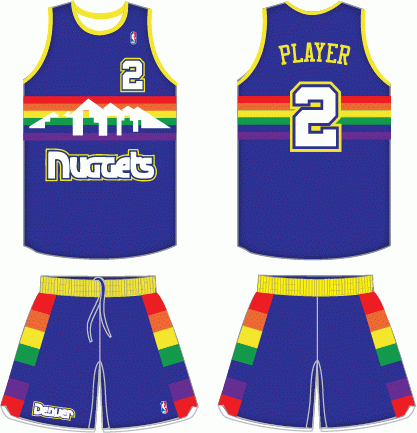
In an era of bad uniforms, this one clearly takes the cake. The Nuggets wore these from 1985-1993 and made one of the best logo improvements in NBA history in 1993. No clue what is even going on here. Outlines of houses? Technicolor rainbow? Could people even tell the difference from the color palate when the cable cuts out to when the Nuggets were actually playing? Could you imagine if they had been wearing these when they upset the Top-seeded Sonics in 1994? Vomit city.
10. San Antonio Spurs

Despite the “Fiesta Logo” the Spurs never abandoned their standard black-and-white uniforms. With the Fiesta Logo, they could have gone in any number of directions that would’ve landed them on the 10 Worst list (like a teal, yellow, and pink jersey…vomit). However, the Spurs stuck to their guns and stayed true to their black-and-white look. That earns their inclusion into the Top 10.
9. Phoenix Suns Home

Anyone who remembers Charles Barkley, Dan “the man” Majerle, Kevin Johnson and gang running through the league in 1993 probably has a soft spot for these jerseys. The shame for the Suns, they ran into the buzz saw that was Michael Jordan, Scottie Pippen and the Chicago Bulls in the finals. In one of the greatest NBA Finals games ever played, the Suns topped the Bulls in a triple-OT thriller in Game 3 of that series.
8. Atlanta Hawks Home 1995/96

The Hawks modernized their uniforms in the 90s, adding a sweet looking bird of prey gripping a basketball in it’s talons. While the road jersey was downright painful (see the discussion on gradients above), the home jersey was actually pretty cool. It had a modern script above the Hawk and the wings of the bird wrapped around to the back.
7. Minnesota Timberwolves 1996/97

In the mid-90s, Minnesota decided that their old Wolf-in-Basketball logo wasn’t badass enough and upgraded to something totally fear-inducing. The little trees around the boarders of the uniform was a nice touch, but there was also a marked improvement in moving from a generic blue to a darker hue and making the wordmark look like icicles and/or fangs.
6. Houston Rockets Road 1995/96

I bet you thought you’d see this jersey on the other list. Nope! Maybe it was just my fascination with Hakeem “The Dream” Olajuwon, but I loved these jerseys. The little cartoon rocket flying around the basketball was vintage 90s design and the 3D-looking design of the letters was just awesome. This was a solid use of pinstripes as well as they fade out around the logo/letters.
5. New York Knicks Home 1997/98
The Knicks made a small change to their uniforms by adding blue piping down the sides in 1997. This was a great move that gave a little extra kick to a classic but somewhat plain look.
4. Seattle Supersonics Road 1995/96

Gary Payton and Shawn Kemp led the Sonics on a few deep playoff runs, including a trip to the NBA finals in these dark green uniforms. These uniforms, coupled with a pretty awesome logo that included the space needle, suffered a sad fate in 2001 when Seattle abandoned them to return to a bright green and yellow concept that scared away the people of Seattle because it was too bright andreminded them of the sun, which they only see twice a year. You have to know your audience, and the people of Seattle who are used to rain and cloudy skies needed a darker uniform to exemplify this.
3. Utah Jazz Home 1996/97

At the beginning of BASEketball, we are reminded that “The Jazz moved to Salt Lake City where they don’t allow music.” In the 90s the Jazz ditched their old music-note logo in favor of one that more represented the city where they had played since 1979. The “JAZZ” script featured purple mountains under blue sky underneath the purple-and-white Rockies. The logo as a whole was encircled in copper, one of the key exports of the state. The jersey reflected this and featured the purple-and-white mountains seamlessly integrated with the rest of the uniform. For anyone who watched the Mailman and John Stockton tear it up in the Western Conference, you know this jersey belongs on the list.
2. Detroit Pistons Road 1995/96

What says 1990s better than teal and flames? These jerseys pretty much had it all. There was a horse that was clearly a badass with all the fire that he produced and his bright yellow/red eye. One of the best things about this uniform is the color consistency. The teal of the uniform is also used to give a 3D effect to the “Pistons” script on the logo. The red and yellow are used as fringe around the borders of the uniform and to give the numbers on the back a 3D effect.
1. Chicago Bulls 3rd 1997/98

Simple, plain, but stylish. Back before everyone wanted a black jersey, the Bulls inverted the colors of their road jersey and produced a fearsome red-on-black look. The first year of the black 3rd jerseys they featured pinstripes, but they ditched those in 1997 in favor of an all black background. Nothing special, just straightforward in your face awesomeness.
Add The Sports Daily to your Google News Feed!