I’m a big fan of fight posters. I’m an avid collector and have many displayed, much to the chagrin of the opposite sex. So with this being a very lean fight week, I decided to take a step back and really take a look at what UFC posters I enjoy the most…and the least. I plan on doing boxing posters at a later date, as they tend to be much, much better and more creative.
Also, I made the starting point at the Zuffa purchase at UFC 30. Without further ado.
THE BEST:
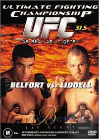
-Look at the Worst Of below at the second poster. This one came directly after it. I’m assuming someone got sacked immediately after, because this is very, very nice. You’ll notice a trend that I tend to enjoy simple, clean-looking posters. Boom, two guys side-by-side, nice blended in fight shots of both below them, and the Bellagio logo classes it up. Solid work. The “As Real as it Gets” is puke, but you can’t do anything about a slogan if the higher-ups want it, and you know that just had to be Dana’s doing.
-I like this poster in theory. If they could have actually matched up “old guard” fighters with “new guard” fighters, it would be perfect. Putting Hughes in with the old guys is a bit of a stretch, but it’s the thought that counts with this one.
-Beautiful. Maybe the most aesthetically outstanding poster they’ve ever done. The only flaw is the giant MILLER LITE right in the middle, but this is gorgeous.

-The UFC was on a roll at this point. Going from the colorful, vibrant Couture-Belfort poster to this one here. Simple, tells the story, and brings levity and importance. Could do without the “IT’S ON!”, but hey, it could be worst. Looking at you “WHO R U PICKING?”
-Not a damned thing wrong with this. Champions on the left, challengers on the right, blended fight picture behind. Simple but effective.
-I do have a soft spot for face-to-face posters. This was also the UFC’s highest buyrate to that point and for some time after. The bigger the event is, the less you need on the poster, and this follows that. Chuck. Randy. 3. All you need.
-Yeah, I don’t mind the whole red, angry theme. Normally I wouldn’t approve of ANYTHING that highlights Tim Sylvia’s hideous tattoo, but it’s a theme and they committed to it, so I like it. Would have been funny if they would’ve made Tito’s massive head completely red for effect.
-HAHAHAHA THEY TOTALLY DID!!
-I’d like to buy whoever designed this poster a Schlitz and a horseradish-crusted salmon filet. Goosebump city.
-As John Madden would say, when you put your title front-and-center, you’re making sure your title is front-and-center.
THE WORST:
-First off, I actually like the flag inside the octagons. I really like that. Here’s the problem, your event is titled “Worlds Collide” AND FEATURES HALF OF YOUR FIGHTS AS USA VS. USA. The American flag vs. American flag graphic for Lindland-Miletich is just…how did that get through without anyone batting an eye? STATES COLLIDE! Also, that font is awful.
-I know making fun of early UFC posters is shooting fish in a barrel, but come on. Look at that thing. Eee gads. This is something 1995 ESPN2 would have thought was too gaudy and scattered. This might be the worst MMA event poster ever, and I’m including the Pride one where there’s teat-suckling.
-They were on such a roll before this. First off, naming your event “Heavy Hitters” is just asking the fight gods to jinx you. Sure enough, Buentello’s fight ended via submission and Forrest’s ended by decision. By the way, is Forrest fighting Buentello? No? Who’s he fighting? Oh, someone not on the poster. Is Arlovski fighting Buentello? No? Who’s he fighting? Oh, someone not on the poster. Who’s Buentello fighting? Oh, someone noTHIS IS INEXCUSABLE, PUT SOME FUCKING OPPONENTS ON THIS.
-What’s with the weird edges? Are they going for a Wild West vibe? Is this fight happening in someone’s thought bubble? Am I dreaming about this fight? Also, come on with that picture of BJ. They really couldn’t have found a better picture? His hair says 65, but his chest says four.
-Rule o’ thumb; if you’re trying to promote your fight card as a sport between able and matched opponents, you might want to try not having an odd number of fighters in your poster. Also: none of the fighters pictured here are fighting each other and the main event isn’t even listed. Just atrocious.
-R.I.P. Chris Kelly.
-JESUS CHRIST ALMIGHTY WHAT IS HAPPENING?! I’ve seen Club Opening flyers handed to me on the street that had less going on than this.
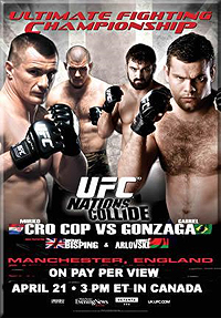
-And the UFC is now 0/2 in common sense “Worlds Collide” posters.
Check back later this weekend for Part 2 and maybe 3.
Add The Sports Daily to your Google News Feed!


