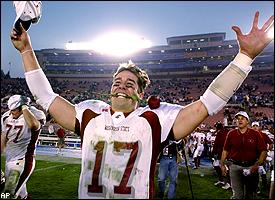
With practice sessions about to begin, we will step outside the box a bit today. All the buzz has been about the new uniforms that will grace our Cougars next year once the Nike deal takes hold in January, and obviously some concerns arose with the news. Would they create something hideous as we’ve seen from our NW brethren in Oregon? Or the “Jog-Bra” look at Oregon State? Maybe they’ll stay conservative, ala UW which aside from changing some of the font on the numbers, well, they still “look” like UW, you know what I mean?
Anyway, we thought it would be a good idea to look back at some past WSU combo’s in the modern era, and see if we might come to a consensus of which uni’s worked the best over the years, and which ones didn’t. Today we’ll roll out the road combo’s. Check out the poll question to the right, and feel free to leave comments on which style you prefer. Here goes:
1) 1981 Holiday Bowl Road Uni’s
 Crimson pants with white stripes down the side. Solid block crimson numerals with double-crimson stripe on the sleeves. Gray helmets with Cougars script, and a center stripe on the helmet. White face masks, white shoes.
Mainly rolled with this style in the Walden era with very little change. Basic, but clean.
2) 1988 Aloha Bowl Road Uni’s
 Here we see the change that Erickson wanted when he showed up. Gray pants without any piping or stripes, and a WSU cougar head logo on the hip. White jerseys with basic lettering, and the big change having the Washington State school name across the chest. WSU Cougar head logo on the sleeves. White shoes. Gray helmets with Cougars script and crimson face masks.

3) The Bledsoe/Palouse Posse/Ryan Leaf years of the early-late 90’s


5) The Current Versions – Mkristo Bruce – Jerome Harrison – Jason Hill – Alex Brink years.

Finally, the look that we have seen in the last two Apple Cups. It’s also a look that has done us well over the years (1988 Aloha Bowl, 1997 Apple Cup, 2005 and 2007 Apple Cups). Yes, I’m talking about the gray helmets with the Cougars script, same simple, clean jerseys, solid gray pants with the WSU hip logo, and black shoes. I have to admit…..I FREAKIN’ LOVE IT!
So there you have it. Feel free to chime in via comments or vote in the poll for your favorite combo.
Add The Sports Daily to your Google News Feed!
