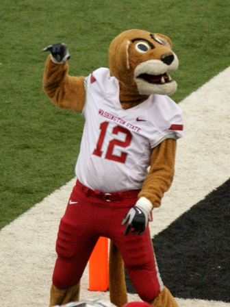
Good morning afternoon and Happy Hump Day, Cougs! I’m sure you were all waiting anxiously all morning for the continuation of my mostly arbitrary rankings of quasi important components of the programs that comprise the Conference of Champions. In case you missed it, I’ve ranked the logos, uniforms and stadiums of the Pac 12 so far. Today, I’m here to rank what might be the most important factor of all: mascots. They may not seem like a big deal to you, but mascots are hugely significant (to children and 30 year old bloggers who behave/think like children). At this year’s Spring game, when my son Brady wasn’t busy telling Coach Leach to go for two or run plays for the tight end, his primary focus was tracking the whereabouts of the one and only Butch. Thanks to a stroke of great fortune, we were able to run into the costumed Cougar on the way back to the parking lot and a four year old’s day was made. Now that I’ve effectively established that my target audience for today’s post can’t read yet, let’s jump into it. It’ll be hard hitting stuff, I assure you.
1. Butch, WSU
Simply put, Butch is the coolest. He’s the fan-friendliest, crowd-surfingest, ATV-ridingest, team uniform-matchingest mascot in all the land. One of my favorite wrinkles with Butch is every Dad’s Weekend when Papa Butch makes an appearance; always a crowd pleaser. You had to know my main man Butch would be top dog cat here.
2. Oski, Cal
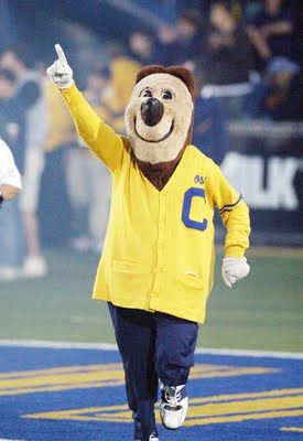
Oski is takin’ it back to the old school, cuz he’s an old fool who’s so cool. You had me at your sweater, Oski. You had me at your sweater. If taking a look at Oski doesn’t make you smile at least a little bit, there is a little black hole where your heart should be. He may not be the hippest dude around, but Oski is clearly the kind of bear that ladies are proud to bring home to their parents and feel good about. He just seems like a nice guy, amiright? I might be overthinking this.
3. The Stanford Tree
I concede that absurdism isn’t for everyone, but it’s definitely for me. Nothing captures the absurd quite like the Stanford tree. It’s awful looking and beautiful at the same time. Everything about it makes me chuckle a little bit, but especially the regular human legs with tennis shoes coming out of it. Along with their band, the Tree is an excellent comic foil to the otherwise very serious academic institution. Well played, smart people.
4. Chip, Colorado
While it’s not mandatory, it is a definite plus if your mascot can have a lovable cartoonish face on an oversized head. Chip meets all these criteria and does so with great aplomb. For all the menace that is Ralphie, you’ve got the kiddie friendly Chip to make sure that nobody ends up with a crippling fear of buffaloes. Methinks this is a good idea.
5. Sparky, ASU
I’m not quite sure what exactly a Sun Devil is and how it differs from your standard issue Beelzebub. Ostensibly, he’s pretty similar, but likes hanging out at the beach and having a great tan. Whatever it represents, I like it. I’m also a fan of funny facial hair and pants that look like something a mid-card professional wrestler would wear, so I like Sparky. As I referenced in the logos post, he should have never been done away with in favor of the “This sounds like an amazing idea in the graphic design and marketing offices in Beaverton, but really it’s just a stupid fork”.
6. Benny Beaver, OSU
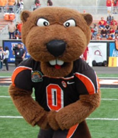
If you’re a fan of alliteration and the comedy that can be derived from double entendres and the word beaver, then Benny is probably your guy. To me, he’s riding the fine line of being totally ridiculous looking and taking himself super seriously (i.e. the look in his eyes). This all balances out to be a pretty good aesthetic, when it could be a total disaster. I’m curious to know how much time was spent discussing Benny’s tooth size, but they really nailed it.
7. Traveler/Random Horse Riding Trojan Guy/Tommy Trojan, USC
I’m generally not in favor of actual humans as mascots since it’s a missed opportunity to use a massive oversized cartoon head, but the use of an actual horse makes the whole USC thing pretty cool. In “researching” this piece, I learned that the guy who rides Traveler is not, in fact, Tommy Trojan. He’s just any ol’ generic Trojan warrior. The only thing bearing the Tommy Trojan name is the statue on campus. File this under “Things I now know that will never come in handy after this”.
8. Joe and Josephine Bruin
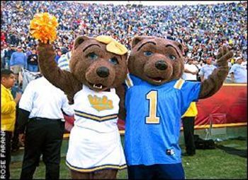
I absolutely give credit where credit is due for these lovebirds sticking together as long as they have. That said, where Oski’s old school appearance makes him looking charming and even retro, Joe and Josephine just look like really old costumes. Hey, I don’t make the rules, UCLA fans. I just enforces ’em. Actually, I do make the rules, but whatever. It’s a silly list.
9. Wilbur and Wilma Wildcat
I don’t know what it is, but something about Wilbur and Wilma reads a little creepy to me. He’s got a crazed look in his eye and is bearing his teeth all the time. Meanwhile, she’s always smiling passively and has a bit of a blank look in her eyes. I’m no marriage counselor or anything, but there is something up here. I hope everything’s OK at the Wildcat household.
10. Harry the Husky, UW
Why so serious, Harry? His recent makeover added a lot of realism to the Husky, but now Harry just looks kinda sad all the time. The previous iteration of Harry was one happy dog. He looked like his head was permanently out the window of a moving car, which is ultimately a good vibe for a mascot. New Harry bums me out. Somewhere New Coke is nodding. New Coke can relate.
11. The Duck, Oregon
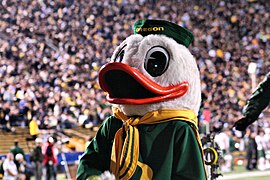
I never realized (or cared, I guess) until today that the Oregon Duck was nameless. Once I thought about it, I never got past “Donald” or “Howard the” as potential names so I guess it makes sense. Just being called Duck is bad enough. Being one of the most famous cartoon characters of all time, but in a much worse outfit is flat out awful. That’s why you are 11th out of 12, Duck. Props on all the push-ups, though. In case you’re wondering, Mandrake would have been number 156 on the list of 12. I don’t know how. He just would have.
12. Swoop, Utah
Look, I understand the inherent difficulty in creating a mascot to go along with the Ute nickname so I can get on board with using a bird or whatever other animal you want to use. I don’t get the amount of bad decisions that went into the creation of said bird, though. The following must have happened: Should we use a bird? Yeah, sure. Should it it have wings? No. OK, so no wings, just regular arms then? Nope, it should look like it’s on steroids. Should it be friendly looking? No, let’s make it kinda scary. How about ugly? Should it be ugly? Yes, absolutely. The net result is a mutant mess that is Swoop.
There you have it, folks. I don’t know how the Pulitzer committee goes about compiling entries, but if anyone could pass this along, I’d greatly appreciate it.
Go Cougs.
Add The Sports Daily to your Google News Feed!

