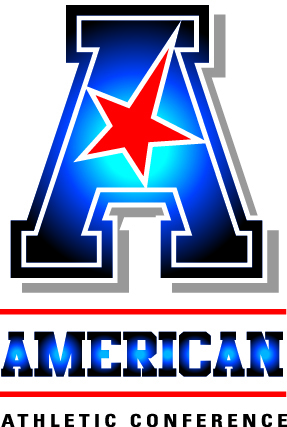
The American Athletic Conference took its first step in revealing itself to the public today with the introduction of its new logo. The new look is the initial phase of the conference’s rebranding itself as a remnant of the Big East Conference.
The logo is a letter A in red, white and blue, which according to the conference, “each institution can customize with its own colors.” The conference formally will assume its new name and image July 1.
Earlier this year, seven Catholic (non-football) schools broke away from the other members of the Big East to form — or re-form — a basketball prominent athletic league. The Catholic-Seven succeeded in wresting the popular Big East brand from the remaining schools; hence the need for a new identity.
In addition to the new look, the conference has dubbed itself “The American” and announced a new website (www.TheAmerican.org) and a plethora of new Twitter handles (@American_Conf, @American_FB, @American_MBB, @American_WBB and @American_Champs).
According to Commissioner Mike Aresco, “We believe this bold mark and our series of ancillary marks will support our conference name and the values that our name represents. In addition, our partners at ESPN and CBS agree that its strength, simplicity and elegance will resonate well on TV.”
The conference recently inked new football and basketball broadcasts agreements with both networks.
The inaugural conference teams include Big East holdovers Cincinnati, UConn, Louisville, Rutgers, USF and Temple, along with newcomers UCF, Houston, Memphis and SMU. In 2014, Louisville and Rutgers depart for the ACC and Big 10 respectively, while East Carolina, Tulane and Tulsa join the fold. Navy is set become a football-only member in 2015. Aresco indicated no immediate plans for further expansion.
Add The Sports Daily to your Google News Feed!
