 Welcome to the “Re-Imagining The NHL” project created by Cole Jones. Cole has been great enough to allow Days of Y’Orr to post his idea on different teams with his spin on them. You can follow Cole on Twitter. Please feel free to comment on the team below. Feel free to read the official announcement of the project here. Since neither Cole or Days of Y’Orr consider this team our “home team”, we will do our best to bring in a fan of the team described to get their thoughts. Today we were lucky enough to get input from the wonderful ladies of Couch Tarts.
If you haven’t checked out our other teams, visit the Re-Imagining the NHL team page. The team page will be updated daily with every team we update. So before we take a look at the uniforms, lets take a look at Cole’s comments on the Sharks.
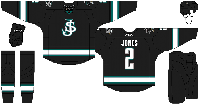
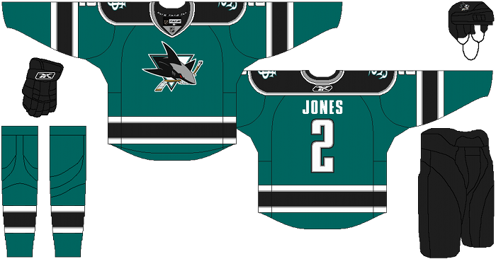
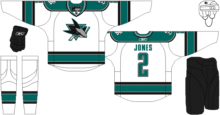
Cole’s Comments: I decided to go with the things that I think worked from each of their previous looks, as well make some small tweaks that I think work better than what they’ve had. I normally don’t enjoy seeing mashed up jerseys that blend every era into one, because they normally look disjointed and overdone. I tried to avoid that here, while still using things from all 3 eras.
I think the sharks are on of the better edge looks, despite my hatred of the team. that said, I’ve never been a fan of their damn-near columbia-blue teal. If you’re going to be a teal team, wear teal. Teal is greenish blue, not sky blue. I also went back to silver, instead of the orange. I just thought it fit better.
the primary logo I used is tweaked in a few ways too. first of all, I changed the shark from teal to silver. I just always thought Sharks were sort of a silver color, so it was an obvious choice, especially when I was trying to bring silver back into the scheme. I also changed the triangle into a true triangle shape, like their original logo, rather than the curved-top they’ve had post-edge. The last tweaks were minor, like adding stick tape to the butt end of the stick, changing the stick to a more wooden color, and the eye from orange to red…I also made the triangle’s outlines extend to both sides of the triangle, instead of being solid black on the upper left. The secondary/alternate logo is a slightly modified version of zephyr’s x-line logo that i’ve always adored.
The rest if fairly self explanatory.
After the jump, the San Jose Sharks re-imagined.
Away:
Alternate:
Gray from Couch Tarts’ comments: Helluva project to take on! Now, let me tear it apart with blatant disregard for your efforts.
I have to say that right away the first thing that strikes me is the look of the silver and black of the Shark on the logo. Obviously, given that a local football team wears those colors, we know it works, but I feel like in the logo, it looks rather off putting.I can’t quite explain why, but they way it sits against the home and away jerseys feels awkward to me. Silver has been used in the past, but I feel it’s better as a tertiary color with this particular design, not a secondary.
I don’t mind the new teal, but I do feel like it adds to an overall deadening of the entire color scheme. It’s too muted for my tastes, and likely for the bright tastes of sports. Team colors need to stand out and look energetic, not sleepy. This teal, with that particular silver, is a snoozefest. As much as some fans hated the orange, the bright addition doesn’t fade into the teal, and gives a really strong visual contrast that helps separate the stripes of color. The silver falls back into the white far too much in this design, and eliminates a lot of that visual interest.
Regarding the red Shark eye, it just doesn’t work in this context. The warm orange-brown it is now works because the color is reflected in the stick. The red is just pulled from nowhere, and is never repeated anywhere in the rest of the color scheme. I find myself asking where it came from. That alone would drive me nuts if I had to stare at it all season. That is also why, despite occasionally wanting to, I do not give the Shark a red eye. Thematically, it’s just weird. (Also dislike the idea of anything red ever being sewn on a Sharks uniform. Red = Wings, and we just can’t have that. The parallels that would be drawn the moment the Sharks add red to their uniforms would be obnoxious, to say the least.)
I am really mixed on the SJ logo that was added in. While I very much enjoy the hint of a sharks tail in the typography, I feel like it would have to be pushed a lot further for that logo to really work. I’m not sure about it being on the top and bottom of each character. I feel like you could do more if that’s the idea you were going for. (the again, make it a shark like head and it could look like a weird snake, which would be pretty bad) It also reminds me way too much of something I’d see on a baseball hat, which I’m not super wild about for a hockey team.
Mina from Couch Tarts’ comments: Overall I think it’s really nice work. As a Sharks fans, I would totally buy one of those jerseys (except the third one, but I’ll get to that) so most of my comments are going to be nitpicks.
In terms of colors, I agree with Gray that the teal could use to be a bit brighter. I like the use of the silver on the road jersey, but I don’t think it pops enough on the other 2 jerseys. And for some reason it really bothers me on the collars (especially the road one). Orange is my favorite color so I really like having that on the jersey (and having an excuse to wear my bright orange Converse to games). The silver is more subtle, which isn’t necessarily a bad thing, but it’s a little expected with the black and white and the orange is more unique.
I’m not really into the Shark as silver, though I can’t really explain why. Could be the whole Raiders feel, could just be a first impression. It’s not a deal breaker and I don’t have a better suggestion (Gray is the color expert). I really like the red eye. For me, it calls back to the giant Sharks head at the tank. I totally get all of Gray’s arguments against it, but it’s a nice touch for people who have spent a bunch of time in the Tank. And I really like the subtle touches to the stick like the stick tape. I also LOVE that you took the numbers off the front.
But as for the SJ logo, I hate it, especially on the third jersey. I get the idea behind it, but I think there are too many tail ends on the whole thing. With maybe one tail per letter, I think it would make a good shoulder logo, but I can’t get behind it as a main logo. If you’re set on having a different logo on the third jersey (which is a great idea), maybe just the word Sharks across the front instead.
Like I said, it’s a really solid effort and a jersey I would buy. With a few small changes, it could be a jersey I love.
Days of Y’Orr’s comments: Honestly, I love them. The teal is perfect in Cole’s mockups. It’s not the ugly ass light blue used when the team first came into the league (and EA still uses as their primary color in the NHL series palettes). QUICK RANT: How the fuck can a company like EA screw that up? Don’t know what I’m talking about? Pop in NHL 10 or NHL 11 and design something. When it comes to the color picker hit ‘Y’ (or Triangle PS3 users) and select NHL. Go over to the Sharks and look what you have there. That sure as hell aint teal. If you’re a company putting out a game, how can you look over something like this. How can you not have the TEAM’S PRIMARY COLOR IN THE COLOR PALETTE!? It’s mind boggiling to say the least. QUICK RANT FINISHED
With that said, I love the look of these jerseys. The Sharks really nailed the Edge template in real life and Cole nailed it with this one. My only gripe is the change in the logo color. The teal and black on the shark work and to change the teal to silver makes it look like a Robo-shark. The girls nailed it with the comparisons to the Raiders as well. I’m sure Zombie Al Davis would love them. That said, the stick tape on the butt of the stick is a nice touch and the red eye doesn’t bother me as much as it probably bothers others. Orange eye, red eye, it’s a shark.
Lastly, the alternate jersey is good. I’ve always loved a black jersey with San Jose. The SJ logo leaves something to be desired and I don’t know what that is yet. Would I use it on a jersey? Probably not. I feel like it’s a great shoulder logo and would also look good on the pants. Overall, it’s a solid design and I think a lot of people in the San Jose area would enjoy the switch.
Add The Sports Daily to your Google News Feed!

