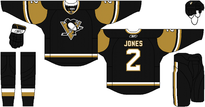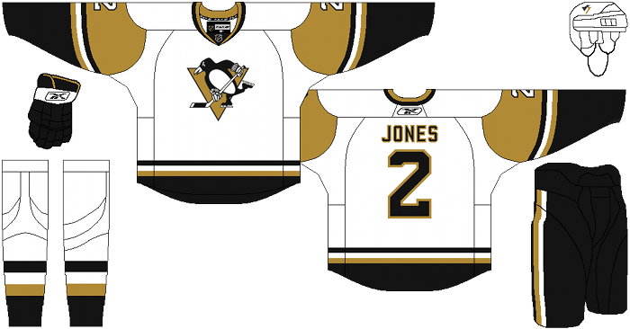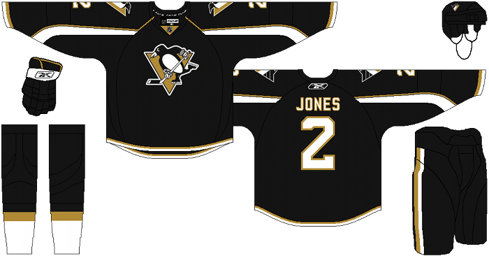
If you haven’t checked out our other teams, visit the Re-Imagining the NHL team page. The team page will be updated daily with every team we update. So before we take a look at the uniforms, lets take a look at Cole’s comments on the Pittsburgh Penguins.
Cole’s comments: My goal with this concept was to find any way possible to ditch the bland reebok sweaters and give them a uniform that would be instantly recognizable as Pittsburgh hockey, without simply putting a full throwback design onto a reebok uniform cut.
My biggest pet peeve with the Penguins current uniforms is vegas gold. It’s such a bland and ugly color and it makes them look like the washed out cousins of the black-and-yellow Pittsburgh sports franchises. Apparently the gold is popular with the fan base, and it’s been well documented that Mario Lemieux hates athletic yellow, so I figured I’d try to come up with a compromise.
I chose a shade that isn’t vegas gold by any stretch, but is still distinctly “black and gold” instead of yellow. If I had to name it some arbitrary sports color name, i’d call it old gold.
The home and road are a nod to the Lemieux/Jagr era and the alternate is based on the template from the Senators current alternate. Call me crazy, but I thought that template looked like an abstract rendition of Penguin Wings, and in black/white with a tad of gold, I think it’s a perfect fit. I also brought back the “robo-pigeon” that everyone seems to hate. I think it’s a fantastic logo, and a perfect alternate mark.
After the jump, the Pittsburgh Penguins…
The Pensblog’s comments: Hmmm lets see…With regards to the home jersey, we’ve taken better poops than this. But it is okay, we remember the first time we just to draw something too. With the road jersey,We thought this wasn’t bad…If the Penguins were a high school team. Last is the alternate jersey and there is no one in this world who would like this. It has less personality than Helen Keller.
Here is the deal with the Penguins uniforms. They aren’t horrible, but we agree to an extent with Cole, the Vegas gold has to go. We’ve heard from numerous people within the Pens organization that they chose to go with “whiteouts,” at Penguin games because a ” vegas gold out makes the entire arena look like puke.
It just doesn’t look right.
Where does that leave us? With these:
The Penguins first changed these because in 1993, owner Howard Baldwin saw a chance to make even more money with a redesign. These uniforms just weren’t as good. Still no clue what kind of penguin that is supposed to be. From there some of the uniforms were bad and good.
The diagonal Pittsburgh jersey is actually one of our favorites. Even this alternative jersey wasn’t horrible.
The most current jerseys aren’t really anything to get overly upset about, and they aren’t anything to get pumped about. Really just run of the mill. The Penguins have introduced two blue jerseys that are the absolute worst. We can’t even talk about them. Like seriously? Fucking blue.
Anyway out of Cole’s write up, here is what we agree with more than anything:
“I also brought back the “robo-pigeon” that everyone seems to hate… i think it’s a fantastic logo, and a perfect alternate mark.“
YESSSS! In fact just bring back the 91′ jerseys and everyone will be happy.
Anything less than that is a reach. Or reach-around to make it easier for Bruins fans to relate.
Days of Y’Orr’s comments: Okay, let’s start off. I love the change from Vegas gold to “Old gold”. I’ve never been a huge fan of the Penguins current home and away jersey because they’re as basic as they come. With that said, I like these ones minus the gold around the shoulders. There’s something about them that I can’t get past. I don’t know what it is.
The more I look at it, the more I like the gold on the away. It’s the gold on the black that is doing it. Anyways. I like the away more than the home.
The alternate isn’t anything special. It gives me a feeling of a Capitals jersey and I hate anything that has to do with Washington.
Sometimes you hit a homerun and sometimes you hit a ground out to first (what’s up with me and these baseball euphemisms when it comes to describing things?) and this is more of a ground out than anything.
What do you think?
Add The Sports Daily to your Google News Feed!


