If you haven’t checked out our other teams, visit the Re-Imagining the NHL team page. The team page will be updated daily with every team we update. So before we take a look at the uniforms, lets take a look at Cole’s comments on the Red Wings.
Cole’s comments: I present for your consideration the Detroit Red Wings.
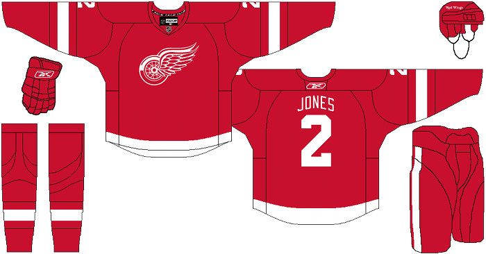
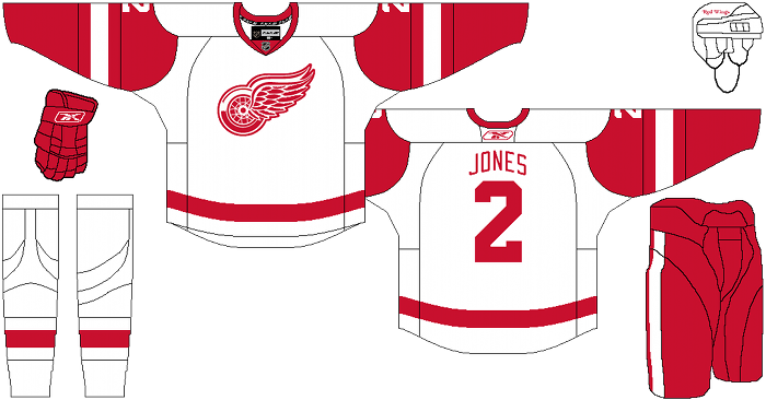
Call me lazy, or call me a traditionalist, but I barely did a single thing to the home or road. The only thing even worth noting is the hem stripes, which I always felt looked incredibly awkward on the Reebok jersey cut. When all you’ve got a single stripe, I see no reason why it shouldn’t follow the contour of the hem. crucify me if you must, Wings fans but I just think this minor alteration looks a ton better.
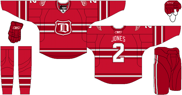
The meat of this concept lies within the alternate uniform. I made a rule for myself when I started this project, and that’s that every single team MUST have an alternate sweater. That means Montreal, New jersey, Detroit…everyone. The problem with doing an alternate for detroit is their color palette. There’s only so many things you can do with one red marker on a white piece of paper. This led me to debate with myself what other colors could possibly be used for a Red Wings sweater that wouldn’t be universally rejected by all of hockey tradition. Silver was a given. If their marketing department had a hard time selling silver on Wings fans, they’d probably just have to call it “stanley cup silver” and their fan base would eat it up. That gave me one other color, but I wasn’t done. I considered black for about half a second, before I realized that they aren’t the Detroit Lions and shouldn’t ever put themselves on that level. Then I considered purple (from the octopus logo) and realized that was just ridiculously ugly and cartoony for a team like Detroit. That’s when I remembered the 2-tone red all-star sweaters and how nice I thought they looked on the ice, despite never being a fan of any 2-tone non-blue uniforms.
Now with the colors out of the way, it was time to focus on the design. I didn’t want to go straight throwback, because there’s no creativity or fun in that on my end. So I decided to draw inspiration from their history as the Detroit cougars/falcons and come up with a somewhat modern uniform with deep roots in detroit hockey history. I hope you like what I came up with. I like it more than I expected to.
After the jump, the Red Wings…
Chris from Nightmare On Helm Street’s comments: Re-imagining Detroit’s legendary sweaters eh? You’re treading on hallowed ground sir. You best be careful.Oh wait, what do we have here? The home jersey is simply beautiful! I love the elegance of the red, the refinement of the logo, and the simplicity and grace of how it flows all together.
And the away jersey? Oh it’s stunning as well! It’s the sort of thing that’s classy enough to wear formally, but you still know a bad mother f’er lies underneath. I have to give you credit sir, I wasn’t expecting to enjoy watching someone mess with perfection, but you have done the impossible.
What’s that? You didn’t change a thing to those two, other than making the stripe follow the flow of the jersey (which I would have to see in person to judge, but it makes sense)? I give you credit, you realized when something is completely faultless and kept your hands off. Nice work sir.
Now for the thirds. As a Red Wing fan, I absolutely abhor the thought of Detroit wearing a third jersey, but I respect your endeavor. And you know, for trying to create something new, you did a pretty damn good job. I think I would like it better without the silver outlines (but would have to see it to decide), but I really do like it. I love the Wings’ version of the Old-English D and wish there was more apparel out there with it. This is basically a “home” version of the Wings Winter Classic jerseys, done fairly successfully.
All in all, I’m impressed. But instead of wasting your talents on Detroit, I think you need to make a trip over to Columbus where you’re desperately needed. Maybe stop on by Florida while you’re at it.
Days of Y’Orr’s comments: So the home and away are pretty much perfect. Detroit hasn’t (basically) changed their uniform since 1887 so what’s the point in doing it now? Home and away get an A+.
The alternate is the big one here. I don’t think the Red Wings have ever had a true alternate. Like Chris said, the logo is an inspiration from their older days and the more recent 2009 Winter Classic jersey. Like Cole said, it’s tough to make an alternate jersey with two colors, so I like the fact that he used a two tone red as well as silver in the uniforms.
It’s hard to give a franchise like Detroit an alternate but I think Cole hit this one on the head. The uniforms are solid and the alternate is good enough that the people of Detroit would buy them. I also enjoyed the crack at “Stanley Cup Silver”.
What do you think when it comes to the Wings? I love them.
Add The Sports Daily to your Google News Feed!


