Oh Nike, you really, really fucked up. I mean, you had one job to do. All you had to do was make some hockey jerseys for the 2014 Olympics. It didn't have to be hard. It didn't have to be ground breaking. Copy the 1980 US jerseys. Tweak the 2006 Canada jerseys. Keep them simple. That's all one ever, really needs when it comes to hockey jerseys.
You really only had one job.
There's a reason why the Original Six uniforms are held in such high regard. The simpler a hockey is, the more elegance it lends itself to the eye. We like simple jerseys. This isn't college football. We don't need volt yellow, fake collars and crazy fucking patterns. It didn't have to be this way Nike, but you fucked it all up. You ruined it.
With the leak of the Team Canada jersey last night, this is shaping up to be one of the worst looking Olympics. Seriously.
After the jump, we'll look at Russia, USA and the newly leaked Canada jerseys…
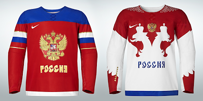
Russia
Um, yeah.
So the home jersey is basically a recreation of Russia's 2002 Olympic jersey, but without the old Nashville arm patterns. Honestly, I like the home jersey due to it's simplicity.
What ruins every Nike hockey jersey is that lame fake laces. What's the point? Seriously, what's the point? No, seriously – I want an answer. It's the same as those stupid stripes on the Nike football college and NFL jerseys. WHAT'S THE POINT? FASHION?! Will these fake laces make Alexander Ovechkin actually play defense? Doubtful.
Now what's the deal with the away jersey? It looks like a soccer uniform (which may be a trend here). The white bird is supposed to symbolize Russia's coat of arms, but why have the coat of arms symbol and then a huge outline of the crested eagle that spawns the chest and arms?
Then to top it all off, Nike pulls out the Oregon style shoulders and adds the wings.
I just can't.
United States of America
Seriously.
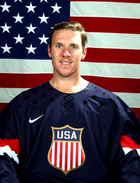
These are seriously the best things that Nike could come up with? I guess let's start with the logo. Why did they chose that one? There are tons of USA inspired logos they could use, but instead they chose one that looks like the Union Pacific logo.
Then we have the lame fake fucking laces.
But the worst part about these uniforms – the absolute sprinkles on the shit sundae that is the American hockey uniforms – are those stars. Those fucking stars.
WHY?!
They are not pleasing to the eye. They are not fun to look at. They are more awkward than the American hockey team's portraits. Look at Jimmy Howard, he looks like a date rapist!
If Nike wanted to do it right, remove everything from the white jersey. Plain white with the crest and a blue swoosh and you have an instant classic. One thing I do like is the inside of the collar has the two gold medals won by Team USA inscribed on it.
Canada
Last but not least, Team Canada. This was leaked yesterday:
Toews looks miserable. So I can't tell if it's shitty lighting or if the "white" on that jersey is cream. Either way, it's another rip off of a company logo, Petro Canada (thanks Rick).
Also – fake laces.
And there's something on the shoulders, but I can't make out what it is. Since Nike is so obvious it's either a maple leaf or a lumber jack – two of the most Canadian things ever.
These are the best of the released jerseys so far, but we don't have any idea what the away looks like and I really, really want to know what's on the shoulders.
I feel like Nike is making the hockey portion of the Winter Olympics one of those fraternity pig parties and Nike is looking to bring the ugliest dates to the table.
Add The Sports Daily to your Google News Feed!


