Robert Judin examines some of the NBA’s newest uniforms, and tells why they all fail to impress.
Younger generations of athletes and sports fans seem to have one common interest. They care about appearance as much as they do performance.
For athletes, wearing a sleek alternate jersey or new shoes provides a boost of confidence or a power up – similar to Mario when he gobbles a mushroom and grows seemingly 10 feet in height.
The NBA has seen three teams alter their closets this off-season.
The Phoenix Suns, Detroit Pistons and New Orleans Pelicans will debut new jerseys this upcoming season. However, they should all go back to the drawing board.
This was meant to be a piece that ranks the teams’ new uniforms to find out which one is best, but it turned into something centered around determining which wasn’t the biggest eye sore.

1. Phoenix Suns – Rating: Bad
Phoenix tried to accommodate for its look in the 90s, which I can appreciate because those jerseys were great – the best jerseys were the black ones with the orange lining that Charles Barkley made popular by himself. The Suns unveiled a logo that mimics that same logo in the 90s, but the font just seems bland. Some retro jerseys can survive in today’s game, but these are a question mark. Honestly, the white and purple versions of the new Suns jerseys are acceptable, despite the lack of flare, but the all-orange jerseys with sleeves are pushing it. I feel like I’m watching a bunch of Gatorade bottles run back and forth. The orange uniforms look more like pajamas who misinterpreted the word “swag.” You failed.

2. Detroit Pistons – Rating: Awful
The Pistons only unveiled an alternate jersey, but they shouldn’t have. At least they tried to stay “close to home” with an all-blue jersey that reads “Motor City” in Piston red. In a way, their new jersey is very fitting. They essentially tweaked the same jerseys they already had but with a different text on the front. It’s plain, mundane and reliable – like Henry Ford’s Model-T. You failed.

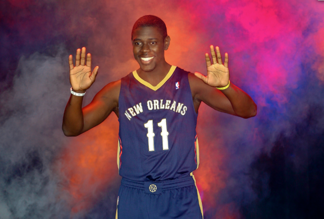
3. New Orleans Pelicans – Rating: Just stop it
It’s a bit difficult to design a jersey that makes a pelican intimidating, so the Pelicans get an “A” for effort. Similar to the Pistons, the Pelicans tried to incorporate a hometown feel with their jerseys. The font looks like it fits in with the Bourbon Street mentality. It’s reminiscent of Mardi Gras. The colors are navy, red and gold. Can you imagine what the Latin Nights jerseys would look like? Fans would ask for their money back if they had to watch a team wearing uniforms that read “Los Pelicans” on the front. Again, there should have been more flare. The logo is as boring as the Hornet was before the name change. Let’s see some intertwining stripes that blend down the side. How about pumping up the size of the font? Work with us here, New Orleans. I think it’s safe to say those who are getting ready to play NBA 2k14 will be rocking the old Hornets jerseys… a lot. You failed.
It’s the dawn of a new day in the NBA with Adam Silver taking over as commissioner. Here’s to all the new jerseys that are going to be implemented while he has the job. And in case you haven’t heard, the Los Angeles Lakers are in talks about debuting an all-black jersey. Remember how sick the white uniforms were on Christmas day back in 2004 when they debuted? Kobe Bryant would dominate, as usual, in an inverted version of those uniforms. The black mamba could be back in black.
Add The Sports Daily to your Google News Feed!