Some of you may have heard this already, some may have not. As many teams wallowed in misery will do, the Detroit Lions changed their logo.
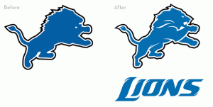
Personally, I like the sleeker design, but from a distance it looks like the Lion is slobbering. Not sure if that’s what the Lions were going for or not.
In light of this, here are, in my humble opinion, the best and worst logo changes in NFL history. Since a lot of really old logos sucked, mainly because teams lacked the power of computers to make logos, so the logos were hand-sewn, those have been discarded. Only Super Bowl-era logos were taken into consideration.
The Best
Biggest improvements over prior logos


Seattle made a good move here, and it resulted in them having success on the field. In addition to that, the replacement of the run-of-the-mill silver with the metallic blue helmets was a plus.
4. Miami (1996)
Small change by Miami here, making the Dolphin sleeker. While the new Dolphin is a little more cartoony, it also looks less like something from a 5-year old’s coloring book.
3. New York Giants (1976)
Not sure what the obsession with stencil-logos is, but this went from a completely awful logo to one that produced two Super Bowl championships.
2. Cincinnati (1981)
Gotta give credit where credit is due here. The Bungles went from having their name on the side of the helmet, like a lot of other teams of that era, to having one of, if not the most unique helmet in football. Good work here. Too bad the current players mistake the stripes for jail bars.
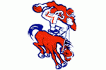
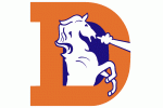
1. Denver (1968)
What were the people in Denver smoking between 1962 and 67? Wait…don’t answer that, it was the 60s. But that’s still no excuse for a bad logo. In spite of the new logo looking a bit like a unicorn, this was still a vast improvement over their old Gumby-and-Pooky logo.
The Worst
Teams whose new logo was worse than the old.
5. Buffalo (1974)
What is a “Bill” anyways? Buffalo stuck with the “Bison” idea but slapped a big red gash into the side of it. By itself, the blue leaping Bison would have been cool. But the red streak just makes it look, well…lame. Add on to this that the Bills uniforms now look like they have bibs on them, it might be time to send in the big Gunn.
4. New York Jets (1998)
The Jets went back to a logo reminiscent of the ones they wore back when they were relevant. But guess what? They still sucked. At least the old Jets logo incorporated something about the team’s nickname into it.
3. Washington (1970)
The Redskins took a logo, helmet, and color scheme very similar to Florida State’s and completely turned it on it’s head. The R logo came with the ugly yellow helmets, a divergence from the quality burgundy that the team sported before the change. Luckily, the Redskins got it together and brought back the red helmets.
2. Tennessee (1999)
I realize that naming a team the “Tennessee Oilers” didn’t make much sense. But then again, neither does “Titans”. This one makes the list mainly because it destroyed a classic logo. For those who may not remember, Tennessee played as the Oilers for one season after moving before changing their name to the “Titans.” Luckily for everyone, the NFL is celebrating the AFL this year so the Titans will don the old Houston Oilers uniforms and we’ll get to see the Oil Derricks once again.
1. Tampa Bay (1997)
This isn’t Pirates of the Caribbean, Jack. Bucco Bruce was not only a classic, he also had that look of a swashbuckling buccaneer. The raised eyebrow, wink, and knife in his mouth said “I’m not taking shit from you.” Unlike the new logo that is eerily reminiscent of the Oakland Raiders logo with the skull and crossed swords. And the football on the flag? Really? Bring back the Creamsicles.
Add The Sports Daily to your Google News Feed!
