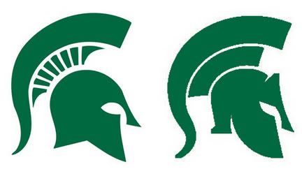
According to MLive, Michigan State University will be unveiling a new logo this upcoming April. Apparently, the new insignia was discovered by a Spartan fan on the U.S. Patent and Trademark Office official web site. According to Heather Swain, the Assistant Vice President for University Relations, the new look is “the result of a two-year collaboration between MSU Athletics and a team of top designers from Nike.”
Two years? Top Designers? Wheww. To me, the new logo looks like the product of a 2nd grader trying to doodle Sparty during arts & crafts time. If MSU officials indeed make this Robo-Sparty a reality, they will be tossing aside a terrific classical take on the Spartan gladiator helmet. In my opinion, there is much to be said for tradition at college institutions. You don’t see Notre Dame cashing in their infamous ND emblem for something more chic or Penn State adding any pizazz to their ageless helmets. Why? Because they’re simple, tasteful and they just work.
While my allegiances lie with the Maize n’ Blue, part of me sympathizes for my Spartan comrades. However, the other part of me just has to snicker as if my little brother just received a god-awful haircut. Sorry, little buddy.
Add The Sports Daily to your Google News Feed!
