The Sabres new uniforms aren’t royal blue and that’s okay. The slight tweaks the Sabres jerseys received in the Adidas changeover drastically improved the overall look of both the home and road jerseys.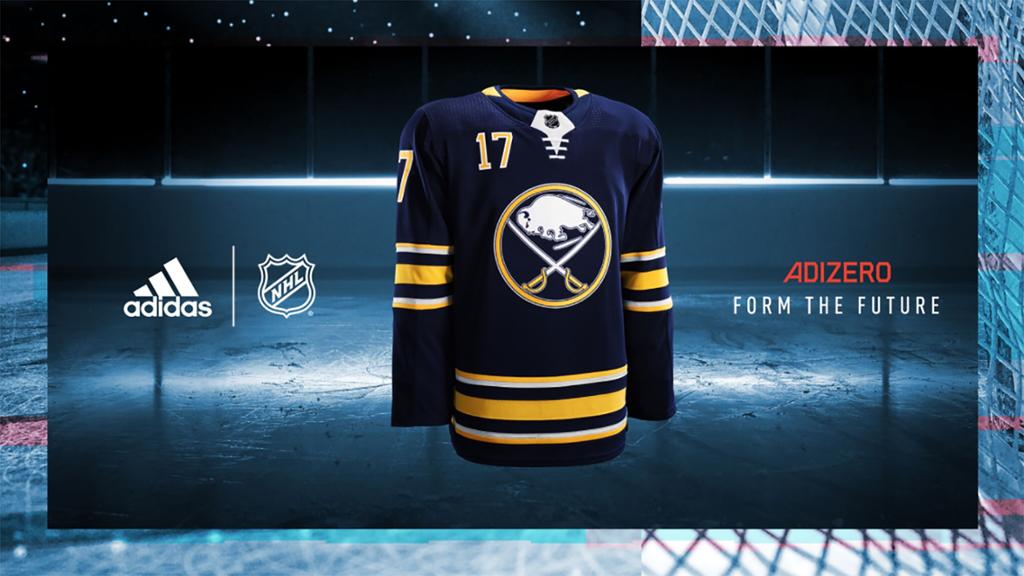
In conjunction with Adidas and the NHL, the Sabres took a step away from the grey/silver accents that have graced the uniforms since featuring prominently during the red and black era and being utilized as an accent on the Slug jerseys. Gone are the wildly unpopular apron stripes and arm pit accents.
It’s unfortunate that there was so much hubbub regarding switching to royal blue from navy because it ultimately distracted from what was one of the better redesigns in the entire league. Prior to the rumors and guesswork – some of which I’m guilty of – I think the number one item on almost every fan’s hit list would have been the silver accents. With those two prominent and unpopular features in the trash, the Sabres uniforms are cleaner and simpler and look that much better as a result.
Sabres fans have been left wanting with the last few rounds of jersey unveilings in Buffalo and around the league. This time the Sabres are among the best of the new designs, vastly surpassing the likes of New Jersey and Nashville and offering up a fresh new look with just a few small changes.
This will be our look on the road for 2017-18. #IsItOctoberYet 🏒 pic.twitter.com/Bk21Nwx5L4
— Buffalo Sabres (@BuffaloSabres) June 21, 2017
Note the white jerseys do not have any numbers in the official mock up. If they did they’d have numbers on the chest just like the blue jerseys do. There won’t be that type of difference between the two.
Hopefully fans can look past the lack of sweeping changes and accept that the redesigned jerseys, as minor as the designs may be, are most certainly for the best. The team will look better on the ice, the jerseys won’t be as busy and fans ought to be happier donning the new sweaters in the arena.
The new uniforms aren’t without their flaws as the new Adidas template seems to have some rigidity in certain areas. This isn’t much different from when the Reebok Edge was introduced or even when Nike took over the NHL uniforms (more on that connection later). The good news is that most of the time the leagues and designers realize what is and isn’t working and fix the errors on the fly.
A closer look. #IsItOctoberYet 🏒
More on the new jerseys from @adidashockey ▶️ https://t.co/NzNYm0dALr pic.twitter.com/bOuqkQMSQL
— Buffalo Sabres (@BuffaloSabres) June 21, 2017
Both the home and away jerseys have improved and I look forward to seeing them on the ice this year. Here’s a list of both the good and bad aspects of the new Buffalo Sabres Adidas jerseys.
The Good
Toned Down Silver Trim – I don’t have as much disdain for the silver trim as other fans do. However, the apron stripes on the front of the uniforms and the pit stain accents under the arms never seemed to work. They were too busy and removing them cleans up the overall look of the uniform and brings it much closer to the original design.
New Crest – Adidas has a whole bunch of buzzwords for the tech featured on the new uniforms, what’s the most interesting to me is the addition of mesh to strategic portions of each team’s crest. The Sabres crest will see the entire blue background utilize the new material and I think it ought to provide a cool new wrinkle to the uniform. The release with all of the new features can be found here.
Laces Stay – Even though the Sabres appear to be using faux laces as opposed to real laces, keeping that feature, if only for the visual aesthetic was a great decision. There would be a ton of dead space on the jerseys if the laces weren’t present and even if they aren’t proper laces, keeping this feature on the jerseys was vital.
Liquid Metal NHL Logo – Count me in the minority, but I like it. It’s rumored to be a deterrent against counterfeit jerseys and if that’s the only reason Adidas and the NHL included it, I’m more than okay with that decision. But I don’t mind the look of the liquid metal either, it’s a small little feature that few will pick up on, but it’s good in my opinion.
Striping Pattern Unchanged – The only way to improve the stripes on Buffalo’s uniforms would be to dump the silver trim and return the white jerseys to the alternating pattern which defined the team’s original jerseys. Looking around the league, a number of teams saw their stripes change for the worse through this redesign and even though these may not have been improved, this was an instance where no change certainly didn’t hurt anyone.
Dimpled Shoulders – I was a big fan of this feature on the World Cup of Hockey jerseys and I like it on the NHL uniforms as well. It’s understated and hard to discern from distance but a cool wrinkle when you get a uniform in your hands.
No Three Stripes – Early theories on the Adidas takeover pointed to the potential of featuring the traditional Adidas stripes on all of the NHL uniforms. Like the breakaway track pants that were big in 1998, only on a jersey. Turns out that wasn’t the case and we’re better off for it.
The Bad
Toilet Bowl Collar – Given how poorly accepted the Nike football two-tone collar was, I’m a little surprised the NHL and Adidas followed such a path. The blue jersey doesn’t look too bad with the two-color collar but it really stands out on the white road jerseys. Perhaps this is something that’s resolved down the line, but the overall structure and pattern of the collar itself makes this seem doubtful.
NHL Shield Cutout – One of the things the Reebok Edge did best was the triangular cutout for the NHL shield. The new Adidas jerseys use a much more prominent design which stands out more upon first viewing of the jerseys. It’s hard to tell if the Sabres version is white or silver (probably white) but it doesn’t work well on the home jerseys. It looks fine on the road jerseys, but the contrast color is a little too stark given the collar design on these new jerseys.
Lack of Collar Design – A surprising number of teams have added some form of inner collar design for the upcoming season. The Sabres had an inner collar design on the Turd Burgers but don’t feature any sort of design on the new uniforms. This seems like a missed opportunity for the team and hopefully it’s something they’re able to amend in the near future.

One thought I shared on Twitter would be a very simple take on the current wordmark and the year the team was founded. Placing 1970 over top of a single Sabre would provide for a simple yet powerful design for the inside collar of the jerseys.
Front Numbers – This is a minor quibble at this point but the Sabres are literally the only team left with numbers on the chest of their jerseys. It’s time to give up the dream, especially with the inclusion of numbers on the front of the helmets.
Add The Sports Daily to your Google News Feed!