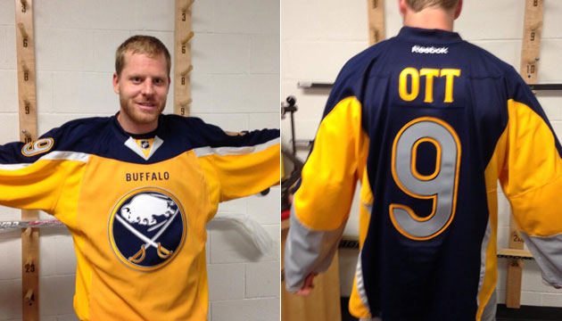
Things went off the rails last year when the Buffalo Sabres unveiled their newest alternate uniform that has since become known as the Turd Jersey (or #TurdJersey). It was the fourth alternate sweater designed by the Sabres and is by far the worst alternate jersey ever to grace an NHL ice surface.
In honor of tonight’s Second Annual Black and Red Night, I thought I’d honor the other third jerseys worn by the Sabres in an unofficial, but definitive, ranking.
Third jerseys can be tricky. Sometimes teams opt for a futuristic look which often results in mixed opinions. The most recent trend in hockey has been to lean towards traditional or “throwback” designs when it comes to these uniforms. The Sabres have run the gamut in terms of their designs and my rankings are based on a number of factors.
An effective third jersey should serve as a true alternate to a team’s current uniforms. Above all else that is always my first point of evaluation on an alternate uniform. That is obviously a broad definition as the Sabres themselves have done a good job differentiating their home and away uniforms from their alternates, but they haven’t always had well executed jerseys. The key, for me, is something that offers a truly different look to the team’s normal set of uniforms while staying in line with the overarching brand standard. Ultimately determining how a certain jersey fits a team’s identity requires a handful of different evaluations, but the final determination still falls under one umbrella.
One feature I’ve grown to appreciate with any third jersey is the use of an alternate logo. Plastering the current crest on a drastically different uniform can often bring terrible results and introducing an alternate logo that aligns with the team’s #brand is not only a way to branch out from the traditional home and away uniforms, but many alternate logos and jerseys have been quickly adopted as home and away uniforms by teams around the league. Look no further than Los Angeles and Minnesota as great examples of this.
The final way I like to look at a jersey is simple looks. Does it pass the mirror test? That doesn’t mean a jersey can only have horizontal lines, neck ties and traditional design points; simply put, if the jersey has an attractive, flowing design, I’m probably going to like it quite a bit.
With all that taken into consideration, here is how I rank the third jerseys worn by the Sabres:
1. Red and Black “Butter Knives” – I’ve wavered on these jerseys a bit through the years. I remember 
They do everything an alternate jersey should do. The red sweater was a stark difference from the white and black jerseys Buffalo wore on a nightly basis and the screaming red jersey not only stood out brilliantly but also stayed perfectly within the look the Sabres had at the time. The traditional striping design is perfect and contrasted the futuristic, angled stripe pattern of the home and away jerseys while still drawing from some contemporary features (the goofy neck, for one). Lastly, the logo brought Sabres back to a Buffalo uniform after the original black and red uniforms all but eliminated the team’s namesake from the duds. Outside of the shoulder patch, there were no swords on the uniform beginning in 1996 and these changed that. These aren’t too popular amongst many fans, but I can’t help but appreciate how the ticked every mark on the alternate jersey checklist.
2. 40th Anniversary – Another perfect example of finding a new package with the same colors. The Slug all but prohibited the Sabres from unveiling an alternate uniform with contemporary design strokes and the organization
Honestly the only thing keeping this from the top spot was the horrible decision to include an off-color nameplate and felt, cross-stitched numbers. Contrasting nameplates are never a good idea (looking at you Philadelphia) and the gold based nameplate on these were terrible. Combined with the overdesigned feature of felt numbers, the back of these uniforms went a step too far. Truthfully, the numbers wouldn’t be nearly as obnoxious if the nameplate was royal blue with gold lettering, but I suppose that was too hard to accomplish. Going with royal and gold over navy and gold (the team’s color scheme at the time) loses style points but nothing that disturbs me too much.
Bonus points for the matching socks, pant shell and helmet stickers.
3. 2008-09 Return to Traditional pattern – This may be more of a surprise than
These jerseys set the stage for the transition back to the original crest in 2010 and were a massive hit. They were a true deviation from the home and away uniforms and had the added bonus of creating a new(ish) crest that was truly an alternate to the Slug jerseys.
4. 2006-07 Traditional jerseys – The Slug was a massive failure, we can all agree on that. While the jerseys themselves were actually really awesome, the logo was panned and died a necessary death. The first year the Sabres wore the Slugs they had these jerseys to accompany them and they served to calm the masses a bit. For some reason I feel as if they were a last second addition to the arsenal after the organization realized the logo was horrible. Here’s how I see things transpiring:
Executive: Okay team, it turns out that everyone hates the Slug logo but there’s no way we can change lanes now so we are going to put a number on the front of our original jerseys and call it an alternate uniform. Sound like a plan?
Staff nods in approval
What was great about these uniforms is they served as an outlet for everyone who really hated the Slugs. The problem was that the number on the front looked idiotic, there were no matching pant shells or helmets and the royal blue didn’t match the navy used in the home and away jerseys. Granted, the royal vs. navy thing is small potatoes in my opinion, but it still results in a deduction. These jerseys strike me as something that was mailed in at the last second, not a well thought out piece of the rebranding of the team that came in 2006. If these had been part of the plan the entire time they either would have been navy, had matching pants and helmet decals or both.
5-499. Literally every other alternate jersey ever.
6. Turd Jerseys – These are an embarrassment. They’re over designed monstrosities with a stupid two-tone front 
I’m sure most of you disagree strongly with my rankings and I’d be more than happy to hear your arguments and opinions in the comments section below or via Twitter. Don’t forget tonight is Sabres Black and Red Night and to wear your black and red gear to watch the Sabres take on the Lightning.
Add The Sports Daily to your Google News Feed!