Today we will be looking at the Buffalo Sabres. If you haven’t been following the project, we’ve already looked at the New York Islanders, the Phoenix Coyotes, the Florida Panthers and the now defunct Atlanta Thrashers. Here’s Cole’s thought process while working on the Sabres.
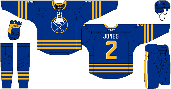
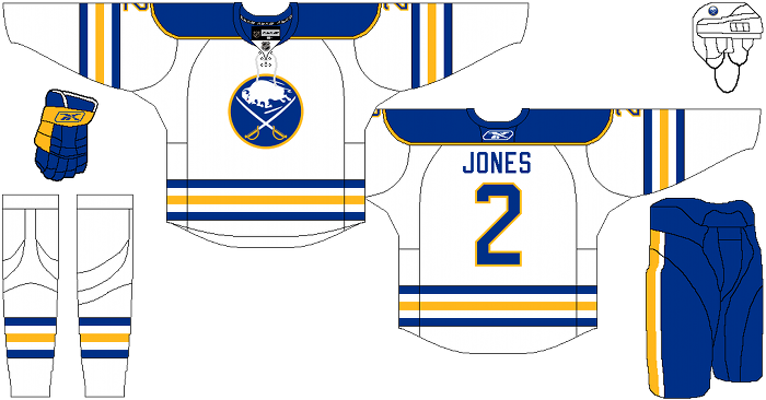
Cole’s description: The home and road are the traditional Sabres uniforms, with traditional colors and traditional everything. Not the stupid modernized versions they wear now, that are the epitome of “over-designed”. The colors are the shades used on their current third jersey. Royal blue and warm yellow.
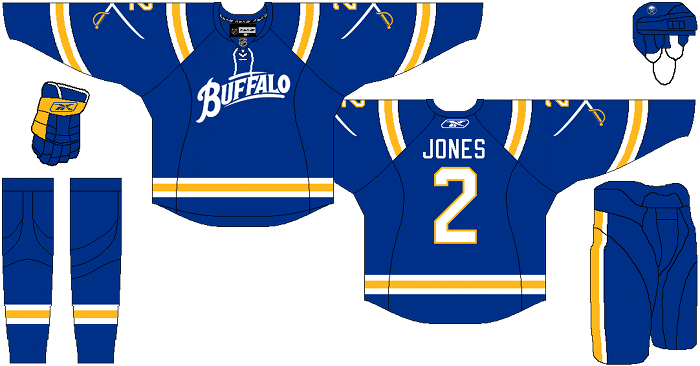
The third jersey is a more straight forward homage to the Buffalo Bisons, that their current thirds pay tribute to. I went with football-style shoulder stripes, like the Bison and Seals wore. I also killed all the contrast stitching and contrast nameplate tomfoolery that ruins their pretty awesomely unique alternate right now. Other than that, pretty straight forward, but still a well-deserved return to what they belong in.
After the jump, a look at the new Sabres…
Alternate:
Phil Kneitinger’s comments: It’s hard to do wrong by the Buffalo Sabres when your starting-off point is the classic uniform set so beloved by the team’s fans. The blue home jersey is pretty much perfect. The white away jersey is 98% of the way there – the only thing I don’t like about Cole’s design (and this is personal opinion shared by many others) is that the torso stripes should be alternating as compared to the sleeve stripes. It’s a trait that made the traditional white Sabres jersey so unique. Neither jersey features the smaller crest patch on the shoulders, but that’s not really a big deal to me.
That blue alternate jersey is…interesting. I love that Cole kept the Buffalo script intact, and that he simplified the nameplate and numbers, but the crossed sabres on the sleeves just doesn’t do it for me. The stripes on the sleeves are interesting though. I dig ’em lower on the sleeve, but the broken shoulder stripes don’t really strike my fancy.
Cole gets serious bonus point for putting vertical stripes back on the hockey pants. Every team should have stripes on their pants.
Days of Y’Orr’s comments: This is how Buffalo should look. Boom. Period. The Buffaslug should be hosed in salt and left on the side of the road to die. Buffalo’s traditional logo could be one of the greatest NHL logos invented. The first two uniforms are pretty self explanatory. The third jersey? Masterful. Buffalo’s real third jersey? Man. The name plate looks like shit and the stitching on the numbers may be the worst thing that’s happened to numbers, ever. While the home and away may or may not be an upgrade to the originals, I tink the alternate is a lot better.
What do you think? Love it? Hate it?
Add The Sports Daily to your Google News Feed!

