 Welcome to the “Re-Imagining The NHL” project created by Cole Jones. Cole has been great enough to allow Days of Y’Orr to post his idea on different teams with his spin on them. You can follow Cole on Twitter. Please feel free to comment on the team below. Feel free to read the official announcement of the project here. The Dallas Stars is Cole’s home team and he’ll tell you so in his comments. He’s a HUGE Stars fan, but we like to get the opinion of others so today we were lucky enough to get Luther Xue from Stars of Big D.
If you haven’t checked out our other teams, visit the Re-Imagining the NHL team page. The team page will be updated daily with every team we update. So before we take a look at the uniforms, lets take a look at Cole’s comments on his squad, the Dallas Stars.
Cole’s comments: I present you with my concept for the greatest hockey team known to man. My Dallas Stars.
This concept took a lot of thought and a lot of effort. A lot of scrapped ideas. I’ve always found it incredibly difficult to make a concept for my favorite teams… simply because every look in team history has a bit of nostalgia for me, so it’s hard to decide which elements I’d like to put together in my own design. I know what I don’t like about every Stars jersey ever, but I’m not sure I know what I do like about them all, other than that they’re Stars jerseys.
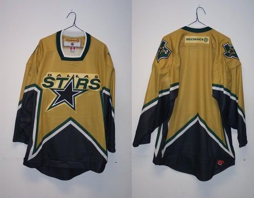
With this concept, I made a few noticeable tweaks. The first thing you’ll probably notice is the shade of green I used. It’s not exactly the same shade of Kelly green that the North Stars and 1993 Dallas Stars used, but it’s pretty much halfway between that shade and the current green used by the Stars and Wild. I actually really like the overall look of the Stars white sweaters right now. The level of green and gold on there is perfect, and looks like modern day version of the North Stars, without biting any of their former designs in the process. It’s far from perfect however, with the curved arm stripes and minimal waist stripes… I like the general look enough to use it as a base for my home and road, with an emphasis on green and gold, and black dropped to a tertiary (or even quaternary?) color. Basically, I drew inspiration from Team Canada in the Vancouver Olympics, with their solid red and white uniforms with black equipment. I think it’s a way for Dallas to really stake claim as THE green team of the NHL, without going full-out head-to-toe green, which can look overwhelming in some cases (especially with brighter greens like the shade I chose). I also drew inspiration from the now-defunct Iowa Stars, who used gold numbers on their green sweater, rather than the customary white.
The alternate jersey was inspired by the old London Knights black sweaters (Tavares-era) which were in-turn inspired by the 91-Cup-Run era Stars jerseys. The logo on this sweater was actually designed by my good friend Ken Chernoff (Editor’s note: Seriously, go check out his stuff, it’s fantastic). I made a few color tweaks and alterations to it, but the genesis of the entire logo design came from that man’s mind. It’s basically a Dallas version of the classic North Stars N-Star, with a D for Dallas. Rather than having the Star in the “northern” part of the logo, it’s in the southwest corner of the D, also giving the logo a subtle boot-and-spur shape. It’s pretty ingenious, so I made sure to ask him for permission so I could include it in my concept. Interestingly enough, I showed that very logo to Brett Hull about a year ago during a conversation about the Stars up-coming alternate jersey that he has had a hand in designing, and he was intrigued. He said that our future alternate jersey would be green and inspired by the North Stars aesthetic, but I haven’t heard any word on what he plans to use as the logo… Ken said that he hasn’t heard anything back from Brett on the design in a year, so we’re hoping it’s not going to turn into a Baltimore Ravens situation. Regardless, I think it’s genius, and that’s why I’m rambling on.
Without further ado, here is my concept for the Dallas Stars, in all their Kelly-Green-Glory.
After the jump, the Kelly-Green Dallas Stars…
Home: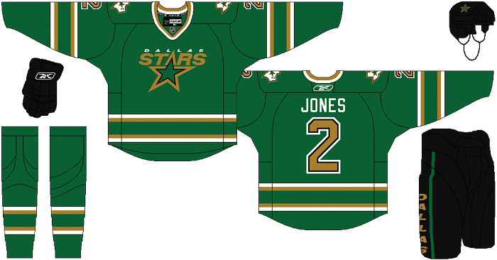
Away: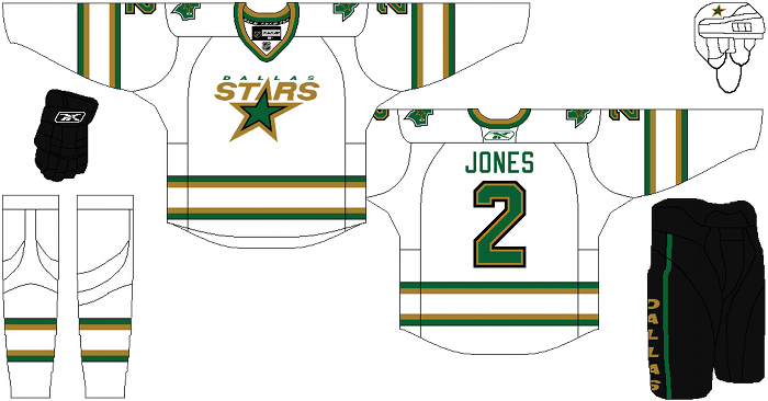
Alternate: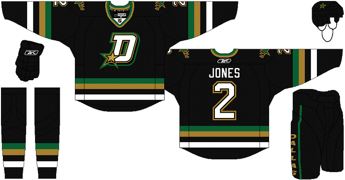
Luther Xue’s comments: Home Jersey – This has always been a personal preference of mine, but I just absolutely hate it when green is the dominant color on jerseys. Something about it has just never looked very pleasing to the eye to me, especially when it’s a lighter shade of green. Although this might all stem from the fact that as a Cowboys fan, I hated the Eagles and their ’80s-’90s kelly-green jerseys with a passion. I could live with a darker shade of green like the one in this jersey though.
Road Jersey – I like the look of this one, crisp and clean. I also like the look of the current white jerseys. Keeping the player’s name in the green color is a must and I think I’d prefer it with just green instead of having a gold outline around it. I feel like the striping around the waist is missing something, but I’m just not sure what. Overall though, the white jersey is excellent.
Third/Alternate Jersey – I love the look of this one. The Texas vibe that it has is great (even if it does have a San Antonio Spurs feel to it). Moving the usual Stars logo to the shoulder and replacing it with that D would be great. I wouldn’t mind if they rolled out with this every game. It’s also about 2 million times better than the old alternate jerseys that, for some reason, had a lot of red color to it and had the bull-like constellation as the logo. That thing still gives me nightmares. The only thing that bothers me a little is the striping. I don’t feel like the extra green is needed on the arms. I say replace the gold with another black stripe, so it’s pretty much two black in the middle. Have a thinner gold stripe surrounding those, and then a white at the edges. The waist stripes look fine to me though, although I think it would also work if they weren’t even there and it was a solid black.
Days of Y’Orr’s comments: Before I begin, the pre-Edge Dallas Stars jersey with the star cutout is one of my favorite jerseys of all time. Why? I have no friggin idea, but I love it. When Cole re-designed the jerseys, I wanted that jersey to come back but I knew it would look like shit on the Reebok Edge template. When it comes to the kelly green home jersey, I like it. It’s nothing special but it definitely would pop out on the ice. When team’s come up with concepts for their uniforms, they should design something that pops on the ice. Those bland Florida Panthers and Columbus Blue Jacket turds don’t pop because they’re way to similar and way to boring. Do I like the idea of an NHL team wearing this shade of green all the time? Yeah, I do. It would differeniate the Stars from the green they use now (which is close to what the Wild use) and the gold number is unique.
The away uniform is perfect. Crisp, clean, beautiful.
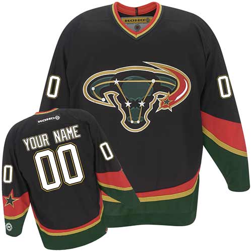
The alternate is a great one too. Dallas has always had trouble when it comes to making a good alternate sweater. First there was the Mooterus jersey. For those who aren’t in the know, it’s called the Mooterus because it’s a cow and the star pattern is oddly shaped like a uterus. So bam, Mooterus! There was also a rumored gold third for the Stars, but I don’t think it was ever seen. Lastly, when Reebok came knocking at the NHL’s door, Dallas produced one of the most uninspired alternate jerseys this side of Florida. It’s their fucking away jersey with a DALLAS wordmark on the front and different shoulder patches. Same striping, same layout, same colors. What’s the point!?
What Cole did is he made an alternate jersey and ACTUAL alternate jersey. The logo is sharp and I like it a lot. Ken Chernoff did a fantastic job with this one. The only thing I would change about this jersey is the green stripping. I would remove it completely.
Cole did an amazing job with the Stars. What say you?
Add The Sports Daily to your Google News Feed!