We are chugging along with “The Project” and it’s been a lot of fun. I’m really excited for all the feedback from not only our readers but other bloggers in the community. The difference in opinions have sparked some great debate and conversation. If you haven’t checked out any of the other teams, you can do so here. Today we’re looking at a team out west that (other than my beloved Flames), I have a huge bromance for. I love the Kings and I’m not really sure why. Well, while I ponder my mancrush, here’s Cole’s thoughts on the Kings.
Editor’s note: This concept was designed before the Knigs announced that they would make their third jersey alternates (see logo at the top left) the primary home and road for the 2011-2012 season.
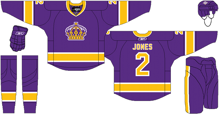
Cole’s Comments: Proving that simple can still look good, my Los Angeles Kings.
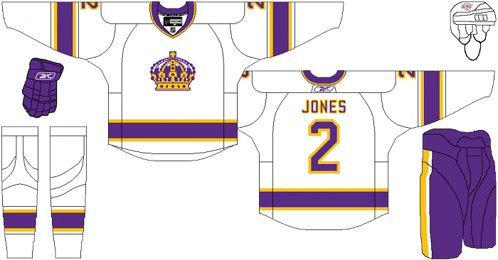
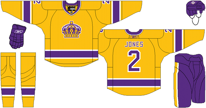
Not much to say overall. Inspired by their recent throwbacks, but altered slightly to my preferences, I return to the Forum Blue and Yellow. The crown is from one of their original logos, but has never appeared on the front of a jersey before. Back when the Kings originally wore purple and yellow, the yellow was their home jersey, but here it is the alternate. Purple is at home, since the NHL mandates dark colors at home. Rather than make yellow the full time road jersey, I figured it would be best to make the roads white, and give the Kings the option to wear the yellow on the road, or at home as a nod to their original homes.
After the jump, the LA Kings…
The Royal Half’s comments: Ahhh, a Los Angeles Kings jersey re-vamp. Almost as common as the sun rising and setting. People may give gruff to the Vancouver Canucks franchise for changing uniforms on a daily basis… but in the Kings 43 season history, they have changed their uniform/logo 7 times… or roughly once every 3.5 playoff appearances.
If you really wanted to make a splash, for the Alternate jersey you would bring back the head to toe gold jersey. Worn during the Kings first few seasons in the NHL, it was like cheering for a six pack of bananas. Don’t tell me you wouldn’t love seeing this flying down Anze Kopitar’s wing.
In terms of this particular white road jersey… man, that is awful. Purple and gold highlights on a white jersey is hard to pull off… even if you are the Minnesota Vikings. For me, I couldn’t imagine a NHL team sporting this look. It’s way too distracting and doesn’t feel “clean” in any sense. I’m actually pretty happy with the Kings current use of the black and white jerseys. Sure, it may not be the most original, but it makes me think I’m waiting for Wayne Gretzky to hit the ice… and I’ll take that feeling any day of the week.
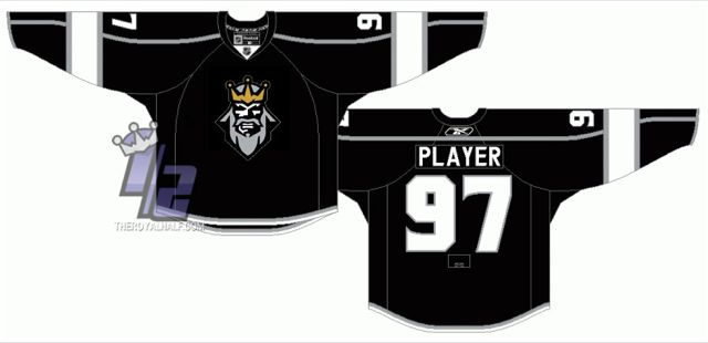
But for this overall “re-imagining” I take umbrage with the use of the Crown. Sure, it may not be an actual “Queens” crown… but it’s pretty lady-like. How is a team supposed to play mean and dirty when they are wearing the headgear of someone who should be eating tea and crumpets? The Kings have been struggling for years with their logo identity… are they a team that wears a crown on their chest… or are they a team that wears some sort of shield, coat of arms type thingy on their chest? The answer is simple… it should be an angry, bearded King. (click the images for high-res images)
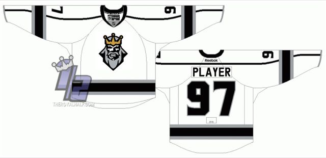
Originally, the often-made-fun-of logo from the Kings disastrous 1996 Alternate jersey had a grey beard instead of purple beard. So don’t tell me it wouldn’t look fucking hot on the new Kings jerseys. Now that’s how you re-imagine a franchise!
Days of Y’Orr comments: First off, The Royal Half fucking brought it. It’s shit like this why I’d love for a Bruins/Kings final if only to have them come to Boston and drink their black and purple faces off with ours. Okay, first Cole’s concept. I hate it. When it comes to the Kings, I’ve always hated that logo. Like RH, I’ve felt it was a little to feminine for a hockey team. My favorite Kings jersey will always be the purple and black home. I’ve also never understood why people try to take the black out of the Kings. I think that a black primary fits the team much better than any other color and the team would be smart to stick to the Gretzky era colors.
The away uniforms are really hit or miss depending on your style. Again, not feeling it.
Lastly, let’s touch on the alternate. Yellow alternates haven’t worked very well in the NHL, especially if you look at Nashville’s mustard yellow alternate and the dreaded Pooh Bear worn in Boston. To continue the trend, this jersey works if this color scheme if your thing. Again, it’s not mine so I don’t like it. The pruple and gold attack going on with the third is what I would imagine Birdie and Grimace‘s retarded love child from McDonalds would look like. Why their child is retarded is beyond me, but I bet it’s because Birdie is a crack fiend.
I understand Cole’s thought process in everything, but like I said before, I’m a silver and black kind of guy when it comes to the Kings.
What say you? Black and silver or purple and yellow?
Add The Sports Daily to your Google News Feed!
