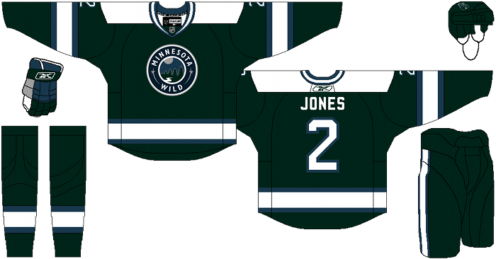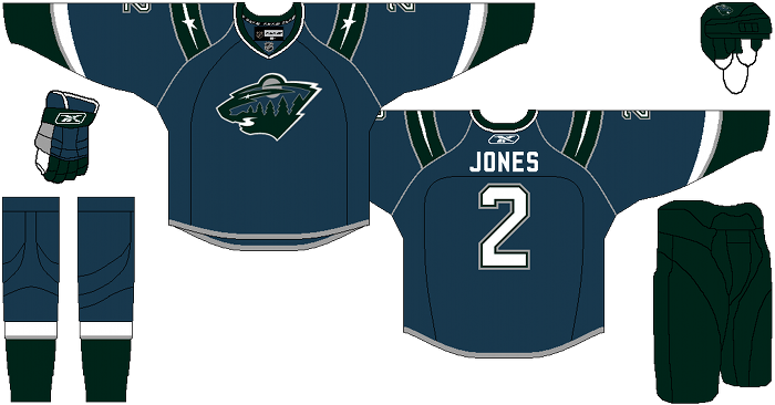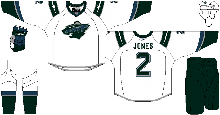
We’ve looked at changes with the Buffalo Sabres, New York Islanders, Phoenix Coyotes, Florida Panthers and now defunct Atlanta Thrashers. Today we’ll be looking at the Minnesota Wild, which Cole has some big changes planned for.
Cole’s Description: Finally up, after weeks of trying to fix one of the most broken identities in hockey (in my opinion), I present the Minnesota Wild.
Tackling this team required a strategy. First off, the color scheme of red and green clashes so horribly in my eyes. It can work, in some places, but I just don’t think it works at all in the Wild’s identity, so that had to go. I actually like the logo the team has, and find it very clever… but the colors had to change. The other big issue that stands between the Wild and a good identity has to do with chronology. A team whose name and logo are so ultra modern that it’s hardly even a noun (let alone a plural noun) should NOT try to dress like an Original 6 franchise. Nor should a team that never saw the 1990’s, let alone the 1950’s.
With this in mind, I gave the Wild some sleek modern threads and a color scheme that while and dreary has a very “Wilderness at night” vibe to it.
The original plan was to give Minnesota a green version of the home jersey as an alternate, but my girlfriend stepped in the way and said that it was too boring to do that, and helped me put pencil-to-paper on some ideas for an alternate jersey. I settled on a simplistic contrast to the ultra-modern home and road, meant to make subtle reference to the Minnesota North Stars, while still respecting that one team’s legacy has nothing at all to do with the other.
I hope you don’t hate it, because I put way way WAY too much work into this concept. It just further underscored how much I hate everything about the Wild’s identity.
After the jump, a vastly different Minnesota Wild…
Alternate:
Derek Felska’s comments: The first word that comes to my mind is ‘Yikes’ on the newly designed Wild sweaters. I am not sure if it was intentional but your sweaters have a strong ‘Timberwolves’ like vibe to them; or we look like more stylized version of the Hartford Whalers. I think some of the contrasts in both colors and lines work very well, especially the road whites but the others are far too dark. In addition you also ignore our team’s current alternate sweater which in my opinion actually has a look that is sort of like the designs you were going after. What you have for our alternate is actually our current home jerseys.
http://www.hockey-jerseys.ca/images/minnesota-wild-third-jersey-rbk.jpg
Another Wild fan on Hfboards actually made a new Wild alternate that took the circular crest of our home jerseys and put it on the alternate sweater which again is pretty darn close to what you came up without abandoning our current color scheme.
While others I get that you hate our colors and you also do not like our team’s name; but I understand that our current color scheme certainly makes people think of a certain holiday, just as New Jersey’s old White, Red and Green ‘Sbarro’ jerseys had there own connotation I think perhaps the story of our jersey needs to be explained.
The logo was inspired by a contest, after the name ‘Wild’ won out over the Voyageurs, Blue Ox, Freeze and Northern Lights. The colors are symbolic with our state. Iron Range red, Harvest gold, Minnesota wheat (the offwhite color), forest green and white (snow) are all meant to fit our state. Yes we avoid blue; but that’s just fine as there are plenty of teams in the league that use that color. In fact everything in our logo is symbolic of the Wild. The moon / setting sun depending on how you look at it, the shooting star, the river, the trees and in our current home and alternate sweater the idea was to embody the state’s rich heritage of hockey. It was meant to look old school; with the laces at the top, the lettering and striping. The colors are limiting, but I’d rather we look the way we do than give up and just make a black jersey and put ‘Bolts’ or ‘Senators’ on it.
While I think a lot of fans love what we used to have in one of the best sports logos ever in the Minnesota North Stars we’re not that team anymore. We don’t want to be them anymore either. We’re the Wild and we’re damn proud of it.
If the team did decide to embrace a color change, I think its tough to say whether it would be greeted with enthusiasm or not. As an avid jersey collector, I think many fans were annoyed when the league went to the RBK Edge jerseys and how that made people feel compelled to buy the ‘new’ version of the jersey. They saw it as exploitation and marketing rather than something that had to be changed. A radical shift in jersey design would perhaps be seen the same way.
I don’t hate your attempt at a re-design. I guess I simply resent the reasons for it because it pretty much trashes much of the symbolism behind it (which by my guess was probably due to the fact you didn’t realize it). Yes, I realize we look like a Christmas-themed team. Is it perfect, no, but its a part of our identity. We do see ourselves as the State of Hockey. However, making our team look like the laughingstock Minnesota Timberwolves could be a major turn off for some fans. Our colors may not look as bad ass as Black and Gold, but we had our reasons for going with those colors I think that deserved more consideration on the part of your design.
Days of Y’Orr’s comments: Wow. This may the biggest change of all the teams we look at. First, I agree that the green and red concept of the Minnesota Wild is terrible. I always thought that they should somehow work the North Stars into the equation, but I know it would never happen. The Wild’s current home jerseys are red with a god awful circular logo as their MAIN LOGO! Why would you do this? People in art school are looking at that logo and committing suicide because their talents are going to waste! What Cole did in terms of logos works on all scales. First, it removes the circular bullshit as a main logo and went back to that strange coyote-head-thing. The biggest improvement with all of it? The color. The blue and green work much better than a green and red Christmas-style abortion. The blue looks like a throwback to the Kevin Garnett days with the Timberwolves and the subtle nods to the Minnesota North Stars work.
I think this is a major upgrade over the current uniforms, but that isn’t saying much to me.
So love it? Hate it? It’s definitely the biggest change we’ve seen so far!
Add The Sports Daily to your Google News Feed!

