Welcome to the “Re-Imagining The NHL” project created by Cole Jones. Cole has been great enough to allow Days of Y’Orr to post his idea on different teams with his spin on them. You can follow Cole on Twitter. Please feel free to comment on the team below. Feel free to read the official announcement of the project here. Since neither Cole or Days of Y’Orr consider this team our “home team”, we will do our best to bring in a fan of the team described to get their thoughts. Today we were lucky enough to get input from Laura, founder of The Active Stick.
A lot of people have complained that Days of Y’Orr hasn’t busted out “the big guns” yet when it comes to the Re-Imagining The NHL project. If you don’t consider Colorado a big gun, you weren’t around in the early 2000’s. We also have Minnesota, Phoenix, Florida, New York Islanders, Buffalo and Atlanta for you to check out. So if you don’t consider any of the teams we’ve looked at already big guns, here’s a bazooka to your fucking face. Let’s look at our most hated rivals in a two part…
…two part…
…two part post. As always we start with the words from the creator himself, Mr. Cole Jones.
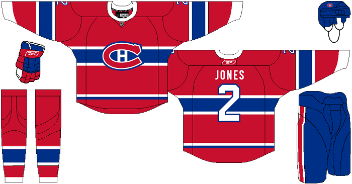
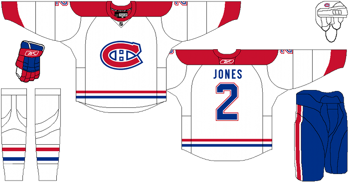
Cole’s comments: This one is less of a change (because you can’t mess with tradition, you can only hope to clean it up if need be)… but it really all started out as a reebok template concept, more than a Habs concept. Flipping through a couple of my hockey history books, I was really inspired by the retro rounded collars of historic sweaters. It’s just an aesthetic that I really enjoy, so I started tinkering with ways of making it fit into the modern style uniform while still having a place for the mandated NHL shield on the collars. My first attempt was to just slap an NHL logo on top of the actual collar like the Flames did with their throwbacks, but that just looked rushed and awful… so I took inspiration from one of my old grey sweatshirts, and put the NHL logo in a modified “Reebok triangle” under the collar. Hopefully it doesn’t look too much like a raggedy sweatshirt… but even if it does, I still think those sweatshirts have a vintage athletic feel, so it’s not entirely out of context.
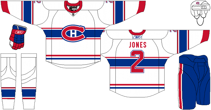
The home and road are absolutely nothing you haven’t seen before, and only minimally changed from what they’ve worn since the dawn of time, if at all. The alternate jersey, I returned to the chest-striped-white sweater they’ve had off-and-on through-out history. I toyed with making it the standard away, with the non-striped sweater as an alternate, but I couldn’t justify messing with the home/road they’ve had since everyone on this forum was born, so the alternate remains an alternate. My biggest pet-peeve with the standard way this sweater has always been rendered is the bleeding together of the blue and red (which looks even more muddy using the classic lighter red/blue shades that I employed with this concept), so I decided a slight separation with a white stripe would do wonders in modernizing and cleaning up the look. I tried to keep this sweater looking like a “red team” instead of a “blue team,” despite the bold blue chest stripe, and I think I pulled that off.
After the jump, the Montreal Canadiens…
Alternate:
Laura’s comments: these are really cool, and also beautiful (I may be biased). Funnily enough, not a fan at all of the collar update, the original one looks far less messy to me, but I guess it’s up to whatever aesthetic you’re into. As for the third, the first suggestion (in this email) is my favourite. It’s a cleaned-up version of the impossible-to-read alternate the Habs had as part of their 7865 jerseys from their Centennial year(s). Seriously, I was at one of those games, the numbering and blue stripe were one big blur from the upper bowl.
Days of Y’Orr’s comments: Despite our hatred for the Habs, you have to respect that their logo is one of the most iconic logos in the sports landscape. The home and away don’t look to different than the current uniforms the Habs use, but like Cole mentioned, the collars are the biggest thing. Round collars have always looked right on Original Six teams – until Reebok came along. Suddenly the Reebok Edge template screwed everything up and gave teams a more triangular collar and included the NHL shield. Cole’s collars work here and Reebok can still be happy that they have the NHL logo on the front.
The alternate is the biggy. Montreal is one of the teams who don’t wear a consistent alternate jersey. They will wear the odd barberpole jersey but they don’t have something they will wear consistently. I think Cole’s design is good, but I find it a little odd to see the large blue stripe that has been a staple on the red primary draped across a white jersey. That’s not to say it’s been done before.
Should the Habs look into using a consistent alternate? I don’t see why it could hurt them. I like the modernization of the alternate, but those arm stripes gotta go in my opinion. Also, I love the red number on the alternate.
There will be a part two of this that will look into a different set of alternates, so come back tomorrow for the second part.
Add The Sports Daily to your Google News Feed!

