 Welcome to the “Re-Imagining The NHL” project created by Cole Jones. Cole has been great enough to allow Days of Y’Orr to post his idea on different teams with his spin on them. You can follow Cole on Twitter. Please feel free to comment on the team below. Feel free to read the official announcement of the project here. Since we are not experts on the team we’re presenting, we’ve gone out of our way to get one. Today we have Christian Arnold, Founder of Islanders Hockey Blog.
We’ve already taken a look at the Atlanta Thrashers, Phoenix Coyotes and Florida Panthers so now it’s time to turn our attention towards the New York Islanders. Here’s Cole’s take on his design.
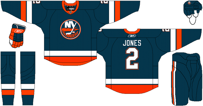
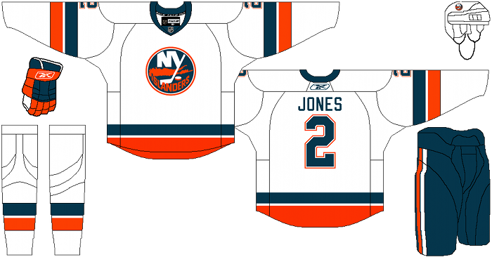
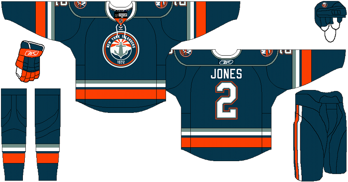
Cole’s description: After spending forever trying to make a decent crest for the alternate jersey, I’ve finished the New York Islanders.
I know they recently switched back to royal blue from their short sojourn in navy-land, but it’s my personal opinion that the Yashin/Peca era Islanders team is the best dressed team in their franchise history. Navy works for them. With that in mind, I set out to choose a shade of Navy that I felt would be unique, nautical, and visually pleasing, without picking one that looks entirely out of place in the Islanders color scheme. I think I chose a nice unique shade of greenish navy. To help balance out the colors, I took the Islanders red and gave it a slightly redder hue than what is currently used.
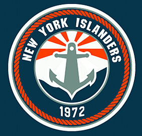
When it came to the Alternate, I didn’t want to give them a boring orange version of their home or road, or anything orange at all. I decided to take the parts of the Fish-sticks era uniforms that I thought worked and bring them into the fold. Instead of using a greenish-teal and a grey, I decided to use a color inspired by the Dallas Cowboys “metallic silver green” pants. I also created my own crest for the front of the sweater that I really enjoy, but wish it were executed better. Logo design isn’t my strong suit, so I’m open to suggestion or help if anyone has anything they’d like to say. I thought it was pretty clever, if nothing else. Since some of the detail is lost in the lower-resolution, I included a bigger version of the alternate logo. (click on the image for a high resolution picture)
After the jump, I present to you the New York Islanders…
Alternate Logo:
Christian Arnold: I LOVE THE HOME AND AWAY JERSEY!!! The navy blue jersey back in the late 90’s early 2000’s were one of my favorites and the resurrection of the design and color scheme was a good idea. I have no issues with the home or away jersey’s and if they were put into existence today I’d run out and buy one. With that being said I have a major issue with the alternate jersey and logo. To be perfectly honest, I hate the logo. It’s too much of a reminder of the Gordon’s Fisherman days and the thought just makes me want to vomit. To me anything that’s not the original log is a crime. Other than that I really like the alternate, home and away jerseys.
Days of Y’Orr’s Comment: Here’s a look at the Islanders current home and away jerseys. As you can see, they are both pretty similar, but the blue is different. I’ll be honest, I like Cole’s blue more than the royal blue New York currently uses. When I think New York and royal blue, I think more of the Rangers than the Islanders. The third jersey is fantastic, and while the logo is good, you know my thoughts on circular logos. With that on the table, I would rather see a circular logo like the Islanders one that has some creativity to it than something slapped together like the Penguins or Blackhawks logo. Overall, I think it’s a good looking set.
So again, what do you think? Love it? Hate it?
Add The Sports Daily to your Google News Feed!


