If you haven’t checked out our other teams, visit the Re-Imagining the NHL team page. The team page will be updated daily with every team we update. So before we take a look at the uniforms, lets take a look at Cole’s comments on the boys in blue.
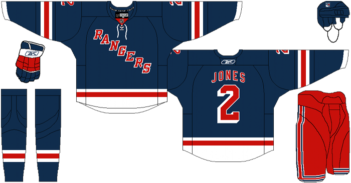
Cole’s comments: This is another that required only a few tweaks, rather than a complete redesign. The New York Rangers are an iconic team, so I didn’t want to stray too much from what has worked for them in the past. I did however draw a ton of inspiration from their new navy/cream/red alternates. I think those just look fantastic.
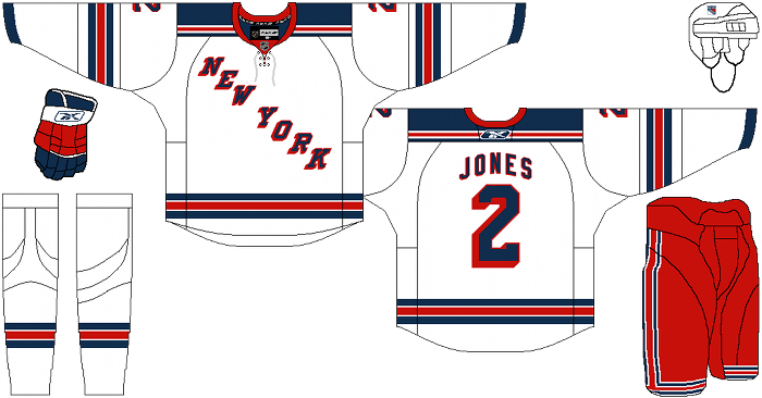
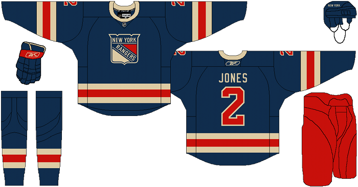
The first thing I did was changed the shades of blue and red to a darker more subdued and softer shade. I used the same shades of blue and red on the home, road, and alternate, since i hate when teams have royal home/roads and navy alternates. The home jersey has the familiar RANGERS wordmark, while the roads have the short-lived NEW YORK wordmark. The shield is the primary crest of the third jersey, which also uses cream instead of white.
Nothing more to say here really, as this concept is pretty self explanatory. I hope you like it.
After the jump, the New York Rangers…
Alternate:
Kevin DeLury’s comments: Rangers fans love the tradition of their original six team and, with the exception of the Liberty jersey, aren’t big on drastic changes to the beloved Blueshirt. So I have to admit I went into this with some apprehension.
I’ve got to be honest I was pleasantly surprised with Cole’s designs. Using the darker shades of blue and red for the home jersey really gives it a retro feel while keeping with the traditional look we Rangers fans have come to identify the team with. Big time fan of this subtle color change.
As far as the away white jersey, this is a concept I’ve heard a lot of Rangers fans wanting the Blueshirts to wear during the Winter Classic this season. Again the darker colors work real well while replacing the “Rangers” with “New York” is similar to what was done with the very popular Heritage Jersey the Rangers unveiled this past season in honor of their 85th anniversary. Again this is a jersey I feel Rangers fans can get behind.
Here is were I feel Cole went wrong. The third jersey he designed is very much a cross of the Heritage Jersey with the short lived 1970s Shield jersey both of which I like. Unfortunately, when merged they just don’t mesh well. If you’re going to use the cream color to represent an old school sweater look you can’t just pop in a modern logo. Maybe changing up the signature horizontal RANGERS word mark to more of a bow look with a number underneath would have looked better.
I felt like Cole did his homework and made some interesting tweaks to the home and away jerseys, but he missed the mark on the third jersey. The Rangers heritage and tradition deserves more of an effort.
Days of Y’Orr’s comments: Lets get this out of the way early. I hate the Rangers. I have no idea why but I hate everything about them. I know that I shouldn’t bring my hatred for the Rangers to the project so I’m going to try and leave it “at the door”. In terms of the design for the home jersey, it’s not much different than the jersey the Rags rock now. The biggest change in all of these is the color. Like Cole mentioned, the blue and the red are darker which don’t contrast as much as the current uniforms do. Not much to say other than I like the change of the colors.
The away jersey is, again, similar in design to the current away uniform but this has two major changes. The colors that we already talked about and the NEW YORK diagonal that replaces the RANGERS diagonal. I love the New York wordmark. It’s something a little different and make the away jersey look a little classy (and that should mean a lot because I hate the term “classy” when it comes to sports).
The alternate jersey doesn’t really do it for me. I love the Rangers heritage jersey that was put out this season. I would’ve kept something along those lines. The rounded collar…eh, again doesn’t do it for me. Just not a fan.
Overall, the home and road are perfect. The alternate isn’t something I’d like to see on a jersey.
What do you think?
Add The Sports Daily to your Google News Feed!


