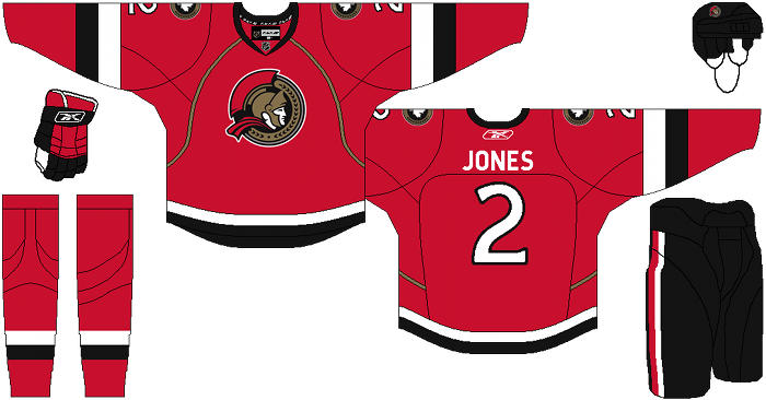
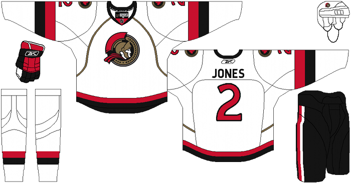
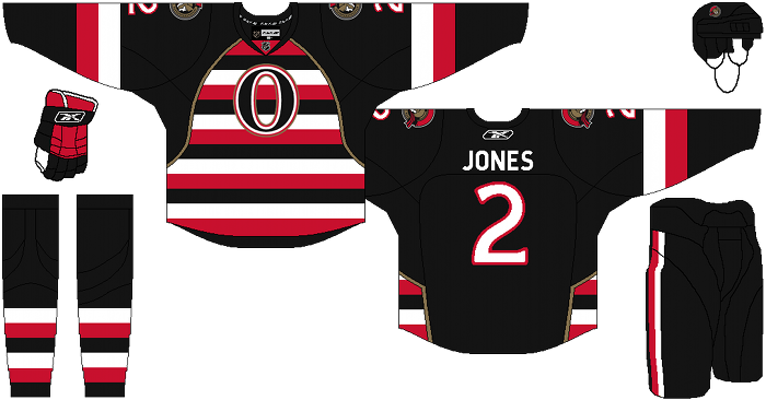
 Welcome to the “Re-Imagining The NHL” project created by Cole Jones. Cole has been great enough to allow Days of Y’Orr to post his idea on different teams with his spin on them. You can follow Cole on Twitter. Please feel free to comment on the team below. Feel free to read the official announcement of the project here. Since neither Cole or Days of Y’Orr consider this team our “home team”, we will do our best to bring in a fan of the team described to get their thoughts. Today we were lucky enough to get input from Graeme Nichols founder of The 6th Sens.
If you haven’t checked out our other teams, visit the Re-Imagining the NHL team page. The team page will be updated daily with every team we update. So before we take a look at the uniforms, lets take a look at Cole’s comments on the Ottawa Senators. Maybe a change in uniform will change around their franchise (but I doubt it).
Cole’s comments: This one is probably going to be a little controversial, but I give you the Ottawa Senators. I hope you like barber-pole.
Not much to say here… simple uniforms with a modern twist. I used the barely-used alternate logo as the primary. I also wanted to do something barber-pole with the alternate, but knew that a straight representation of the original senators onto a modern template would be absolutely hideous and illegible. I thought a simple front-panel of barber-pole pattern on a black sweater would make it a little easier to watch a game.
After the jump, the Ottawa Senators…
The 6th Sens’ comments: Personally, I appreciate the fact that Cole kept the colours (my apologies for the Canadian spelling gents) the same and brought back a 2-D logo to compliment the the home and away jerseys. Even if it’s not the original logo that I have been publicly yearning for on The 6th Sens, the never used modern twist on the 2-D logo seems like an appropriate compromise providing a fresh look while paying homage to the franchise’s first jerseys from its modern history. Even the simplicity of the stripes is a noticeable improvement in the sense that the team’s current home and aways look befitting of practice jerseys without any stripes adorning their bottoms.
That being said, if I had any complaints about the home and aways, it’d be the inclusion of the unnecessary gold piping and the maple leaf shoulder patches. I know that Ottawa is the nation’s capital, but there’s already one team in Ontario that wears a white maple leaf. There’s no need to incite ridicule from a divisional rival when a city landmark (Parliament Hill’s Peace Tower?) could have sufficed.
In regards to the alternate sweater, I want to know: what did Ottawa ever do to Cole to deserve this? Seriously, it wasn’t enough that the organization allowed Zdeno Chara to hit unrestricted free agency and let Peter Chiarelli and Chris Kelly into your hearts? Thanks for nothing guys.
Days of Y’Orr’s comments: Let’s start with the alternate. I fucking love it man. Straight up barber pole uniforms make me want to shoot myself in the face. I hate when the Canadiens wear that ugly CAC jersey because it’s a red, white and blue abomination. It looks like someone puked up the American flag all over a white jersey. Even Ottawa’s million variations of the barber pole are a disgrace. I think a straight barber pole jersey is a disgrace. Plain and simple.
The reason I like this barber pole jersey is because it’s not a straight up baber pole. The black around the pole stripes is a good touch (I don’t believe red would work on a jersey like this) and the gold striping does a good job of seperating the striping from the plain black.
These home and away uniforms are much better than what the Senators currently use. In fact, look at the Penguins home and away uniforms and then the current threads worn by the Senators. Pretty fucking similar. How unoriginal do you have to be to have the same jersey design as another team? I know it happens a lot, but with the variety of things you can do to a jersey why bother having the same thing? I like the home and away Cole used. The gold piping makes the jersey stand out a tad.
The only thing I don’t like is the maple leaf patches. Toronto is named after Canada’s leaf. Calgary has the Candian flag as a shoulder patch. I’m kind of sick of seeing the maple leaf being displayed on Canadian jerseys. It would be like every American team having a bald eagle, American flag or picture of George Washington as a shoulder patch. I like the home and away a lot more than their current uniforms, which isn’t saying much. It’s like eating a turd covered in ice cream sprinkles. Fuck their current uniforms!
Add The Sports Daily to your Google News Feed!


