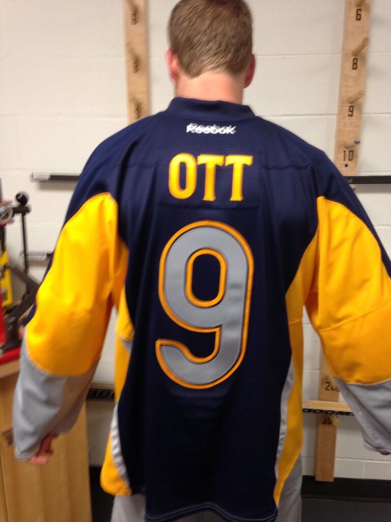
For a team with such a widely celebrated crest and color scheme, the Buffalo Sabres manage to do an incredible job finding ways to disappoint when it comes to uniform design.
Today officially marked a new chapter in Sabres uniform history when Steve Ott joined forces with the Sabres social media team to help “leak” the new third jersey via Twitter. To say that the reaction was poor would be an understatement. Whether via Twitter, news posts or Facebook comment – the album link had over 500 in two hours at the time this was written – the reaction by the vast majority of those who had seen the uniform was incredibly negative.
Count me amongst those who dislike the new threads.

Buffalo will be sporting a two-toned jersey replete with grey and silver trim, a Buffalo wordmark just below the neck, a lapel type thing on the collar and a new type of captain patch that features crossed swords below the letter. If that description or the picture didn’t explain things well enough, these things are busy. Really busy.
It appears that the design team sat down at the beginning of this process, wrote down all of the different features that could be put on a jersey and tried to find a way to incorporate each and every one in this jersey. Somehow a lace-up collar didn’t make the cut.
There is nothing wrong with going in the opposite direction with third jersey design. It is especially effective when the team is using a retro-type pattern for their home and away jerseys like the Sabres do. Offering a fresh take on a different pattern offers a unique alternate uniform for the team to wear. In that sense, the Sabres did a great job. They could have simply gone with a gold or silver/grey based version of their current uniforms, but they went in a different direction, which was a good choice. They just went way too far down the rabbit hole.
What’s amazing is that it’s too difficult to pick out which is the worst part of this uniform. Might it be the two-toned gold front? The choice of going with an entirely different color on the back? Grey numbers? Grey cuffs? That odd silvery grey trim on the sleeves and the back? It’s really hard to say.
If there’s anything that really stands out as the most awkward, misplaced item, it has to be the silver stripes that go up the sleeve and also trim the blue back of the jersey. They appear to come to a point which tells me that they’re supposed to represent an actual sabre. But with everything else going on they just look tacky and out of place.
Perhaps the most shocking part of all this (maybe not shocking when you look at the jersey a second time) is the backlash that has been received. Not a single nation hockey reporter on Twitter had a good thing to say about it. In fact, Justin Bourne of Backhand Shelf noted that they wouldn’t look good if Kate Upton was wearing just the jersey. I agree.
A quick perusal of the lengthy comment list on the pair of Facebook posts – of which it was said that one was deleting negative comments – shows a thin smattering of positive reactions in a vast sea of negative contempt towards the new jerseys.
The disdain directed at the Sabres via social media capped a lengthy campaign that featured a weekly tease of different portions of the uniform. While the theory behind leaking small glimpses of a new jersey is a widely used practice that is generally well received, the nearly two-month saga the Sabres carried out led to nothing but anger, frustration and apathy from those who received each update.
It seemed as if the team missed the boat after the third or fourth sneak peek when they still held the attention of their fans shortly after the release of the teaser video at the development camp scrimmage. At that point the images used in the video and the following pictures released on social media had built solid momentum to a point where there was plenty of interest in what the jersey was going to look like. However, the continued use of the weekly teases wore thin quickly and more than a few grew tired of the practice.

At this point I would be surprised if there are more than 100 Sabres fans out there who support this jersey. It makes me hope that management might take a nearly unprecedented step to withdraw the jerseys and keep the team from wearing them on the ice.
This has been done before when the St. Louis Blues pulled their proposed third jersey for the 1995 season. I’m willing to say it’s time to do it once again. Cleary the Sabres missed the mark with these jerseys. They’re way too busy, barely anyone has anything positive to say about them and I have very little faith that the opinion on them will ever change. Saying that it would be the right thing to do is a drastic overstatement, but it sure would show a lot of good faith if Ted Black came out and acknowledged the backlash they’ve received, noted that they would not be wearing this jersey and explained a plan to reformulate a new third jersey moving forward. Perhaps they could take some clues from the process the Wild used in creating their incredible new road uniforms.
If they do indeed end up wearing these monstrosities next season, the sweaters will join a long lineage of disappointing jersey designs spawned at One SHK III Plaza.
Add The Sports Daily to your Google News Feed!