You can find Part I here
THE BEST

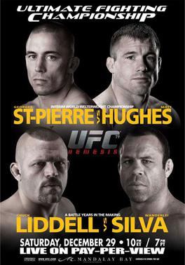
Simple, menacing, ominous. Looks like dark storm clouds over a night sky. Nasty in a good way.

I really shouldn’t like this at all, but shit, if you’re gonna commit to the whole card, then goddamn commit to the whole card. I like it. Makes it look stacked without it being, you know, stacked.
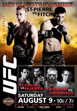
I like the Sin City-esque shadowing here. I suppose that makes Lesnar Marv. I’m more than OK with Florian being Dwight. Fitch as Hartigan?
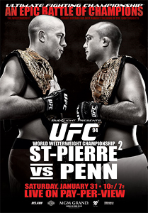
Hoooo boy. Yes.
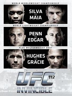
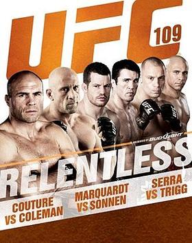
Did a great job of capturing the enormity of the card as well as showing how ridiculously loaded this card was.
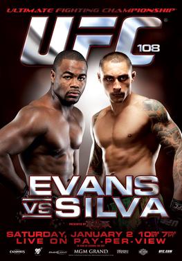
This fucking card…gold star on your report card if you remember all the catastrophic changes this goddamned card went through. I really dig the shiny metallic theme. It was new for them, and gives a clean, crisp vibe.
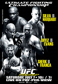
Packed a lot onto the poster, but it works.
THE BAD
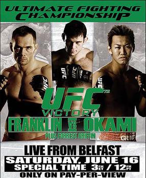
AYE ERIN GO BRAGH! I like the green theme in theory. I didn’t like it was constructed in Microsoft Paint.
“Mama…just killed a man…”
Anyone want to guess how many of these fights ended in knockout?
“…put a gun against his head…pulled my trigger now he’s dead…”
I sure hope they tipped the poor teenaged girl who stenciled in their cheeks at the baseball game.
Pay no attention to the lines of coke in the background.
UFC 97: Stop Signs and Horribly Awkward-Cut Images.
UFC’s Junior Varsity version of the 100 poster.
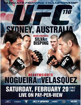
The UFC proudly displaying the flag of Australia on a poster featuring two Brazilians, a Mexican-American, and a man from Great Britain. Well done.
Part III coming soon!
Add The Sports Daily to your Google News Feed!

