![]()
Spring Training is right around the corner and to ramp up the excitement of a new season of baseball, the folks at New Era unveiled the last of the new hats for 2017.
Now, you’re bound to see plenty of things on the interwebs dissecting what’s good and what’s bad. This is another one.That said, instead of telling you how great the new Toronto Blue Jays cap is (it’s really, really good, you guys!)…my ten-year-old daughter is taking the reins and providing her opinion.
Enjoy.
THE TOP FIVE
 CHICAGO CUBS
It’s kinda cute with the little bear on it. It looks good. I like the colors and everything.
 SEATTLE MARINERS
I like how they brought the trident back. It’s a good logo.
 CHICAGO WHITE SOX
I think it just looks really, really cool.
 MILWAUKEE BREWERS
I like that they brought the old logo back. I like that the glove is actually an “M” and a “B”.
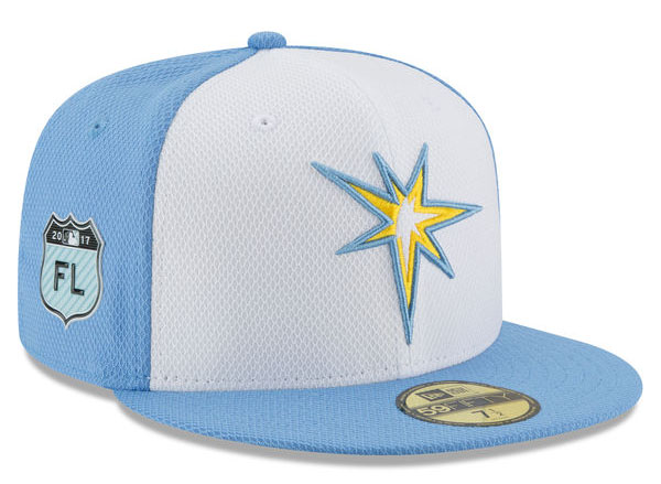 TAMPA BAY RAYS
I really like the colors. The light blue and yellow makes it look really cool.
HONORABLE MENTION
 TORONTO BLUE JAYS (Honorable mention)
I did like this hat…but not as much as my dad does.
THE BOTTOM THREE
 NEW YORK YANKEES
**shakes head** No. (Agreed!)
 KANSAS CITY ROYALS
I get what they’re trying to do with the crown and I guess some people might like it. I just don’t.
 CINCINNATI REDS
It’s a baseball with a face. That’s creepy.
So there you have it. Which one of this year’s Spring Training hats made an impression (good or bad) on you?
![]()
Add The Sports Daily to your Google News Feed!