I absolutely love hockey memorabilia. I’ve been a year into collecting Hockey Cards for the first time since I was a kid, but the biggest memorabilia that I collect are jerseys. Jerseys, sweaters whatever you like or want to call them: it’s the ultimate piece of hockey gear for fans.
I have just over forty hockey jerseys, including eleven Edmonton Oilers jerseys.
I get really excited whenever a team decides to rebrand their look with new logos and a new set of jerseys. Today, I’ve decided to rank seven sets of jerseys in particular from the Edmonton Oilers’ history.
To be fair, compared to other teams, The Oilers have some of the nicest sweaters in hockey. I am biased of course, but I would definitely have them in the top ten across the league.
The Rules
From 1979 to now, I’ve decided to review seven sets of jerseys, based purely on how I think they catch the eye. Remember, this is only one person’s opinion so feel free to offer your thoughts. I decided to add some third jerseys in some sets rather than ignore the third jerseys, but in the case of 2008-2012, one jersey was bumped up to full home status while another was bumped down to alternate status.
Without further ado, let us start from the bottom.
Number 7: The 2007-2012 Home and Away’s.
These are easily, the worst jersey’s in Edmonton Oiler history. In fall of 2007 the entire league was getting revamped with the RBK Edge being released which featured better, lighter materials. Most teams went for a full make over with disastrous results compared to their previous iterations . The Oilers were one of those teams.
Where did they go wrong? Take your pick. First off is the god awful piping that looked like apron strings. How about the complete removal of waist stripes, which is a mainstay in hockey jerseys? A lot of jerseys abandoned the waist stripe, only to come back in other jerseys. The most ghastly sin for this abomination of a jersey was the lazy elbow striping where it only met halfway around the arm. Was it because they could not afford the extra materials? The Florida Panthers had the exact same template but managed to pull it off better because the upper part of the arm was a different color.
These were sad jerseys that did little to stand out. The only nice thing of these jerseys was the solid copper collar. I thought it looked cool.
Number Six: The 1980-81 Homes and Aways
These jerseys only lasted one full season and looked pretty similar to the set of the glorious 80s. On first glance compared to the 1981-96 versions, they have the same colouring, the same striping but it’s the numbers and names that do it wrong for me.
I don’t like it when numbers overlap with the stripes or touch the stripes. However, that’s the most minor complaint of the jersey: I think the way they used the two colours for the names and numbers make it difficult to track.
The numbers not so much, it’s not as noticeable, although I feel that they are much more cruder especially compared to the 1981-96 versions. However it’s the name plates that look like eye sores: those look very tough to read. Imagine those on ice. You can barely notice the orange trim on the white jersey’s but the Gretzky on the blue’s looks horrible. The G looks like an O.
It’s not a horrible jersey and quite frankly, it’s tough to choose a number six. Yet, it’s the numbers that looked off and they would fix this the following season. If anything, this was a prototype of the beautiful jerseys we would be most familiar with.
Number Five: 1979-80 Homes and Aways
Compared to the jerseys that the Oilers would wear the next year, I think these one’s are better. First, the numbers do not overlap with the stripes so bonus points right htere. The name bars are way easier to read compared to the eyesores of 1980-81.
It’s not a bad looking jersey at all. It’s just the 1981-96 jersey’s were better. Mainly because of the numbers. The two colour outline still did not look quite right, but it looked cleaner than the 180-81 versions. However, these numbers are squat and kind of look odd. There seems to be a lot of blank space between the numbers on the back and the stripes, especially on the white jersey.
It’s a good jersey and even though it’s ranked fifth here, it’s a respectable finish.
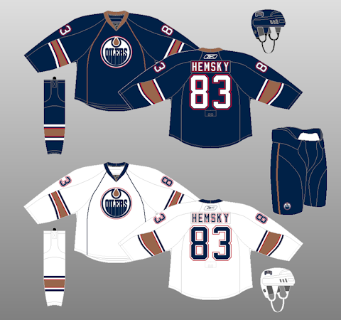
Number Four: 2001-2007 Home, Away and Alternate Set
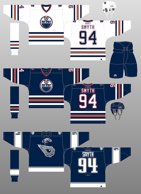
Now I’m in the really tough part of the jerseys and really, you could make an argument why these jerseys would be in the top spot and I would totally understand.
These jerseys hold some really heavy sentimental value: my first ever Oilers jersey was the navy blue from CCM that I got for Christmas while I was in the second grade. I still have the sweater hanging up on my wall in fairly good shape.
I grew up with this set of jerseys: I watched my all time favorite Oiler Doug Weight lead the team in these. I watched the Stanley Cup run in 2006 while they wore this set.
So why is it ranked only fourth?
It’s tough because I just feel there are some other jersey’s that just barely are ahead now. It’s a crawl. The Alternate is really awesome: I know there’s some that didn’t like it, I was not one of them. I regret not getting one while they were around!
The only negative I have is that the white is just a bit plain for my liking. The shoulder patches were nice but I felt it was just a bit too much of white. It’s a weird nit pick but it’s really an outstanding jersey.
Number Three: 1996-97 Home and Away
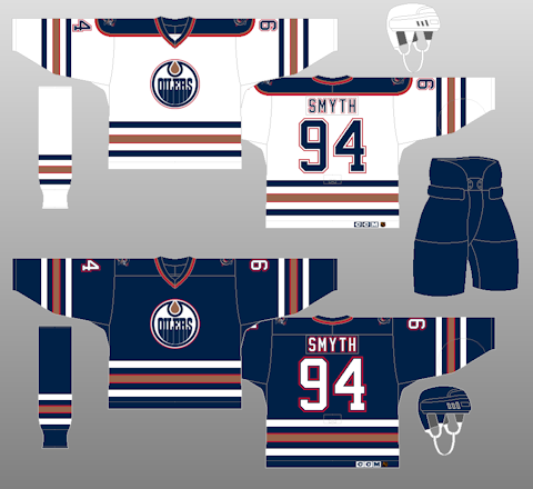
These jerseys are almost identical to the 2001-2007 versions except with one major different which effected the ranking of the previous: the white jerseys.
It’s a shame that the Oilers only wore these jerseys for one season because the white jerseys with the shoulder yolk look so nice. The collar stands out even more when compared to the navy jersey and the yolk is great: it has the red and copper outline with the blue interior. It had more colour and stood out more compared to the ones they would move onto the following season.
It’s too bad because I love sweaters with the shoulder yolk on them. I’m not sure why: it’s simply a preference of mine.
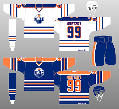
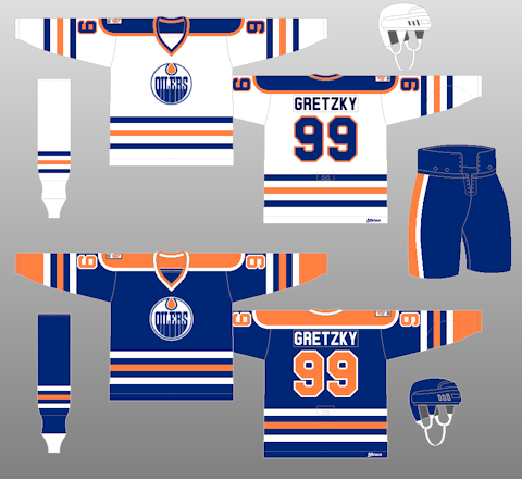
Number Two: 1981-96 Home and Away
These jerseys you can’t really complain about them. They actually have no complaints from me, which is why it’s so weird that they are the bronze medal when it comes to jersey history. What’s there to say about these jerseys? These were the ones the Oilers wore when the won the five Stanley Cups. They are clean, classic and the colours are just wonderful. Compared to the 1979-80 and the 1980-81 jerseys, these ones are just right: The numbers are perfect with a three colour outline that is balanced and easy to see, while making the numbers pop out. The name bars are just one solid colour instead of hard to read outlines.
I have nothing wrong with these jerseys. I remember wanting this jersey in Grade 12 because I thought they were just such a cool jersey. It’s not a shocker that they went back to these: They were outstanding.
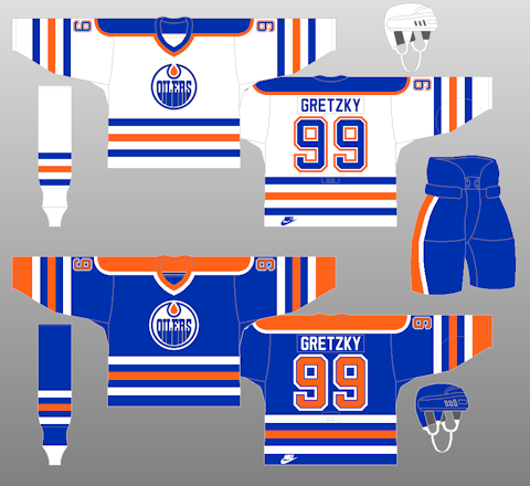
Number One: The Present Day Home, Away and Alternate
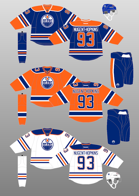
Alright, this was a tough one, but coming in number one are the current set of jerseys. They are cleaner and just a tinge darker in blue compared to the 1981 versions. The one knack these current ones have compared to the 1981-96 version, is that the collar is funky: it does not meet up and just ends. It’s awkward and looked awkward when it came out in 2010 as an alternate jersey, but it’s grown on me since and is one of the most unique collar’s in the NHL.
Where this set shines though is the alternate jersey which is based on the original WHA set they wore in their inaugural season. The numbers on the shoulders, at first impression, seemed odd, but like the collar, grown on me and rather quickly. Again here, the collar is so unique in that it overlaps and is a different striping from the home and away jerseys. The Orange is a nice enough shade and is a relatively unique colour in the NHL (with only Anaheim and Philadelphia being the ones who sport an Orange jersey as well). The numbers and names both have a white outline rather than a two colour outline and it really works on the names. It’s subtle but effective.
The alternate is one of the best in the NHL. It just adds to an already strong set of jerseys. The Alternate is so good in my eyes, that it deserves top spot.
Add The Sports Daily to your Google News Feed!