I want to pre state this: I love NHL jerseys. I’m a jersey collector: I think I have 41 jerseys in my possession and one of my goals is to collect all thirty NHL teams (yes even the Flames and Canucks, but they can be last).
I have always wanted to do a NHL Jersey Ranking for each team. I also want to preface this: this is simply my opinion. There will be jerseys that will be ranked too high and too low because it’s based on my personal preference.
I’m ranking the Jerseys based on the look of the jersey and logo. I wanted to group 30-25 in one post because I wanted to get the dogs breakfast out of the way.
All jerseys taken are from nhluniforms.com
No. 30: The Carolina Hurricanes
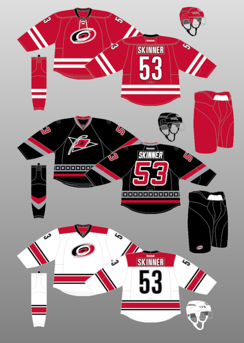 The Carolina Hurricanes have easily the worst jersey set in the NHL. It’s a shame because the Hurricanes used to have some really unique looking jerseys. What’s wrong with these ones? It’s too much of one colour.
The Home jerseys are easily my least favorite jerseys in the entire NHL. They aren’t necessarily ugly, but they look like blood clots on the ice. The Hurricanes followed a recent trend where teams needed to look like “classic”. Gone are the cool Hurricane Checkered striping that were a unique featured. Gone were the black pants. Instead it’s just red. They are a Team Canada rip off.
The White Jerseys look better, but not too much. I like the addition of the shoulder yolk and they decide to add black. If the Reds looked more like this, they would go higher in rankings.
The third jersey is not bad but looks dated compared to the other two jerseys. The number font is angled as is the arm striping. The alternate logo is nicer than the main logo (which looks like a toilet swirl).
Best Jerseys: 2000-2007
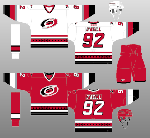
Easily the best. Solid striping and solid colours all around. The logo is still mediocre and I could do without the angled font, but it’s a nice jersey compared to what they have now.
No. 29: The Colorado Avalanche
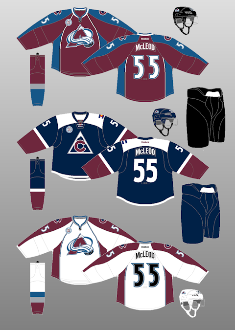
These jersey’s stink. One team that took a giant step backwards when the RBK edge format was released was Colorado. Gone were the very unique striping of the mountain range and replaced with….this. You have apron strings for piping. You have these colour siding next to them. The font is alright but screams 1990s hockey.
The shoulder logo was replaced with the Colorado State C which hurts because it’s boring looking. I loved the Yeti’s foot that used to be there. The colours aren’t bad: Burgundy and that shade of blueberry blue is not used in the NHL so the Avalanche gets some brownie points there.
I’m not a big fan of their alternates. They replaced the blue that they’ve been known for using the entire time, pull a Calgary with having their state flag that sticks out on their one shoulder. The Font is nicer and the logo I think is better than their current one that is looking outdated.
Seriously. It looks like ice cream is adorning the logo. It’s screams “Coolest Game on Ice” slogan from the 1990s.
Best Jersey: 2001-2007
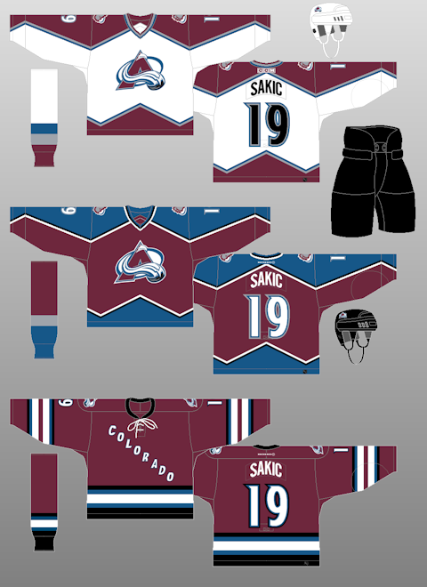
I went with these ones because the burgundy they used earlier was a shade lighter and I prefer the darker shade here. I like the unique striping on the top and bottom: it’s triangular that is shaped like the Rockies. Along with the Dallas Stars, these jerseys had the most unique striping in the NHL but the RBK Edge designed dashed those dreams.
No. 28 Ottawa Senators
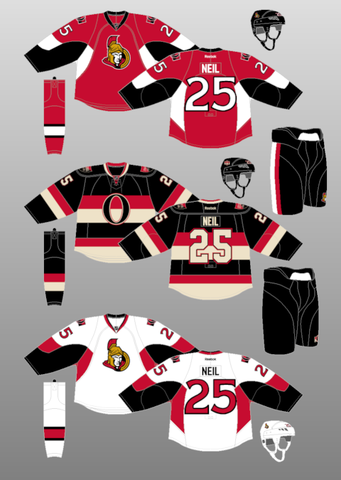
Hey, now here’s a pick that people can’t scream too much bias because I’m actually a Senators fan too. These jerseys are hurting. The logo is not as good as the old two dimensional logo of the trojan looking forward. It looks cartoony and not intimidating.
The Homes are better than the Aways but only by slightly. The template is shared with one other team (that will be coming up next) and it’s just so bland. There’s nothing to really cheer about these jerseys. I love striping and these jerseys do not have any. The font is okay, but again, bland.
The Alternate jersey however, is one of the best in the league (I have it as the top alternate jersey in the league). It’s a great concept taking the Ottawa black and introducing a new colour in a retro creme look that gives the jersey a vintage vibe. While some teams have unnecessary laces (which is a new trend) the laces fits the jerseys. Sure, the big O might get jabs for being a giant zero, but I like it more so than the current logo the team is sporting. The Shield on the shoulders are in both French and English representing Canada’s bilingual country.
However, it’s tough to rank an Alternate on it’s lonesome when the rest of the kit is bland.
Best Jerseys: 1995-97
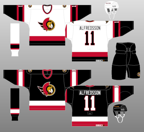
If the Senators went back to these I would be great. They got these right so early in the get go. The Black jersey used to have a hard to see Red Numbers on the back but they switched to this gorgeous, simple but effective look. Ottawa is always a Black, Red and White sports city team (look at the CFL’s Rough Riders, Renegades and RedBlacks for examples) and it fits here. It’s a shame they ditched the black jersey for a red jersey that did not match their whites.
No. 27 Pittsburgh Penguins
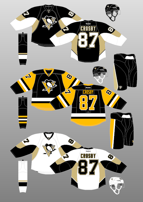
Let’s get this out of the way: Pittsburgh has one of the finest alternate jerseys in the NHL. If I wasn’t biased for Ottawa or Edmonton, I would say it’s the best alternate right now. It’s no coincidence that the Penguins are wearing these jerseys as their homes throughout the playoffs and I firmly believe they will be releasing a new set of jerseys next season featuring the throwback look as the main home and away.
However, they are stuck with these boring jerseys. Yes, these ones have the exact same template as the Ottawa Senators and yes, they are just as bland as the Sens. The Vegas gold was a nice touch when they introduced it a decade ago, but it’s not as nice as the Pittsburgh Black and Yellow that matches the Pittsburgh Steelers and Pittsburgh Pirates. The logo is a classic, much better than that garbage Robo Penguin they used in the 1990s (I love the 90s but man there were some bad jersey ideas).
Once the Penguins return to this….
Best Jerseys: 1988-92
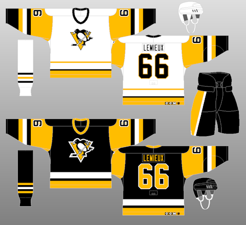
…. the Penguins will force themselves as a top ten team in the league in terms of jerseys. It’s a gorgeous look that matches the city. Sure, the Bruins tried to block the Penguins from going Black and Yellow, but it just suits them. These jerseys were the ones worn during the back to back cups. They switched to Robo Penguin and did not win one cup in those jerseys. Only won a cup when they went back to the skating Penguin. Totally not a coincidence.
No. 26 The Calgary Flames
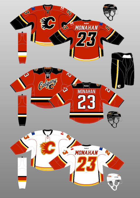
The Flames went from nice Pre RBK Edge concept to a mess of stripes and piping. I’m not saying this because it’s an Oilers blog but the Flames jersey is messy.
The best part of the jersey is that the colours work and the logo is great. I almost became a Flames fan when I was a kid because I thought that logo was the coolest one in the NHL. It’s a Flaming C! Even though I’m an Oilers fan, I still admit Calgary has a nice looking logo.
However, the messy part: what is with all the striping? The striping by the waists are vertical rather than horizontal and stops randomly. Piping continues upwards and stops near the shoulder numbers. Then you have the Canada and Alberta Flags as shoulder patches. They represent Alberta and Canada now? The Alberta Flag sticks out for the wrong reasons.
The Alternate jersey looks solid however. I’m a fan of the unique shoulder yolk: it’s jagged to represent the nearby Rocky Mountains. The font is straight, easy to read and the striping is on the waist going horizontal! The only downside is the script logo. Stick a Calgary Flames C and make these the primaries and they are an instant upgrade over the regulars.
Best Jerseys: 2006-07
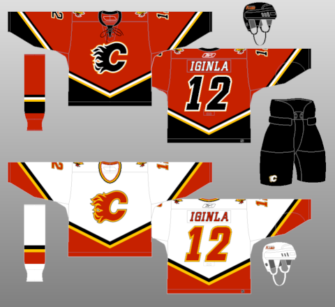
This may be a shocker but I actually prefer these ones to the retro ones. The retro ones are great in their own right, but I prefer these because of the colours they use. The Flames introduced this Red Jersey in 2003-04 after using the Flaming Horse as their coloured jersey for a few years. This jersey was an instant hit and one of the best selling jerseys that year. I like the angular striping on the waist and sleeves. Sure, angled font I’m not a fan but it looks nice here. I also like the Black Flaming C: it was a new logo introduced and made a good looking logo even better.
Conclusion
In conclusion, we have the Hurricanes, Avalanche, Senators, Penguins and Flames taking the bottom five spots in my jersey rankings. Once we get into the late teens, it becomes much more difficult to rank them. Stay tuned as I update the list!
Add The Sports Daily to your Google News Feed!