If you watch a lot of professional sports or any television at all, corporate logos and corporate slogans are drilled into your brain through relentless repetition. The commercials often quickly become noise you try your best to tune out and I doubt I’m the only one that often presses ‘mute’ on my remote whenever a game goes to a commercial break. Or as my dad likes to watch sports, he records them on his DVR so he can fast forward through all of the commercials.
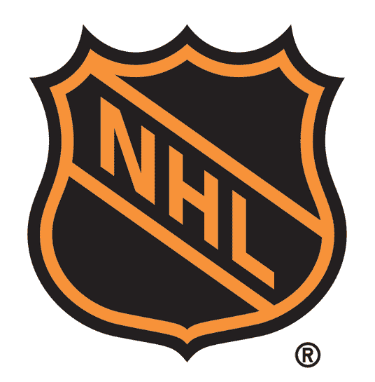
The NHL, like most corporations have at some point re-branded itself over time. Anyone remember this NHL logo?
Then in after the 2004-05 lockout it became what it is today.
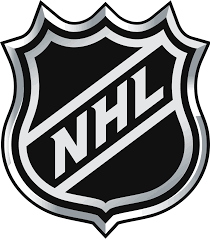
Overall the same thing, but with different colors and I think it pops a bit more than the original. Yet I am sure plenty of people miss the old orange one.
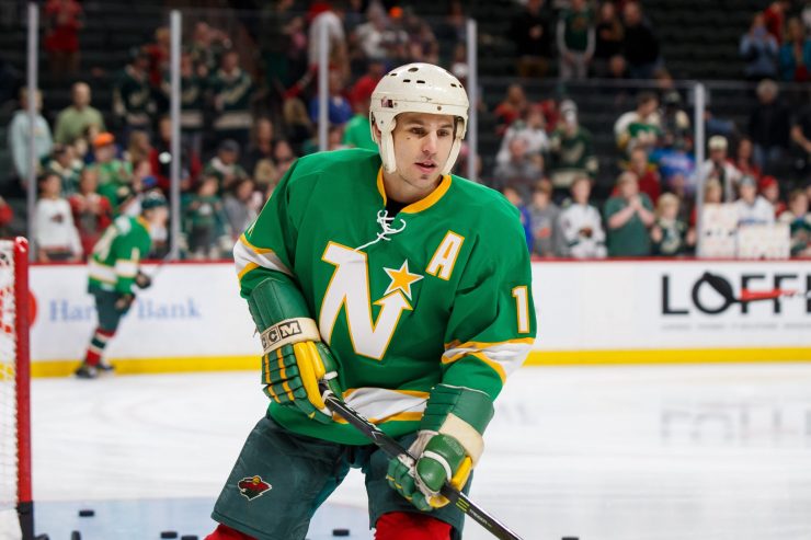
When Adidas decided to do a retro reverse of every NHL team, fans were teased with a few small views of the new jersey concepts before they were released last week. You can read Michael Russo‘s story of how Adidas worked with league teams to make this happen here in The Athletic. The Minnesota Wild version of this jersey leaned heavily on the Minnesota North Stars as it brought back the late 1970’s green and gold and the shadow-effect font for the numbers.
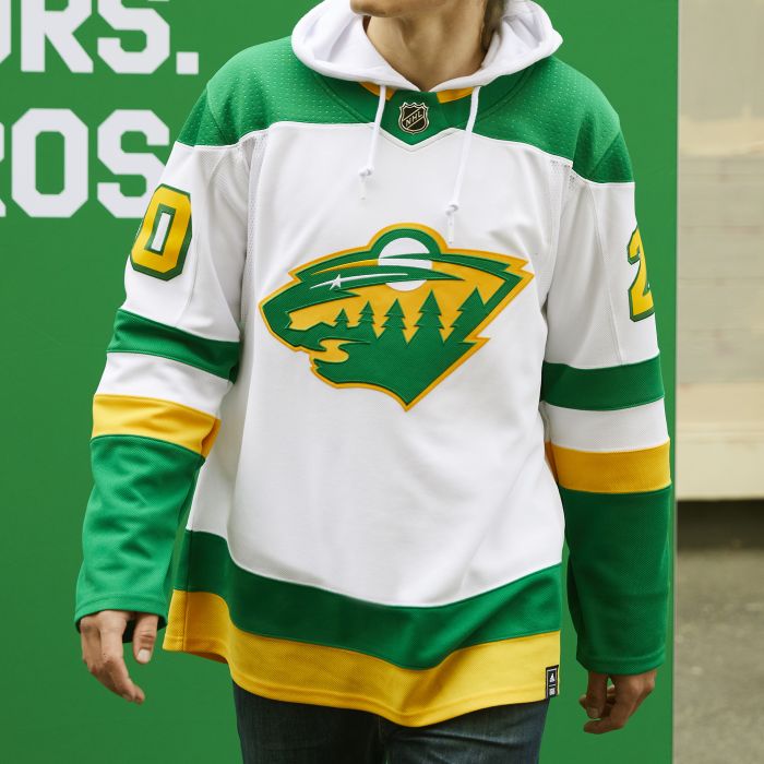
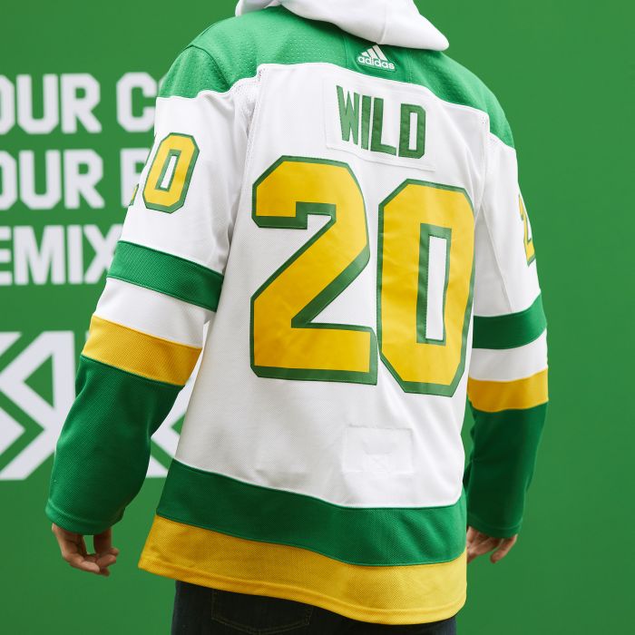
They even went as far as re-coloring the man-bear-pig logo and the result contrasts pretty well. If you scroll through Twitter, the reactions to the new retro reverse sweaters are pretty mixed in kind of a ‘love it’ or ‘hate it’ kind of way.
I have been wanting to see a North Stars-colored, Wild jersey for quite a long time and I remember seeing some fans who had somehow managed to make something similar to this at a Minnesota game and I thought they looked fantastic.
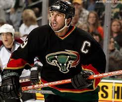
I have been a Minnesota Wild fan from the day the announced we were going to get another NHL team back in 1997. I have followed it closely ever since and have been blogging about it the better part of 16 years but I’ve never been a real big fan of their name or their team colors. The Iron Range Red, Forest Green and Harvest Wheat have never really appealed to me because no matter how its arranged you still look like you are wearing some kind of Christmas sweater.
While I give the organization credit for marketing itself rather well over the years and from the very beginning the team was embraced by fans who really bought a lot of team merchandise. I think the majority of Wild fans like the symbolic nature (no Wild pun intended) of the team logo; with the river, trees, moon and star that was kind of nod to the former club, the colors just suck.
Before anyone who wants to suggest that I am some curmudgeonly older Wild fan that refused to buy one of their sweaters you would be wrong. I own two sweaters from their first few seasons (one of which with #24 Antti Laaksonen), a green Wild practice jersey, two red jerseys (with #96 Pierre-Marc Bouchard, #26 Christoph Brandner), two green ‘Minnesota’ script jerseys (one of them with #36 John Scott on it), a Stadium Series jersey (with #11 Zach Parise), the current white road jersey (with #20 Ryan Suter), and current green home sweater. That’s 10 Wild jerseys so I think I feel like I can say I gave the Christmas Colors a chance.
So with Adidas’ reverse retro jersey, have they given the organization a unique opportunity to re-brand itself? Or at the very least a good reason to try a color shift? I know I certainly would be glad if the team ditched the holiday colors once and for all and gave Green and Gold a chance.
I realize that for some fans, especially to those who were not old enough or even alive when the Minnesota North Stars were around but its more than just nostalgia that has some hoping for the team to switch its colors. Green and Gold just work better. You may hate Edina, but most would agree they have some of the best sweaters in high school hockey.
Let me be clear, I am not lobbying that the Wild become a new version of the Minnesota North Stars. I love the classic ‘N’ logo, but I realize there is no way the NHL lets us have that back permanently. Either way, I’d love to see the colors return because I’d rather not feel like a person wearing a Christmas sweater outside of the holiday season.
Blasphemy you say? Color changes by professional sports teams are nothing new, even in the NHL. The Vancouver Canucks, Washington Capitals, Buffalo Sabres, Pittsburgh Penguins, Anaheim Ducks, Dallas Stars, Florida Panthers and Los Angeles Kings all have undergone significant color changes throughout their existence. And many clubs have significantly changed their logos as well. Check out these mid-2000’s fails with the infamous Dallas ‘uterus’ jersey and the Edmonton ‘Gear’ jersey where they changed both the logo and the team colors.
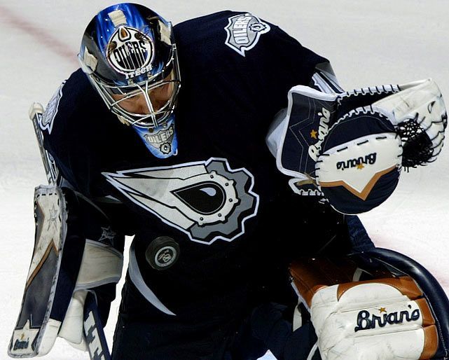
Dallas and Edmonton were not the only ones that tried to change things up. Does anyone remember the Buffa-slug? In all 3 of these attempts to re-launch their brand, the club promptly went back to their old one, and guess what? Everything is just fine. Their respective franchises didn’t implode, the fans didn’t abandon the team because of a marketing decision that missed the mark. It just becomes a story that fans remember and chuckle about and are glad their teams didn’t stick with those ideas longer.
I think having Christmas colors makes the team ‘forgettable’ in the grand scheme of league marketing. While it makes it easy for the league to include the team in ads created for the holidays, it also blends into the background the rest of the year. So why not change it for a season or more and see if people like it? Besides, the retro reverse jerseys do not introduce a new logo at all. Would it had been so bad to use the script “M” as the main logo, I don’t think so but we don’t always get everything we want and that is ok.
In 2007, when the Minnesota Wild introduced their original red jersey with the circular Wild logo in the middle it was meant to be an alternate jersey and soon it supplanted the original green ‘air freshener’ jersey as some liked to call it. That jersey stuck around for a little while before it was supplanted by the Minnesota script green jersey. The main point is things change, even in Minnesota so why not make another change?
I even ran a poll for 5 days and you can certainly see the topic is a bit polarizing to the fan base. With 64 total votes, it was an exact 50/50 split between those that wanted to keep the team’s holiday colors and those which would be happy to embrace the green & gold once again.
While it may have been a slow last few weeks for Wild news, the jersey reveal certainly got the Wild podcastis-sphere talking about it so you don’t just have to take my word for it. Jessi Pierce and Alexis Pearson of Bardown Beauties talked about it, Brett Marshall, Zeke Boyat and Justin Bakke of Sound the Foghorn talked about it, Noah Grant and Nick Maxson of the Huskies Warming House podcast talked about it and Joey Awaijane of Brave the Wild also sounded off on the new sweaters. Yet my favorite take was the one by KFAN‘s Brandon Mileski and Pat Micheletti of Beyond the Pod. Fast forward to the 28:24 mark to hear them comments on the subject and I credit Brandon Mileski for giving me the inspiration for this article.
Let’s make the change Minnesota Wild. Let’s put out an olive branch to those that are still feeling pain from that loss so long ago and try to bring them into the fold with this color change. It will make for a great sweater and I think fans will embrace it, I really do. Some states have laws against having your Christmas lights up too long after New Year’s, now is the time to ditch the year-round Christmas colors for the Minnesota Wild organization.
To all of our readers out there, we would like to wish you a Happy Thanksgiving and hope that its safe, fun and delicious!
What do you think of the new Adidas Retro Reverse jerseys? Should the Wild make the switch permanent? Tell us on Twitter @CreaseAndAssist or in the comment section below!
Add The Sports Daily to your Google News Feed!