Last week, HTW received the following tweet in response to our call for women writers:
really?!? Because we need an opinion on player's pre and post game wardrobe?!?
— Garbage the Cat (@GarbageinCharge) October 27, 2016
Now, you may think Garbage the Cat would be better off keeping his Garbage opinions to himself. You may think he’s stuck in an anachronistic mindset, one that the country and culture is slowly shedding like dead skin. You may think he’s using jokes better left to the dustbin of the 1980s. But you know what I think? I think he’s right. HTW does need to cover what NBA players are wearing. What with all the short sleeves, Pride unis, ads on jerseys, and the almost constant turnover of uniforms, we would be remiss to not make this extremely popular aspect of the NBA a part of what we do here at HTW. So thanks, Garbage the Cat, for the great idea. We probably wouldn’t have thought of it without you. This column is dedicated to you and your garbage.
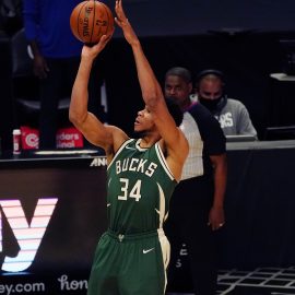
As rumor has it, the Wolves are right now in the process of rebranding (I kind of hate this term) for the 2017-2018 season. In recent years, we’ve seen the best (Bucks, Wizards) and worst (Hawks, Clippers) of what rebranding can offer. I’d like to help steer the Wolves toward the former and light years away from the latter. Why? Because I’m genuinely afraid that, without intervention, we could end up with something that marketers think looks “cool” (which in marketing speak often means “what do kids like?” and always means “how can we juice sales?”) but typically ends up looking like a fake uniform you’d see in a Disney Channel show about a kid who found a magic basketball. Don’t judge a book by its cover you say, and you’re right, but I say who wants to look at trash all season long?
So, if any Wolves PR/Design people are reading this, please take notes.
- Create an identity
There are certain teams that are connected to the fabric of every major sport. These include (but are not limited to. Don’t @ me) Yankees, Dodgers, and Cubs in MLB; Canadiens, Red Wings, and Maple Leafs in the NHL; Steelers, Cowboys, and Raiders in the NFL; and Bulls, Lakers, and Celtics in the NBA. What do they all have in common? They’ve hardly changed their look over the years. Sure, there have been tweaks and alternate jerseys and some god-awful throwbacks, but the foundation of their uniforms has stayed the same. These teams don’t throw out what works for what is “cool” or “modern.” The Yankees are pinstripes; the Canadiens are the Habs; the Raiders are silver and black; the Celtics are the Leprechaun. As the Wolves are designing this new “brand,” they should be looking to create something that stands the test of time and doesn’t need a complete do-over in five years.
- Simple is better
Look no further than the cartoon-inspired uniforms of the mid to late 90s for a Master class in what not to do. I know these have become retro-cool, but trust me, as someone who lived through this era, no team needs a purple dinosaur or an angry rocket or full wingspan hawk on its chest. Speaking of the Hawks, they used to have some of the coolest uniforms in the league (‘Nique era), but they’ve been struggling ever since. I think we all agree that their current uniforms are an abomination that needs to purified from the Earth. That neon yellow is the equivalent of a headache-inducing strobe light. And I don’t give a damn that the “triangulated feather pattern is a foundational design element which draws inspiration from a hawk’s breast.” Actually, it’s an unnecessary design element placed on the jerseys for the sole reason of using the above marketing speak. Looking at other sports, how about that two-tone Jaguars’ helmet? Buccaneers’ digital clock numbers? ‘Snakeskin” on the back of the Diamondbacks’ pants. And if I hear the word “sublimated” in regard to sports uniforms one more time… Just give the Wolves uniforms clean lines, the team name (and don’t try to cram Timberwolves on them. Wolves is fine), and numbers on the front and back. Don’t get clever.
- Be bold
This might seem like it contradicts the “Keep it simple” advice, but it doesn’t. It doesn’t! Bold doesn’t (and should never) mean neon colors or giant cartoon animals. In this context, it should mean do something that stands out, something a bit unexpected. In other words, think the Bucks use of blue, the Wizards use of stripes, the Raptors perfect primary logo, then take the lessons learned from the Clippers debacle, avoid the washed out colors of the Thunder, and, for the love of Pete, stay away from black. I also wouldn’t be upset if we ended up with an anthropomorphic wolf spinning a basketball on one of it’s claws as our secondary logo. Think a cross between a werewolf version of the Celtics leprechaun and the old Bucks logo (Now I need someone to draw this for me. Please.).
- Go minimalist
One of the best things to come out of design in the past couple years is the move toward minimalism. No need to have a cartoon wolf when an outline will do (the current secondary logo should’ve been made the primary the day it was announced). No need to add depth to the graphics. No need to make the letters and numbers look “angry” or “intense” or like “foundational design elements that draw inspiration from the wolf’s teeth and reflect the tenacious resiliency of the residents of Minnesota and your Minnesota Timberwolves.”
- Don’t be afraid to look to the past for inspiration
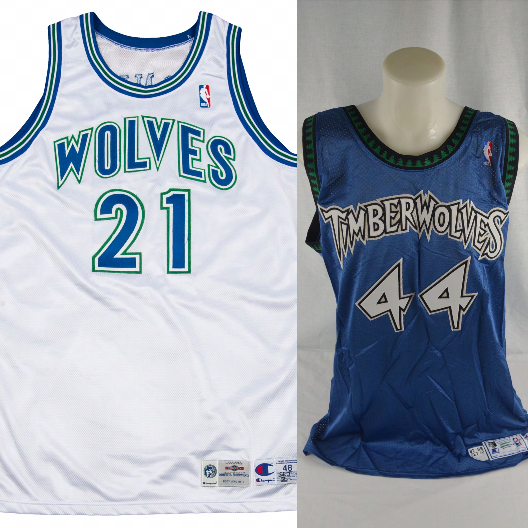
The Wolves original uniforms are by far and without question the best they’ve ever worn. I think they’re damn near perfect, but as the NBA doesn’t allow their teams to just re-use old uniforms, we can’t switch back. That doesn’t mean they shouldn’t influence the new design. But why limit ourselves to just the Wolves’ old unis? There have been so many wonderful uniform designs in the NBA over the years, especially in the 70s and 80s (no, I’m not being nostalgic), and the ABA had some of the finest uniforms in any sport. Many of the best uniform updates in recent years have used elements of the past (e.g., Wizards, Warriors, Jazz) melded with the designs of the present to make beautiful uniforms. The Wolves don’t have the history that these teams do, but they can still use history. Just don’t make it an obvious rehash.
- Green, green, green
Green is an underused color in the NBA, always looks great, AND fits perfectly with a forest theme that a team called the Timberwolves should be cultivating. But go with a green in the kelly range and stay away from the neon green and midnight green ranges. I’d love to see green away jerseys but would be happy with green alternates or even green lettering and numbering (on a white home and blue away). Don’t disappoint me.
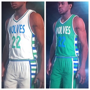
Words are easy and often vague, so here’s something I cooked up on NBA 2K.
I think it does a good job of creating an identity, keeping it simple, being bold yet minimalist, looking to the past (basketball’s not the Wolves’), and including green, green, green. Truth is, though, I have no background in graphic or any other kind of design (you’re shocked, I tell you! Shocked!), so I’d love to see what our readers, both those with professional design skills and those without, come up with.
DM us on Twitter @howlintwolf with your best designs (feel free to include logos and word marks along with the uniforms), and we’ll feature our favorites in an upcoming article.
Follow me on Twitter @absoloj
Add The Sports Daily to your Google News Feed!
