Nike unveiled their fourth and final NBA uniform set for this season on Wednesday.
Unlike the three previous uniform combinations that were released, the “City Edition” ones have a unique element as these jerseys are supposed to embody the local culture of each NBA team.
With that being said, some of these new uniforms are interesting, to say the least. There are a few jerseys that truly represent their respective cities and there are others that leave fans scratching their heads wondering why they decided to go that route.
On that note, we took a look at the five worst NBA “City Edition” jerseys, and here they are.
Los Angeles Lakers
Kobe Bryant was one of the greatest to ever play the game, and the Lakers organization is one of the winningest. With that said, why are the Lakers running out their same black uniforms but just changing the name? A few years ago, the team had black unis and called them Hollywood Nights, which at the time was pretty cool.
Meet the newest addition to the Lakers uniform lineup.
For the City. By @kobebryant. #LakeShow| #NIKExNBA pic.twitter.com/Ok7Ussh6jF
— Los Angeles Lakers (@Lakers) December 27, 2017
But doing it again, this time in the name of Kobe, is a little overboard. Also, which one is it, the Black Mamba edition or the Lore series? This also reminds us of how every team in the NFL now has a black uniform. It just loses the allure.
Oklahoma City Thunder
There isn’t much to say about the Thunder’s uniforms, except that at least they are not black.
https://twitter.com/okcthunder/status/945806310561517568
Don’t get me wrong, I understand the orange and blue concept, sticking with the team’s original colors, but this reminds us of when we were children playing with magic markers or watercolors. We all remember rolling with two streaks across and just attempting to stay in the line.
Dallas Mavericks
Here come the black jerseys, haunting us again. The Mavs’ uniforms do look cool at first glance, as they’re different from both their old and new school color scheme, and who doesn’t like the three-letter city combination across the jersey?
Only in Dallas will you feel the energy the downtown skyline brings to its Dallasites. Marked by the neon glow on the letters, numbers and piping, the new Mavs City Edition Jersey reflects the swagger of the Big D and the vibrancy of Dallas nights.#NIKExNBA #MFFL pic.twitter.com/aNNxUeJD8c
— Dallas Mavericks (@dallasmavs) December 27, 2017
Dallas’ new uniform set supposedly represents the downtown skyline and vibrant Dallas nights. However, this just doesn’t feel right. Again, going with the black is cool, but the green and blue almost reminds us of the Seattle Seahawks or the old Atlanta Hawks’ throwback uniforms.
A sneak peek of tonight's throwback jerseys! 👀🔥 pic.twitter.com/flY2RAvQPq
— Atlanta Hawks (@ATLHawks) January 13, 2017
Dallas went outside the box with this concept, but played themself.
Brooklyn Nets
Remember, the Jay-Z song, “Brooklyn (Go Hard),” that opens up with “Brooklyn, we go hard, we go hard?”
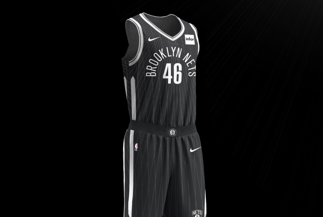
Well, someone should tell Nets’ management that these jerseys do not go hard. Brooklyn unveiled their “Brooklyn Unite” unis and they look basic.
Brooklyn Unite#WeGoHard #NikeXNBA pic.twitter.com/rPykGNlziG
— Brooklyn Nets (@BrooklynNets) December 27, 2017
Their uniform concept is inspired by none other than the Brooklyn Bridge. The Brooklyn Bridge may be iconic to New Yorkers, but it’s hard to believe it has an appeal that is broad enough to be on a uniform. The wiring pattern going down the jersey, which represents the bridge’s steel cables, just doesn’t work.
There is a lot left to be desired with this jersey.
Orlando Magic
This is another jersey that came up short on the aesthetics. We’re unsure if we should pick up this jersey at a local sports store or go pick it up at Disney World’s Magic Kingdom.
Details on new @Nike threads: https://t.co/Ur1jbPlklP pic.twitter.com/xRG1csWsoh
— Orlando Magic (@OrlandoMagic) December 27, 2017
Here’s what Nike said about the uniform:
The edges of light bordering our universe reveal a vastness greater than our imagination. Emblematic of the desire to achieve more, the Orlando Magic City Edition uniform is the will to break boundaries, push our outer confines and find something greater than our individual selves. Go higher. Go farther. Go deeper. Be limitless.
It’s hard to believe this uniform will break boundaries in any sense, but we do believe it will be a great gift for anyone working at NASA.
Add The Sports Daily to your Google News Feed!
