![]() Welcome to the “Re-Imagining The NHL” project created by Cole Jones. Cole has been great enough to allow Days of Y’Orr to post his idea on different teams with his spin on them. You can follow Cole on Twitter. Please feel free to comment on the team below. Feel free to read the official announcement of the project here. Since neither Cole or Days of Y’Orr consider this team our “home team”, we will do our best to bring in a fan of the team described to get their thoughts. Today we were lucky enough to get input from Justin Azevedo from Matchsticks and Gasoline
Welcome to the “Re-Imagining The NHL” project created by Cole Jones. Cole has been great enough to allow Days of Y’Orr to post his idea on different teams with his spin on them. You can follow Cole on Twitter. Please feel free to comment on the team below. Feel free to read the official announcement of the project here. Since neither Cole or Days of Y’Orr consider this team our “home team”, we will do our best to bring in a fan of the team described to get their thoughts. Today we were lucky enough to get input from Justin Azevedo from Matchsticks and Gasoline
If you haven’t checked out our other teams, visit the Re-Imagining the NHL team page. The team page will be updated daily with every team we update. So before we take a look at the uniforms, lets take a look at Cole’s comments on the Calgary Flames.
Cole’s comments: When Reebok took over and applied the Edge template to the Flames, they went from having one of the most over-rated uniforms in hockey (in my mind at least) to having one of the ugliest uniforms in hockey (common opinion). In all actuality, the Flames have never really had any uniforms that I thought were fantastic. The closest they’ve ever come was their Cup era team, with Theo and Nieuwy and Mike Vernon. I think the Flames realize that, and that’s why their third jersey is a throwback to that uniform. That said, the original colors are just a little too loud and obnoxious for modern day NHL hockey. The red and the yellow shades they use are just too bright and clash too hard without the black to level things out…. rather than over-use black, like the Flames have done for the past decade, I decided to simply pick more complementary shades of red and yellow.
I switched the red to a much darker shade, almost burgundy… and picked a warmer more orangey shade of yellow. I drew inspiration from the Washington Redskins color scheme, without trying to make it look like a football-to-hockey crossover project, and without taking the exact color codes of the Skins.
My home and road, I love. I wanted every concept to have an alternate jersey, but with the elimination of black from the color scheme of the home/road sweater, I didn’t have many options for an alternate (other than a gold jersey that i’m sure wouldn’t go over too well.) I decided to go more modern with the alternate, drawing inspiration from the super popular pre-edge look, only with a decidedly more “fire” inspired striping pattern. I think alternate jerseys have every right to be more “out-there” than a team’s primary look, so I had no issue bringing back black into the color scheme for the thirds, and using the black C that they currently use.
After the jump, a look at my favorite Western Conference team, the Calgary Flames…
Home: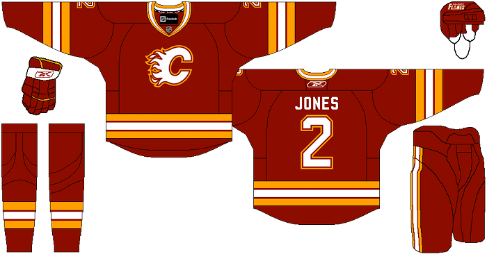
Away: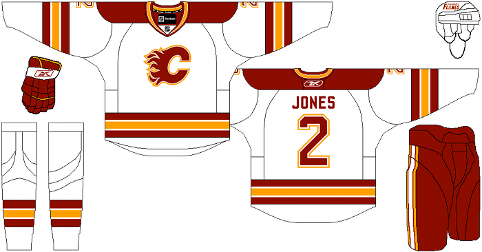
Alternate: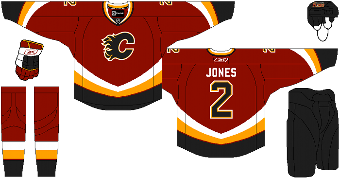
Justin Azevedo’s comments: Personally, I like how bright the current retro jerseys are, but I’m completely fine with the burgundy on the homes and even though I’m not old enough to remember the ’89 jerseys, I feel as though Cole’s home and away capture the spirit of them exceptionally well. I like the brutal simplicity of the pants on the home and road, and the stripes down the side are nice.
Saying that, I’d like the gold to be the big stripe on the away pants, and the solid blacks on the third just don’t do it for me. I’d prefer if some of the red and gold were implemented into their design. I am a fan of the curvature of the colours on the thirds, but I have an issue with the white on the gloves-I hate it when white appears on gloves and it’s not on the cuff.
I would like to say my biggest issue with the two main jerseys is the colour matching-everywhere red would be white and gold would be the constant accent-but I think those would end up being a little too plain. Lastly, I would prefer if the lettering of the names matched the design of the numbers (borders and all), especially on the third. Aside from those minor details, I think Cole did a great job on these and I’d be more then happy to plunk down a Borden or two for one of them.
Days of Y’Orr’s comments: I’ve already established that I love the Calgary Flames. Anyone who follows me on Twitter, especially when the Bruins played them this season, knows the type of mancrush I have on Jerome Iginla. Every year I hope he gets traded to Boston will would give me the biggest sportsgasm this side of winning the Stanley Cup again. He’s a phenominal player on a team that ranks just below the Bruins in terms of my fan love.
Right off the bat I have to disagree with Cole on the state of the current home uniforms worn by the Flames. I love them. I own one. I think it’s the sharpest looking home uniform in the NHL to date. Yes, better than the Bruins home.
With that said, I’ve never been a fan of the old Calgary jerseys. They’re too “McDonalds”. The red and yellow interlocked like two obese people humping in the woods. I like that Cole darkened the red and the yellow from the ’89 style jerseys. The old red was, well, too red if that makes any sense.
Overall I like what Cole’s done, but I’ve never been a huge fan of these uniforms. I love the current home jersey and I actually love the black horse head third they used to have. I still have one hanging up in my closet!
So what do you think?
Add The Sports Daily to your Google News Feed!