After the Sabres new away and third jerseys were leaked online, there wasn’t too much tension on my end watching the jersey unveiling on Saturday.
However, it was really awesome to see them in person, particularly the new road uniforms. The 2008 Winter Classic brought back the memory of how great our original white jerseys were, this makes it that much better. I feel the navy blue looks even better than the royal blue did previously, although I’m likely in the minority there. All-in-all, the new white jerseys are nothing short of flawless.

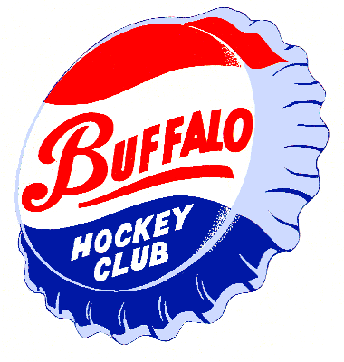
The third jersey is a complete toss-up for me. I don’t mind the royal blue and I am in love with the Buffalo script that hearkens back to the old Buffalo Bisons Pepsi Cap logo. In addition, the helmet logo (just a smaller Buffalo script) looks great as does the wide gold stripe on the pants.

Yet, the back of the jersey leaves something to be desired. The addition of a gold nameplate with blue lettering, plus the cream-colored vintage-stitched numbers aren’t very good-looking at all. In fact, it kind of ruins the uniforms (at least for me).

I feel that the nameplate would have looked okay had the numbers been left normal. In fact, had the cross-stitching been left out the cream numbers would have gone over fine. But I feel like it is overkill to a point. I am still contemplating a purchase of both unis.
The white jersey is a no brainer. And I feel that an un-numbered alternate would look great in a frame. So, we shall see how much dough comes out of my check book in the coming weeks.
Stay tuned for my thoughts on the Sabres entering training camp.
Add The Sports Daily to your Google News Feed!